
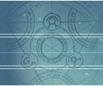


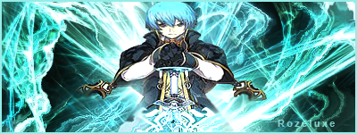
Hello everyone I'm new to this site lol. Hmmm well here is a sig i just made earlier. Hope yal like ^_^
Here's more i've made.
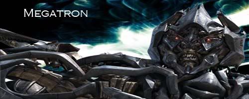
Megatron
 AnimeGalleries [dot] Net AnimeGalleries [dot] Net |  AnimeWallpapers [dot] Com AnimeWallpapers [dot] Com |  AnimePedia [dot] Com AnimePedia [dot] Com |  AnimeGlobe [dot] Com AnimeGlobe [dot] Com |
| AnimeGalleries [dot] Net | AnimeWallpapers [dot] Com | AnimePedia [dot] Com | AnimeGlobe [dot] Com |


Hello everyone I'm new to this site lol. Hmmm well here is a sig i just made earlier. Hope yal like ^_^
Here's more i've made.
Megatron
Last edited by FlashD; 08-25-2008 at 03:26 PM. Reason: Don't multi post, use the EDIT button instead.

Dude, don't double post.
In fact, you TRIPLE posted.
Just edit your posts.
Also, your signatures are interesting, but they are all in low quality. =\
How to make the quality better?Originally Posted by Balance

Find better pictures.
It's almost nearly impossible to make a low quality picture back to a higher quality picture.
So I suggest finding the best resolution of any image you are trying to find.
So in other words...
BIG = GOOD
Because when you make it smaller, it doesn't lose it's quality, but when you make things bigger, that's when it loses it's quality.
O ok thnx Balance
Thank you Hisa ^_^
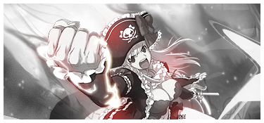
Also here's a symbiote spidey sig i just made


They aren't that great. They're okay. Good luck on your next sigs.
I'm fairly new to using photoshop so i no there not gonna be gud. I am also needing help to those who also use photoshop CS3. I used to use another program called gimp which wasn't so great from making sigs and stuff
^ Sig made in GIMP. >_>
Don't blame your inability to make good works on the program you used or are currently using.
As for your works, I honestly can't say they're good. Bluntly they're pretty crappy. Really bad picture quality, rather weird animations, they almost look like stuff you could do in Paint. I'd really suggest actually taking time to learn so you can post good works instead of posting bad sigs such as this. Don't really have much to say besides that.
Also, please write more properly. It actually gives people a better impression, you know?
Last edited by FlashD; 08-25-2008 at 03:29 PM. Reason: Language
|Power of The Mask|
I never said i was blaming my inability. I was saying that i am not very good at using photoshop. And yeah I know it's crappy, thats. I'm continually making them and posting to see if i've made any improvements on the sigs i am trying to make. I know i'm not good at making sigs. And you really didn't need to tell me that because I already knew it. Also why are you concerned about how I speak. I have my way of speaking and you have yours.


No need to be rude, that was 100% uncalled for.
For one no offense, but people in his sg/ava thread don't really care what YOU made, post it in your our thread. You are an extremely rude person, anyway, just because you have more experience in the GFX world doesn't give you right try and make someone feel inferior. This forum is for comment and critic on the work of the artist who have posted. We were all new at one point, and some of US are still new at still, and we need honest feedback much rather than post just :OMG LYKE YOU ARE SOOOO BAd Y R j00 even posting" I mean honestly.
Okay now, I agree with Balance, your set have somewhat low quality, but that can be easly fixed, sharpen and again use bigger extractions or stock, I could redirrect you to a few sites. So you are somewhat new, but here AF we have a lovely Editing Tips forum that will allow you improve your GFX abilities exponetionally fast, lucky for you most of them are for Photoshop.
Don't believe anything that (s)he just said it was rude and untrue, you are not crappy much rather you are new, you'll get better o_O;
Anyway keep posting but DON'T multi post anymore =D
Last edited by Jose; 08-24-2008 at 11:45 PM.
Did I ever say anything in my post that sig I posted was mine? Actually it's not. Friend's sig, but that's besides the point.
And I really find funny how you warped my whole comment like that. I did give him feedback on the negatives of his work and also told him he should try and learn more before posting his work. Cause again like I said before it looks simply like pasted text and sprites on a black canvas and something that could be done in around 10 minutes or less. Atleast for some of them.
That and I never said he was crappy, just that his work was crappy which implies that it'll get better over time if he actually tries and learns.
So, really don't come with all that rude crap to me. By posting his works he's already opening himself for all kinds of comments - good or not.
I'm honest and blunt with what I say, sue me.
|Power of The Mask|
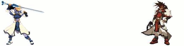
Here's another sig i made.
Please tell me if its good or not and also if it is not please give me tips in order to make better sigs. thank you ^_^
Another way to say it is c'n'c
comment and criticize that is ^.^
Anyway your animation sigs are cool imo..
and again try and find better images aswell with its' qualities.
Your new sig seems to show some improvment : )
Maybe try a lens flare for brightness? It's a bit dark for me
and BTW using two renders is quite often??...
It needs more flow too maybe try smuding some bits
Not bad overall! Please do keep on trying you're sure to do better.
Gosh! Even this thread is starting to get heated. Cool down Yurka and Jose. Please try to keep all that to PMing
Anyway, just to let you know HolyOrder-Sol, even I sucked at photoshop before. I actually ripped stuff unknowingly, can you believe it. Good thing I never put them up anywhere. You still have a long way to go. Give it some time and use more tutoials. You'll have a better idea of where you're going that way. And also listen to whatever Balance says. He's usually right.
Oh, and some people can get VERY harsh while giving critique. Just take it like the way you did earlier on. I'm glad this whole thing didn't turn into a fight. Just keep working on your sigs. The'yre a bit low quality so try using larger images. And give them meaning along with flow and depth. Check the Dazzle Us sub forum for some great editing tips and tutorials. I'm sure it will help you improve ^^
O ok thank you very much Karuto & IchigoKiss. I am gonna keep on trying lol
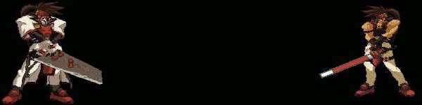
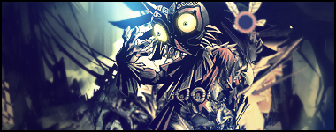
Here's another one i just made from my favorite game:

Try not to Distort the Render anyway possible, When your doing the Render, Hold shift to Resize.. Always Smaller Never bigger.
As for the Text is a bit better, try making it adding a bit of Opacity so it isn't the Center of Attention like Text shouldn't be.
Animating Sig's is a huge + but you need to get your basic skills down first.
I recommend just looking over and or Following a Tutorial.. even if it makes something you dislike, Ignore that and do it... you will learn a TON about Photoshop you didn't know before if you do.
Keep trying you'll get better soon ^^
o ok ^_^.
Also if i have a picture that i like but is small should i just leave it the size it is and make due with it or just go on and use another picture. Becuz i wudn't want to waste anyone's time with sigs like that
Last edited by HolyOrder-Sol; 08-25-2008 at 05:05 PM.
Use it in an Avatar maybe, Depends if it is a Sprite or not. Generally you want the Character to be at least big enough to fit 85% of the frame Vertically ( In my opinion at least)
O ok thanks alot ^_^
Well i've been practicing but i don't think i've made any progress. Tell me what yal think of this to let me know if i made ne progress at all.
Also can one of yal tell me where i can go to look at the basic tutorial for photoshop cs3
As an ex-mediocre-signature maker NEVER USE GIFS!They come out wrong.
-.-" i didn't use any gifs. Unless ur talking about the pictures at the top. I made them from gimp
Google it, there is some tutorials on the forums, as for the Sig. It looks good... Well Right idea anyway, alot more depth then your last sig's.
Pink ball is to much contrast, And your render still seems squished or something.. For your next one Look hard for your render since that seems to be one of your Main issues, Go on DeviantArt, or Google Images. Typing in its Japanese name also can get you a ton of result's that you can't find in english. (E.G. "ララ" gets me a ton of results for Lala from toloveる)
"Bigger is Better" is something you should follow, doesn't matter if it is 5mb's.
Also try to Center your images, but Definetly Right idea for your last sig, your getting there!
Edit: Don't save it to Jpeg, save it to PNG.

Holding down SHIFT when resizing pics is something you really should be doing.
Thank you Evockzi.
Do u mean when i go to the image size hold down shift becuz i wudn't kno if i'm suppose to do it that way @ KuroTan
Also which way do yal start off with a sig do yal start off with a black sheet or go directly with the picture at the start?
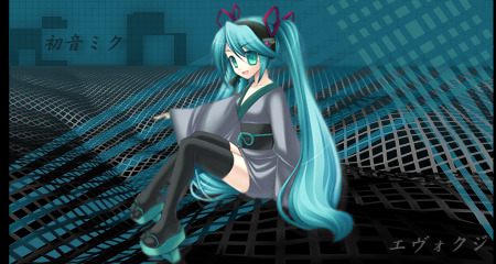
Here's another one:
CnC please
This time the picture isn't skewed which is +
Border would be nice, alot of simple brushes can be made into a border by just going over couple pixels on a flag line.
As for starting on a Sig, I start on a transparent sheet ( this is very important for layering) then make about 10 copies of it, and put my Extract on one, then create my Gradient background on another.
But as for this Sig, its alot better your getting there. Text placement is good. Some of the effects could use some TLC but thats just me.( they a bit bright )
Try and learn a bit more about Flow of the Render too, which is generally you'll base most of the effects off of.
This Tutorial (I finally found ) has a good examples of Flow.
http://www.animeforum.com/attachment...8&d=1217589417
There are currently 1 users browsing this thread. (0 members and 1 guests)
 Posting Permissions


Bookmarks