Ok just chill man.
Your new sig is ok I don't like the textwork though.
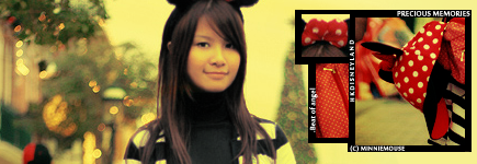
The font choice is just bad.Yet do I see somewhat
polaroid picture thingys being put on??Aswell I see
some motion blur there,am I right??But I just admire
the golden-amber-ish colors you made with this one
but it's too put randomly.Overall good job.
EDIT ::
Now it seems the new one is posted might comment
on it...I don't like the ver2.0 text seems distracting
The 2nd girl don't really make sense.Now that polaroid
looking thingy looks bad on this version imo..


 AnimeGalleries [dot] Net
 AnimeWallpapers [dot] Com
 AnimePedia [dot] Com
 AnimeGlobe [dot] Com


 .
.


Bookmarks