


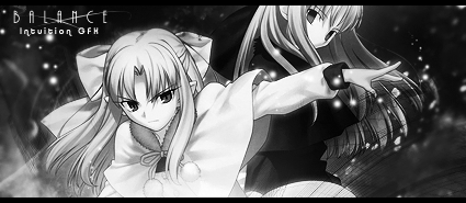
You did well with the scan Balance =/
And I agree with Unli, I like the first one better =D
I just wish it had text ;__;
 AnimeGalleries [dot] Net AnimeGalleries [dot] Net |  AnimeWallpapers [dot] Com AnimeWallpapers [dot] Com |  AnimePedia [dot] Com AnimePedia [dot] Com |  AnimeGlobe [dot] Com AnimeGlobe [dot] Com |
| AnimeGalleries [dot] Net | AnimeWallpapers [dot] Com | AnimePedia [dot] Com | AnimeGlobe [dot] Com |


You did well with the scan Balance =/
And I agree with Unli, I like the first one better =D
I just wish it had text ;__;
.-.
(o.o)
|=|
__|__
//.=|=.\\
// .=|=. \\
\\ .=|=. //
\\(_=_)//
(:| |: )
|| ||
() ()
|| ||
|| ||
==' '==
My my! That's what you meant when you said you're going to do something about people ripping your stuff.
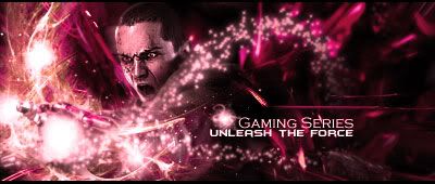
The Orange "face the challenge" sig is nicer. It has pretty depth. But most of your sigs are over-sharpened. [you aren't copying me, are you???]
The strawberry delight tag has such a lovely stock ^^ Really loving that. The Air tag flows very well with the wireframes and all.
I noticed that all your sigs have VERY good flow in them. And you haven't overdone anything about it [except the sharpening bit]. Good work!!

Thanks everyone for the comments...seriously.
No Karuto, I wasn't attempting to copy anyone. =\
Anyway~~~
Had my muse goin on.
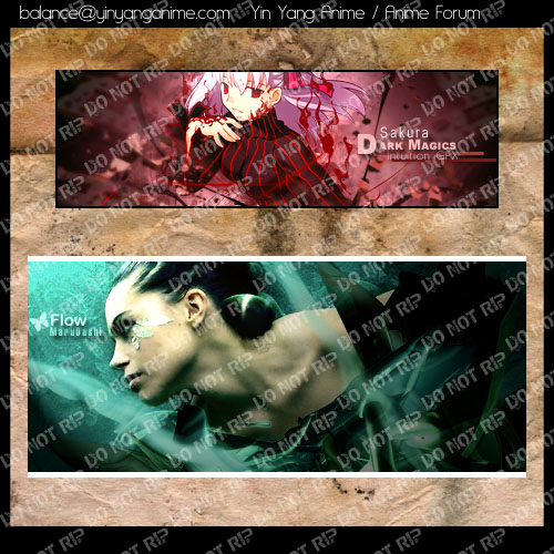
And a gift for lovely MaruDashi.
She should be the ONLY one who is in possession of the original.
Anyone else is meat.
Last edited by Balance; 11-01-2008 at 10:27 PM.
I love it I love it I love it I love it I love it I love it I love it I love it I love it I love it I love it I love it I love it I love it I love it I love it I love it I love it I love it I love it I love it!!!!!!
The dark magic sig came out nice too...but I like mine better [snuggles it]
.-.
(o.o)
|=|
__|__
//.=|=.\\
// .=|=. \\
\\ .=|=. //
\\(_=_)//
(:| |: )
|| ||
() ()
|| ||
|| ||
==' '==

The text overlay makes it hard to see, but I see the 2nd in maru's sig sooooo
with the green smudge, maybe make it totally opague, or set the blend mode to something like linear dodge :3
ein, zwei, drei, vier bin endlich weg von Dir
fünf, sechs, sieben, acht Du hast jetzt keine Macht
♥


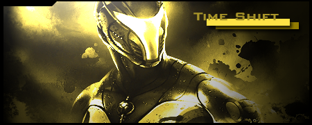
I recken you should have faded in some mech from that game into the background. overall awesome!Originally Posted by Balance

I never said anything about you copying anyone. The other way around, rather.
I simply love the one you did for Maru. A very apt title too ^^ You're so good with greens. I guess I just have to stick to my usual reds and yellows. I can never deviate from them, and when I finally do, it turns out all wrong. But you're not like that. Your creations are Balanced ^^
Been a while since I posted.
Not doing a lot of signatures.
They get boring once in a while.
But it's also due to certain things that I haven't been able to post up what I made.
Anyway, here's what I have made during that time.
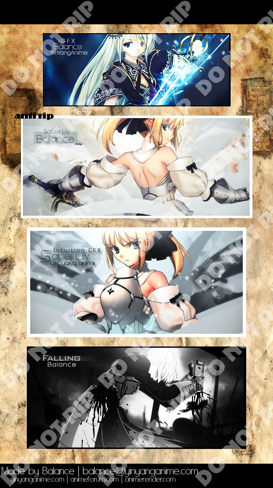
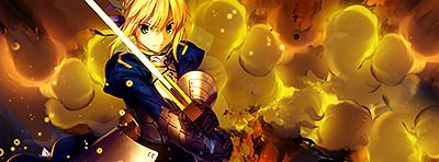
Took on Serated's challenge on two of his extracts, the Saber Lily extracts.
God, they were amazing extracts and honestly fun to experiment with.


Love both of the Saber Lily ones!
Excellent, excellent composition!
You worked really well with colors that, if used incorrectly, in my opinion, can end up looking really boring. When I used that extract, I was forced to completely alter the color scheme, but you used the colors perfectly.
1st one on that tag wall is awesomepwnsauce. <-- new word
Why didn't you mention that you made a sig for me though? So I can wear it. lol Thanks :3
ein, zwei, drei, vier bin endlich weg von Dir
fünf, sechs, sieben, acht Du hast jetzt keine Macht
♥
Oh my gaaaaaaaaaawd.
I haven't posted here for a VERY, long time.
Time to change that.
Few things first.
I've decided not to make signature walls anymore because they took too much time and I just don't want to do them anymore.
If someone has ripped it, then whatever.
I'll find out anyway.
I made four versions, because text is a very hard thing to input.
And I can't decide which coloring I like.
V1.
V2.
V3.
V4.
It's been too long, I need to get started on my activity again.
I can't let my Photoshop skills go to waste.
Comments and criticism are highly recommended.


imo having the text like how it is in V3 is best.
Having it on the right side like in V1 doesn`t look good.
Can`t decide on what I like more, black and white or coloured, it both looks good.
> It's been too long, I need to get started on my activity again.
Agree XD
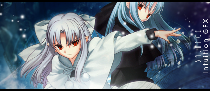
Considering there are two characters, you did a fantastic job.
I would've wanted some more things closer to them, like clipping masks (I like clipping masks), or maybe just place the text closer to them (oh I like text closer to the focal too).
Colors are nice and I like the lighting too. ;3
(I like a lot of stuff.)
Add more saturation, the colors look kinda dull here ;o
ein, zwei, drei, vier bin endlich weg von Dir
fünf, sechs, sieben, acht Du hast jetzt keine Macht
♥

not a real fan of double renders, but you created a sig very well in that case. Text on v3 is the best. I feel like there could be more depth, but flow is good. V3 is my favorite
both made by me
Hm, thanks.
Hm, then perhaps I need to find out a way to use clipping masks without making it look like there's too much noise. Agh.
THAT'S WHAT I WAS NEEDING.
Not a luminescent black and white gradient map, a saturation layer...
THANK YOU.
You kidding me? There's almost no flow. But thanks.
Made one that does have a bit of flow though.
(You should know by now that it was extracted by Serated~)
AUGH, I'm almost using the same exact techniques to create VERY SIMILAR signatures.
Oh, I just remembered I forgot to sharpen that signature...
Forget it. Later.
Comments and criticism thanks bye.
Last edited by Balance; 01-28-2009 at 02:23 PM.
I think it would better if it weren't so big. Also, try adding more shapes, go crazy. Originality is always great :3
ein, zwei, drei, vier bin endlich weg von Dir
fünf, sechs, sieben, acht Du hast jetzt keine Macht
♥
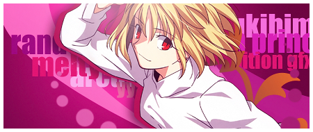
The vector behind Kaede is pretty plain, maybe some clipmasks of funkier colors would help kill the flatness
Mesmerizing colors btw and pretty awesome sig you made there ;D
(I'm SO stealing that color scheme, thanks~)
Over-saturating since '07

~I love the "Saber Lily" siggies ;3 Through the white color they are looking really elegant ^.^
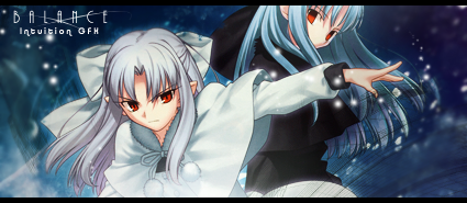
Latest:
http://www.yinyanganime.com/Personal/Signatures/shufflekaede.png
Love the extract- and textplacing. Colors are choosed very well but the only thing (as you've already mentioned) I think would give it a better look is a bit more sharpening.... :3
And I agree with Unli:
Funkie color clipmarkes would help kill the flatness.
How ever: Great work <33
I'm not sure if I've ever posted in here o_O;
For your post #111 I like version 3 the best. I like your text placement the most in those two ones, and the black and white ones seem more flat, like there's not enough contrast and depth imo. Still some really nice signatures ^_^ I like how sharp and clean cut they are, and you made a nice decision with how you cropped your stock and the placement of it, it looks nice. I do agree with Cross Marion's comment though. I'm sure if you change that/have changed it this sig would be 'mazin.
For your latest signature, yays pentool~. Again, you really have an affinity for your choice of stock and a talent at making some really clean, sharp signatures o_O And I agree with everyone that I like the colours! Very nuetral and they compliment the character nicely. I do however agree with Unli's comment. It looks a little flat, though obviously your sig style is creating simple, clean, well balanced signatures and it works great for you, I still thing this signature could use a little more sprucing just because of all the neg space. Clipmasks I think would be a good idea here too. ^_^
Meh, I'm sort of echoing what everyone else is saying here... but I digress. I really do like your style, haha it's so different from mine o_O;; I likes it though, can't wait to see more! Don't let your skillz go to waste, yo.
---
&& all the world's a stage
i existed because i dreamed it;
i dreamed the world...//
Just gonna post the final version because I honestly don't wanna go out and get the rest of the three versions.
After taking advice from Mikadzuki, I finally remade and improved this signature until I got here.
I think I just simply need to get back into the flow of making signatures again.
I'll probably be making large pieces again.
You'll most likely be able to see it in my blog.
Anyway, here's the image.

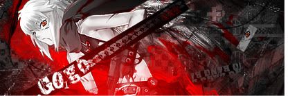
For the text, try to make it a different color. The text mearly blends into the bloody background on the left. Other than that, this sig can pretty much scare someone.
WARNING: This user is wanted for unauthorized access into Ultratech archives. If you see this user in person, please contact Ultratech immediately.
I think the stock in your newest one is a bit too sharp, but overall I like the composition of it.
Very nice color contrast with the Kaede sig...hmmm....I think a splatter brush than fans out in the flow directions with a clipping mask would look nice on it =3
With the last four you posted, version 4 is my favorite, though I think a very small color overlay on the eyes would make it awesome *w*
After that my favorite is the first Saber Lily sig you posted. I really dont have anything else to say about it, other then I love how simple and elegant it looks x3
.-.
(o.o)
|=|
__|__
//.=|=.\\
// .=|=. \\
\\ .=|=. //
\\(_=_)//
(:| |: )
|| ||
() ()
|| ||
|| ||
==' '==
I agree with you on the last one. It is too sharp. And the Saber Lily is also great as well. Simple but effective.
WARNING: This user is wanted for unauthorized access into Ultratech archives. If you see this user in person, please contact Ultratech immediately.
Hm, I shall take that into consideration next time.
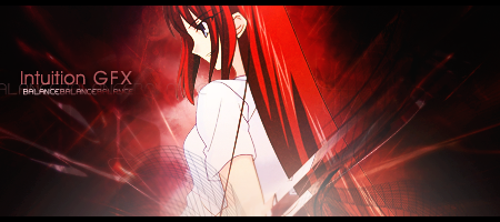
Now I present to you, a tag in which I have wanted to try for a very long time.
VECTOR.
Colors suck though. I need to work more on reds. D=
There are currently 1 users browsing this thread. (0 members and 1 guests)
 Posting Permissions


Bookmarks