


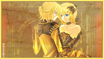
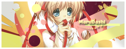
I like the newest tag, but one thing is, there isn't a single shade in it that is the same as, or very close to, the colors of the eyes. (Also, imho, pink and red clash...)
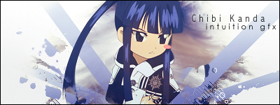
Oh, and I really like Intuition gfx sig. =)
 AnimeGalleries [dot] Net AnimeGalleries [dot] Net |  AnimeWallpapers [dot] Com AnimeWallpapers [dot] Com |  AnimePedia [dot] Com AnimePedia [dot] Com |  AnimeGlobe [dot] Com AnimeGlobe [dot] Com |


Bookmarks