


Glad you liked it
Last week SOTW:21 Human Only theme, here is my entry.
I managed to get second place (woot)

 AnimeGalleries [dot] Net AnimeGalleries [dot] Net |  AnimeWallpapers [dot] Com AnimeWallpapers [dot] Com |  AnimePedia [dot] Com AnimePedia [dot] Com |  AnimeGlobe [dot] Com AnimeGlobe [dot] Com |
| AnimeGalleries [dot] Net | AnimeWallpapers [dot] Com | AnimePedia [dot] Com | AnimeGlobe [dot] Com |


Glad you liked it
Last week SOTW:21 Human Only theme, here is my entry.
I managed to get second place (woot)


Ohlala,I actually failed to notice your thread...
Happy to see me here...?
Lol for that...
Anyhow,as with every other thread,I'll start with the last one,then follow up with updates...I'm sure you won't mind...?
Anyhow,let's see this last one,shall we...?
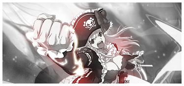
Hmmm,overall good...
It's simple,yet catchy...
I love the simplicity of the background,without any unnecessary effect...
Character is pretty sweet,and well placed,so that's another plus...
There is one thing I dislike about this one,and that would be borders...
I think that you could use different color instead of white,like lighter-brown or something,since white one kind of really jumps out from the siggy,if you know what I mean...
Now,sig has a nice feeling to it,and the balance is quite good,which gives this one that certain flow...
Very good,nicely done...
Keep up...
Aside note: sorry for lame comment...?I really don't see anything else to comment on *runs*
...a gift from Balance...the legend itself...
~ click the button,I dare you ~
lol, that was my first full Photoshop solo signature, other than that I have help from other people or use a tutorial or use GIMP.Originally Posted by Hamashimura

Yeah I understand the border does steal focus form the signature itself, I was afraid that other color wouldn't bend with the color, but I guess that happened anyway. I was honestly shocked when someone voted for it, almost got a heart attack when I got second place. I didn't think it was good at all, but if anyone likes it I still have the .psd file and will be willing to change the text for them and make one of my boring avatars.
Anyway I'm glad that you comment it. My thread is dying, so I'm happy if anyone post anything here.
Pretty interesting pieces you have; you've improved allot from the beginning of this thread up to the point your at now, it's amazing how a place can simply inspire one's work, and you've illustrated that indefinitely.
Keep up the good work.
Last edited by FlashD; 10-06-2008 at 12:33 PM.
Thank you here was a rushed signature just for practice, even if I didn't follow the dirrections exactly and there is no avatar but here is a request by Clawdia
I don't think it's horrible, but not great either.
Some comments maybe?
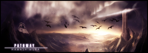
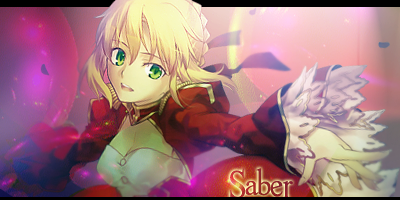
Nope,it's not horrible...But it is good,I like the look of it...
Character position is good,and all effects are leaving the focus on it,which is a plus...
Balance of the siggy is decent,and the complete flow is quite good...
Sig has that special feeling in it...
Effecting is great,which makes this siggy quite gorgeous...
I love the txt placement,and the font,pretty fancy yet beautiful...
As for the borders,I think some pale pink,or pale purple one would be more appropriate...?
White one is kind of weird looking here,but are not necesarilly a mistake...
Overall,I think this one is beautiful,and sort of emotional,which is why I like it...
Nice one mate,keep up...
...a gift from Balance...the legend itself...
~ click the button,I dare you ~


I LOVE in latest sig the stary blury backgrownd... or what ever. love that
Thank you
here's one that was going to be my SOTW 24 Entry but for a couple of reasons won't be enter. I might submit another signature

As you said, not horrible, it's actually pretty good xD
First thing I noticed is the sharpness, it still looks like stock quality without the sharpness ^^;;
Colors are pretty dull imo, theres not much contrast going on. Try pimping it up with the help of this tut, you know, mixing vivid and dullness to some areas or so...:
First one btw
The Text job is well done mate!
I can't really see the depth in this without the backdrop or foreground props, or maybe thats because of the smudging/grunge style (smudge depends heavily on shadow, lights and blurring only)
Motion is pretty good, but I also didn't see you adding flow to enhance that point ;__;
(my writing is retarded, so I'll stop here)
Over-saturating since '07
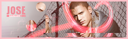
Jose, your current signatire is one of the best I've seen from you.I'm no signature maker, but what's the thing on the right side?

Wow, there are some pretty killer sigs here since my last posting. You have quite the eye. There is a sense of balance, and harmony with these latest ones. And,, how can I put it? A melding of the image maybe? How can I discribe it? A sense that the picture is not just an image and background, but is all one and the same. Know what I mean? Kinda how there are just some images that can't be extracted cause they are part of their background, if that makes sense.
But I like what you've done. And look forward to seeing more. And think I should get back into doing sigs just so I can improve as well, lol.

*Bows down to the ultimate sig maker in AF* Im not worthy!! Have mercy on my signature creations!
XD DUDE! These are amazing signature creations, I can't...Do it like yours, I can't even critique you because it's all amazingness written all over them. I must be taught!
@ ` Tanuuuuuki: hehe, yay I didn't totally fail that one, I'll repost it with help of Serated's tutorial seeing as I like that signature. Seems I'm also not totally failing at text anymore, hope I keep that up.
@Diocletian: It's an iwrap ( liquified) texture, it was pretty hard to do withOUT messing up the some of the lines the texture itself was 100X100 pixels clipping mask and liquefying helped it looked bigger.
@The Rebel:Blending really? wow thanks, I've heard that's one of the hardest things to master, I do need more help on effects and the flow, however now that I'm a part of Intuition I hope I'll have much more help from GFX gods of AF.
@FoxMcCloud: You're one my favorite people now ;3. Hmm I can send you any/all of the .psd/.xcf files I still have via email or I could even work on a tutorial for any signature you'd like me to. I use both Photoshop and GIMP so just tell me which program you have and I'll tailor it that program.
I have a set I've been working on for almost a week now I'll edit this and post it when I feel it's ready. Thanks you guys for keeping my signature thread alive.
Last edited by Jose; 10-20-2008 at 09:27 AM.
-BUMPS-
C'mon people if I am ever to improve then I need some feedback so come comment here, you'll get 5 rupees and reps XP
Here's Serated's Intuition challenge
Avatar
Signature
all done on GIMP, even the pen tooling.
Feedback O_o;? Please <333
Oh! It looks awesome! Soo...abstract-y. x3
But the render is a bit blurry and I don't really like the grains.
Overall, I love it. ^.^
I like the idea of it,there's just too much noise though
around the bottom right side.Imo the clip masking should've been
placed somewhere else.Overall it's cool keep at it!
i agree with it looking to noisy.. not bad for a gimp sig. Personally i think it looks a tad to busy sorry lol.
I dont like the lines behind her and i think it would look better without it and i dont care much for the text. I guess cause i like just normal text on sigs so thats just for me. I think you should of used the color border you used on the avie for the sig. I think it would have set it off nicely. Also would of brought the text closer to the girl. However thats just my thoughts. Its still a nice sig and avie.
Okay thanks for the feedback you guys. Too many applied images, it might be quicker to remake than remove the noise.
Here a new one
extraction credits: Serated
Lame avatar:
Odd Signatures:
1
2
3
They mostly vary in color o_O; dunno which looks best.
Miss when I didn't even have to bump this thread ;_;
No love for Jose </3
Here was a request from Erised
Pretty much completely own my own here, I know text sucks.
Well, the text is lame, not the avatar itself. I guess I could improve on it for you. It's quite tempting, you know ^^
These are not odd at all. I don't know which looks best either. All of them go very well.
But then when you look at the text, the second one seems to do it some good. It's just more visible. Though it would be better if you could enrich the colors of the clipmask that you used.
And that resized bit in the top-right corner has no meaning to it. Maybe you should just lose it. And it will not look empty if you removed it either.
Overall, it's a pretty awesome sig. The pentooling part is my favourite ^^
Good job.


Sorry! I didn't really have a whole lot in mind for it, and I didn't want to be a pain and give you all these instructions. I was just thinking simple... ><
But I like the font. Wicked cool.


*giving Jose some love*
I suck at commenting though.
Ok first those Lucky Star ones:
Me likes the first one the best.
The blue color of it is really nice.
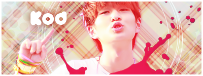
Very nice font on JOSE, and great effect on it.
Cool how you have placed a smaller version of the sig(s) in the corner.
The only negative about the first one is that I think it would look better with the hand there instead of her face/head.
Now the new one:
Pokèmon XD
Nice brushing around the figure, especially the brushline that looks like it`s coming out of the mouth.
The white border fits on the sig, it`s not always a white or black border fits on a sig, but you Jose know that(giving some tips to others :P )
The text hmm, meh it works :3
Do you feel loved now Jose? lol
Thanks for the feeback.
I'm posting this to keep this thread alive.
Pink Border:
White Border:
C or C or both?
Last edited by Jose; 11-18-2008 at 05:38 PM. Reason: my photobucket changed so I moved these there :3

Holy mother of pearls.
I can't believe how mcuh you have improved over such a short time. Unless; you secretly were awesometo begin with and lulled all of us into a false sense of security. OH YES! I KNOW ALL ABOUT YOU.
Now, im going to stop being wierd and CnC XD
I'd say the white boreded one is the better out of the three. I really love the gray and pink colours. How did you do the pink stroke? was it a C4D? Or did you draw it in? Also interesting use of clip masks with the rectangles. They look a little odd though x.x; like you need to blend them more into the background somehow cause the backgrounds a bit plain so the clipmasks stand out a lot. Love the text. Especially going with the box effect. ;D
Jaa jaa. *thumbs up* Awesome work.

Remove clipping masks, they distract from the focal.
And add text closer to him :3
ein, zwei, drei, vier bin endlich weg von Dir
fünf, sechs, sieben, acht Du hast jetzt keine Macht
♥
There are currently 1 users browsing this thread. (0 members and 1 guests)
 Posting Permissions


Bookmarks