


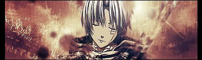
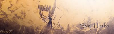
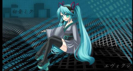
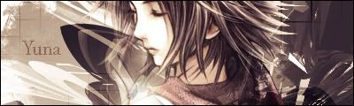
I'm really new to photoshop and here's 2 sig a made during the first 3 hours of messing around in it.
constructive criticism would be nice

 AnimeGalleries [dot] Net AnimeGalleries [dot] Net |  AnimeWallpapers [dot] Com AnimeWallpapers [dot] Com |  AnimePedia [dot] Com AnimePedia [dot] Com |  AnimeGlobe [dot] Com AnimeGlobe [dot] Com |
| AnimeGalleries [dot] Net | AnimeWallpapers [dot] Com | AnimePedia [dot] Com | AnimeGlobe [dot] Com |


I'm really new to photoshop and here's 2 sig a made during the first 3 hours of messing around in it.
constructive criticism would be nice
"Tell me what you regard as your greatest strength, so I will know how best to undermine you.Tell me of your greatest fear, so I will know what I must force you to face.Tell me what you cherish most, so I will know what to take from you.And tell me what you crave, so that I might deny you."
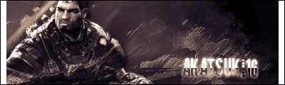
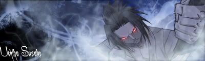
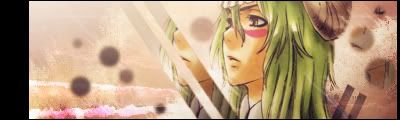
Ok so I've use photoshop for a total of 2 days time and decided to make some siggies. they're not great but i think they turn out ok.
Any and all advices are welcome

"Tell me what you regard as your greatest strength, so I will know how best to undermine you.Tell me of your greatest fear, so I will know what I must force you to face.Tell me what you cherish most, so I will know what to take from you.And tell me what you crave, so that I might deny you."
They're not bad, but here's what you need to work on.
The signatures don't usually have flow in them.
A lot of them seem like you just slapped the extract on them.
Don't use the same font over and over again.
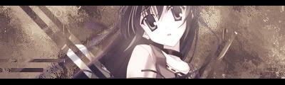
Shana doesn't look proportional, did you hold shift while scaling her down?
A lot of the same background.
The backgrounds are usually boring.
Follow a few tutorials, and you will learn how to eventually blend the extract INTO the signature.
You definitely have potential though, so I say keep it up and keep practicing.


You're doing great so far! I like these sigs, but they all seem VERY similar.
Use a different font that fits the style of the sig, like Balance said. And just play around with things and make them look different from each other. Individual.
Otherwise...the renders are clean. The size is good, and they have good detail.
You're off to a great start and if you keep practicing you'll get better and better! Keep up the great work! ♥
Originally Posted by Demoni
 Nice sigs you got there but...
I'd have to agree with Demoni and Balance, they do seem to be similiar.
Shana does seem kind of narrow(?)
And the font seems to be monotonous try downloading some
although some you have to buy...
Also use some tutorials it will get you far of your GFX knowledge.
So then you always have something different.
I'd love to see improvement from your works like Balance said
Does anyone have any links to good Tut?
"Tell me what you regard as your greatest strength, so I will know how best to undermine you.Tell me of your greatest fear, so I will know what I must force you to face.Tell me what you cherish most, so I will know what to take from you.And tell me what you crave, so that I might deny you."

TUTORIALS OF AF
I'll go easy ^^
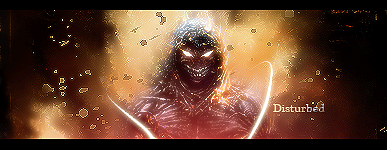
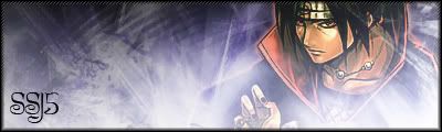
the 5th siggy;
Probably just deepen the colors of the red background a bit. Especially behind the guy. And to really make it natural, darken a bit of the guy as well. Probably near the sides.
And get rid of the text in the background =/
Nice work for 2 days worth ;D
Over-saturating since '07
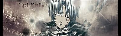
I'm still learning how to use photoshop so try not to be so hard on me...
Any and all advices/criticisms are welcome!
Last edited by cptkelly; 07-11-2008 at 10:20 PM.
"Tell me what you regard as your greatest strength, so I will know how best to undermine you.Tell me of your greatest fear, so I will know what I must force you to face.Tell me what you cherish most, so I will know what to take from you.And tell me what you crave, so that I might deny you."
You're doing an awesome job here.
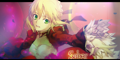
My fav sig is your Lucky Star one. I like the circles. xD
The render in your last sig seems a bit blurry to me. And I think it would look better if the bg was a color similar to the characters hair color.
You're doing great for "getting used to photoshop".
Remember:
Practice makes perfect! ^_^
Keep up the good work! ♥


Hi there :3
Well, in my opinion, i think your doing great as a beginner.
I really like the vector-type signature with all the shapes everywhere, it goes well with the character. Except your name is a lil hidden in the signature, maybe try using a different colour to contrast against the pink instead of a different shade of pink but it isn't that bad, it's fine as it is :3 The naruto one is also good, except the black scanlines are just a bit too heavy so just lower the opacity but if you did intend to have them heavy; sorry ^^; i still think it looks good at the moment, the text is good and the icon.
All of your sigs are fine ^_^ you just need to learn to blend a lil better, try putting brushes in front of the render like on the corners of it, if that makes any sense ^^; just make sure you don't go entirely over the render/extraction so you can still see most of their body and their head. You could also try using vector shapes and smudging.
Anyways, i hoped i wasn't harsh and i hoped i helped. C:
Thanks a lot of the tips...it will surely help me in the future!
"Tell me what you regard as your greatest strength, so I will know how best to undermine you.Tell me of your greatest fear, so I will know what I must force you to face.Tell me what you cherish most, so I will know what to take from you.And tell me what you crave, so that I might deny you."
Ok so here it is...For some reason i can't get it to flow properly...Any advice?

Last edited by cptkelly; 07-15-2008 at 02:19 PM.
"Tell me what you regard as your greatest strength, so I will know how best to undermine you.Tell me of your greatest fear, so I will know what I must force you to face.Tell me what you cherish most, so I will know what to take from you.And tell me what you crave, so that I might deny you."
I think you should put make plumish pink
and maybe lessen the yellow behind Yoruichi
But overall I think it's perfectly fine
But maybe the text needs some work..
Change the font and dont put it in the
bottom left maybe where the yellow is
but a little bit to the left so it's not too idk..
Anyway the font 'Impact' would probably do.
In white and outlined in #b0b0b0

Well some simple tips for getting c4ds to flow with your tag would be to rotate the entire c4d and erase what stands out and disrupts the flow. You just gotta be aware of things such as lighting and if the extract/focal point is tilted a certain way, etc.
But no worries, it's not bad for your first attempt, keep at it.
Here's my lastest sig
here's the same one with more color and no text
Last edited by cptkelly; 07-24-2008 at 06:52 PM.
"Tell me what you regard as your greatest strength, so I will know how best to undermine you.Tell me of your greatest fear, so I will know what I must force you to face.Tell me what you cherish most, so I will know what to take from you.And tell me what you crave, so that I might deny you."
Not bad, I wish I knew how to use photoshop.

I like the coloured one better. But thats just me I like colourful things >:3
The render/extraction looks a lil squashed, maybeits just me. But remember to Hold Shift when resizing an image, extraction.. whatever. Nice grungey background. And is that some clipping masks?
Maybe try putting some standing out text rather than blending it with the sig. xD just imo.
Great work. :3
"Tell me what you regard as your greatest strength, so I will know how best to undermine you.Tell me of your greatest fear, so I will know what I must force you to face.Tell me what you cherish most, so I will know what to take from you.And tell me what you crave, so that I might deny you."
I think post 19 2nd sig needs some text..
But not bad on your new ones keep going ^^
here's my latest sigs....
"Tell me what you regard as your greatest strength, so I will know how best to undermine you.Tell me of your greatest fear, so I will know what I must force you to face.Tell me what you cherish most, so I will know what to take from you.And tell me what you crave, so that I might deny you."

haha the second sig is adorable!!! >_< like the style of one and three!!! very gd from what i've seen so far! nice work! keep it up
Hellsing has never looked so pretty.
It would look awesome if you used anime characters who almost nobody knows.
Here's one i tried using the same render as before, but using a different style.
Tell me what you think

"Tell me what you regard as your greatest strength, so I will know how best to undermine you.Tell me of your greatest fear, so I will know what I must force you to face.Tell me what you cherish most, so I will know what to take from you.And tell me what you crave, so that I might deny you."
Oh that is awesome! I love the lighting, the highlights, the blending... everything
There are currently 1 users browsing this thread. (0 members and 1 guests)
 Posting Permissions


Bookmarks