


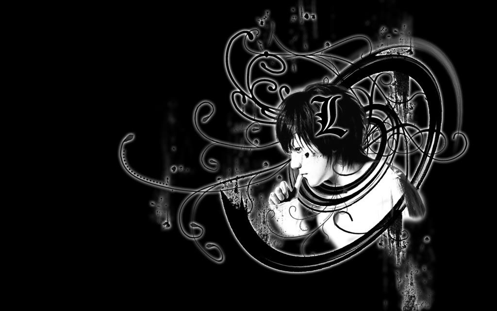
So I did this wallpaper...not sure where it should go
because it IS the live action version of L.
He is the only thing I liked about the live action movies so thats why I did it.
anywho...here it goes.
 AnimeGalleries [dot] Net AnimeGalleries [dot] Net |  AnimeWallpapers [dot] Com AnimeWallpapers [dot] Com |  AnimePedia [dot] Com AnimePedia [dot] Com |  AnimeGlobe [dot] Com AnimeGlobe [dot] Com |


")


Bookmarks