


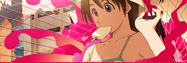
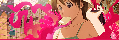
Nice effects, but it looks a little dull. Ease up on some of the effects maybe? Smexy though.^-^
 AnimeGalleries [dot] Net AnimeGalleries [dot] Net |  AnimeWallpapers [dot] Com AnimeWallpapers [dot] Com |  AnimePedia [dot] Com AnimePedia [dot] Com |  AnimeGlobe [dot] Com AnimeGlobe [dot] Com |
| AnimeGalleries [dot] Net | AnimeWallpapers [dot] Com | AnimePedia [dot] Com | AnimeGlobe [dot] Com |


Nice effects, but it looks a little dull. Ease up on some of the effects maybe? Smexy though.^-^
First off, getting rid of the Exposure adjustment.
And tadah! no fog xD
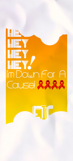
And another one, DOWN4ACAUSE
SOTW entry on OMF. With the maximum size of Verts being used.
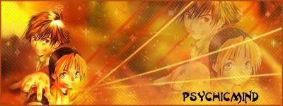
THEME, For A Cause
C&C noggets!
Over-saturating since '07


Onee-chan!?!! Hmm.) nice set of sigs you got there! Seems like there are quite a few good sig makers here in AF.
--


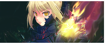
The Saber one seems nice; How did you get that smokey bit? It looks really sweet ^^ Like some flames coming out of her hands and all.
But fate/Stay Night is starting to become a little overused, don't you think?
Major MAJOR improvement without the Exposure adjustment. I like that version way better than the first one. Second is is beautifully simplistic. Well done.
I lost sotw because of that simplicity D: xDDDDD
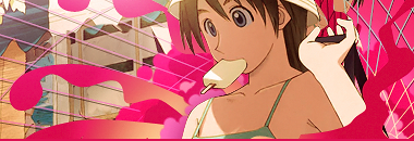
Playing around with my Summer collection stocks.
V.1
V.2
Not sure which is better >_>
Over-saturating since '07
I like the second version better. It's more eye appealing. The first one seems too pink, to me.
Hmm, seemingly so... The Pink squiggle line of V1 fades right into the background, thats not good >__>
And then again, V2 looks a bit too crowded and empty at the same time
I'll try fixing both of them up soon =DD
Anyway, here's my failed work that will make people feel good.
I overused the C4D given, blah. The C4D was just so SEXY
If any one needs this trash for their trashcan, feel free to PM me and I'll give it a nice looking text xDDD
Feel free to give critics or comments ^_^
Last edited by Famahama; 06-28-2008 at 04:15 PM.
Over-saturating since '07
Wei... poor little girl. She's being crushed by all the effects. =b
Ohh, cool, I like the summer sigs you did. I agree - the second one looks better with the city in the background. The only thing that might look more intersting is if you kept the top right side orange-ish color on the second sig and only had the city on the left. I love the colors though!


Lol :3 i agree with Kurotan that there is a bit too much going on o.o but next time, try changing the blending effect of some of the C4Ds to either colour dodge or linear dodge. With some C4Ds this works well with others it doesnt so yeah experiment. And the summer signature Version 1 looks better imo because of the colours of the background. Hope this helped in a slight way xD
V2 is so much betterreally now.
It reminds me on one of those ads where it's a long hot
summer day and the girl buys something cold and chilly
when she opens the wrapper all this kinda abstract retro c4d-ish
effects come out.. hehe :3
Erm on your other one I quite think it's nice that you overused the C4D
whenever I look at it, it may seem all busy and so on
then the girl comes out of nowhere AT ALL the girl seems just pretty eye catching in my eyes
Maybe remove the orange bubbly thingy on the bottom right
Doesn't really make any sense =/
one more thing send me the stock photo please -.-
I think the problem is that the C4D in the middle is the focus rather than the extract. I also think the extract is a bit too small. I think making the width smaller would make it better. That's just my two cents.
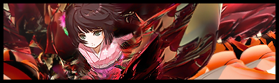
[SAMURAIGIRL ABANDONED]
Its beyond repair >.>
But this, still has some life forces in it
Over-saturating since '07
You poor boy! No it's not worth the trash can, but just reduce some C4Ds. I don't think you should discard it. Maybe blurring the far left and far right C4Ds behind the extract will give some depth. Keep the sword peeking out the other end. Play with some gradient maps and lighting.Originally Posted by That Little Unleh

It shold work out...
You can still work on this one. A LOT.
No amounts of help will spare the life of that thing. Tried blurring for depth when i was making it. It didn't help much, but it did look worse when I over blurred it >_>
supposed to be entry for the SOTW, but dropped since the text can't fit anywhere. It CAN but not effectively due to the massive swatches of colors. I expect craploads of you guys know what I did. If not, I may even make a tutorial out of that simple thing >:3
And another for a friend. ( search for the person )
For some reason, that orange streak of light is in 'style' now >___> Although, it does look good imo.
Over-saturating since '07
Yeah, that orange light does seem to be in - it looks good on some sigs, not so much on others. I like the way you used it on the last ones.
I really like the second sig - the flower pattern looks great, and the sig isn't too crowded.
I also like the changes to the summer girl sig. Both look great - I like the orange on the right in the second one. ^^
Love the sigs!
*Browses previous pages* Those are all good looking tags!! But the sprite sig is still my faveIdk about the sig your planning to dispose of but (personally) I think it was unfinished which could have been a sexy one! *Meh* anyways.. your two latest tags are hawt. +2 for the ver2 of the samuraigirl.
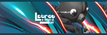
Making random gifts for random people to make my creativity block go away.
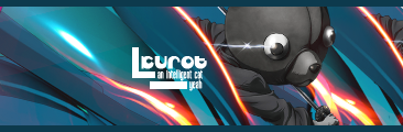
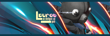
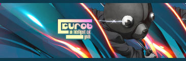
KuroTan is up first.
I can spruce up the colors if there's some complaints. >:3 Or color the text a bit to a nicer color than intense white.
V.1
Green
V.2
Slightly Green
hmm, seems like it was a good practice for C4D placement 83
C&C
Over-saturating since '07


KuroTan: I love the use of C4D in this sig. Its placed well and its a very cute sig. I'm not sure how it would turn out but did you experiment with putting a green [the color of the border] stroke around the text? Overall, a very nice siggy. Though, I can't differentiate between the two version xD
Try arranging them above one another, turn the layers on and off, and you'll probably see ^_^
Tried your advice, I added some more kick to it now >8D
Simple kick
Better Kick
Overkill kick
I discovered something new when I was playing with the signature, it was hella useful!
Over-saturating since '07
How awesome. I got a gifty. Thanks Unleh. =]
????!!
Anyway, I like the gift for KurTan a lot.Nice flow in it. I've noticed most of your sigs look like they have this matte sort of finish. I love that look ^^ How do you do that?
And you got great C4D placement skills...
meimpressed ^^
Oh, I'm a girl now : D
Random signature, although, it would be healthy to give it away, if its good anyways. I hate it >__>
Someone wants it *_*
Noisy background? the background stock is mainly of a road pattern
Last edited by Famahama; 07-12-2008 at 10:21 AM.
Over-saturating since '07
Looks nice. I like the extra large border bit.^^ But maybe you could complete it so the border goes all the way around the sig?
*edit*
I've been meaning to ask you, remember that tutorial you made with the reduce noise filter? What were the numbers I needed to set it to again? My Photoshop defaults itself from time to time and I can't seem to find your tutorial in Dazzle Us for some reason.^^'
Last edited by KuroTan; 07-12-2008 at 11:23 AM.
There are currently 1 users browsing this thread. (0 members and 1 guests)
 Posting Permissions

 |
| 


Bookmarks