


Nice new siggies Unli! ^^
Lulu is great and yes it doesn't match with the colours =/
Although the colours are pretty...
 AnimeGalleries [dot] Net AnimeGalleries [dot] Net |  AnimeWallpapers [dot] Com AnimeWallpapers [dot] Com |  AnimePedia [dot] Com AnimePedia [dot] Com |  AnimeGlobe [dot] Com AnimeGlobe [dot] Com |
| AnimeGalleries [dot] Net | AnimeWallpapers [dot] Com | AnimePedia [dot] Com | AnimeGlobe [dot] Com |

Nice new siggies Unli! ^^
Lulu is great and yes it doesn't match with the colours =/
Although the colours are pretty...


Colors not working? Maybe I had too much fun with the tints D: will try to re-do once I finished my exams ;D
For now, I'll try to finish all the requests.
Moneytalk (if shes still here...)
I had hell looking for good pictures of Tamaki
1 down, 3 more to go
Over-saturating since '07


It was hard to find a good pic of Tamaki? I would think that he would be a really popular picture subject. *shrug*
Anyway...
I love the colors in your sig. Bright colors = Demoni's happiness. lol
The render is so nice and smooth [and smexy]! ;D
Keep up the great work, Unli! ♥

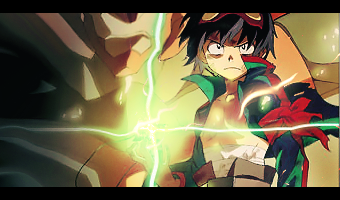
The latet requested sig for Moneytalk doesn't seem to have your usual taste of high quality. Also, the whole thing isn't very intriguing. On the right of the extract, the green thing and all looks low quality. That mars the overall look. What happened to you, Unli??
Oh right, exams. sorry...
Well good luck to you. Don't let photoshop distract you too much. It always happens during my exams.
Last edited by Hautalken; 06-02-2008 at 07:50 AM.
Will do Karuto ;DD
and also, I hate doing Ouran
Over-saturating since '07

Daaaaaaaaaaaaaaaaaang.Originally Posted by Unli.

This is AWESOME.
For some reason, it looks so perfect without any text.
You did amazing on this one.
So awesome.

Hmm, what can I say here.....
Tag 1:
It's good, but it could be better. The girl(is that her boob by her hand?!) is not completely blended with the bg Uli, could smudging fix that? I don't know, but something must be done to fix this! Until then of course she looks like she's popping out >.>;
Tag 2:
O_O;;;*faints from teh sex*
Whhoooaa, that tag is like beyond amazing and I think one of the best I have seen from you yet! But, you gave it to animegalleries instead of wearing it yourself?! Shame on you Uli just shame....I would so wear that if I was you^.^
But on a serious note, it looks awkward without her other arm...or some unsmudge place that is an indication that she has another arm >.>; Maybe leave some of her right arm unsmudged? It would help, right now I can see teh smudge area of the arm which looks weird to the pink themed background. Oh and there need to be a tad more blending on the top of her head, I see the outline of it and that does not look right at all since the rest of the body goes in well with your smudged bg.
But all in all, this is all I have to say on your latest two Uli. So good luck with your future ones to come!
"Sarcasm is my body's defense against your stupidity"-Unknown
That was Ouran? oh...
this new sig is nice. Very good flow. What's the stuff in Japanese written ther? I mean translation >_<
It's got such a nice spac-ish faraway look ^^ I really like this one. 'm stealing for future reference. Hope you don't mind >_> *grabs it and runs off*

*First post updated*
And I still can't find the file ;___;
New and simple one.
I think 13 layers xD Needs to be MOAR colorful though. But how?
(EDIT)
Learned something new, Gradient tool has 5 settings.
New avatar. 150px X 150px
Last edited by Famahama; 06-05-2008 at 09:00 AM.
Over-saturating since '07


OMG, that powerful sig is pure awesomeness. I love it. LOVE.
As for the other one, I think you can make it more colorful by making the shadow/outline layers a bright color that isnt related to the stock. Stuff like bright pinks, purples, etc
I still cant help but stare at that other sig @___@
.-.
(o.o)
|=|
__|__
//.=|=.\\
// .=|=. \\
\\ .=|=. //
\\(_=_)//
(:| |: )
|| ||
() ()
|| ||
|| ||
==' '==
Bruneian, are we...? *winks*
yeah, I am
鬼の目の前にある...
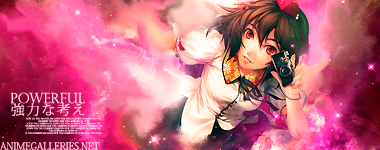
I love this one too!! >.<!~~ Yeah it is powerful indeed I like the
cloudy space effect. And prettyful colours that it catches...
Add some kind of vector clouds with diagonal lines in it
in some eye catchy colour. Or maybe just something kinda
retro-scene(?) ish..
This I adore so kawaii..
BRILLIANT! Theres another Bruneian member here ;3
Hey there kitty
The Vecks tag, Hm, I tried some colorful default brushes. It turned out nasty D: Any recommended brushes I should use? I used circles with tiny jitters, hue jitters and scattered.
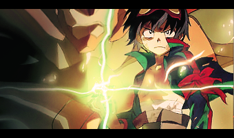
Anyway, Maru version;
A MARUVSICHIGO version
Getting any better?
Their version, but flipped =/
I like the flipped xD
and for SOTW at OM forums.
Theme, emotions.
Simplicity ;D (I may even make a tutorial on this)
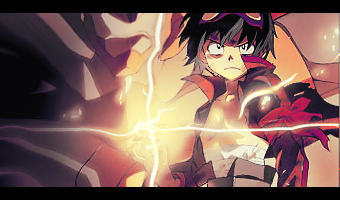
Oh forgot to mention, the powerful tag that people seems to like;
It was originally a sig for the first SOTW here. Blah.
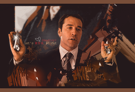
Gandizzl request, filled with the warm love of Kurotan xD
will probably redo it soon. Will be using Kurotan again >8D
And since no one probably went to view the first post;
FIRST POST UPDATED WITH THE 'RULES' OF REQUESTERS
I also have a WANTED list. Check it out if you'd like. And LiLi is mentioned ;3
Last edited by Famahama; 06-07-2008 at 07:35 AM.
Over-saturating since '07

Patton's looking gorgeous, excellent choice of stock :3
Everything flows nice, the contrast of the colors are great, it would really fit his style from the "Peeping Tom" era.
Love the style you guys used, it looks a lot more "old school" than some of Unli's other work, while it still has fresh hint of newer styles.
A whole bunch of thankies and loves to you <33
Edit: Just realized it was a collab between both Unli and Kuro >.<
So kudos to both then :3
Last edited by Gandizzl; 06-07-2008 at 04:30 PM.
Ari Gold set by dotmyztick <33


Wonderwice fan nr.1
|Gan, Lettuce and CFA.. Corrupting the Masses since 2006|
Gandy-Man and Bunster saving one pimp and one pornstar at a time.
MaruVSMe eh??
Well I think it's nicely done ^0^
And it did get better! Sugoi onii-chan
And I much like the flipped one muchhh better.

I'm liking the concept for that one. So simplistically brilliant.=D
And don't let him fool you people, I didn't do much on that collab sig. haha.=b
Well hmm, I've recently noticed that after all my experience with sig making,
1/3 of all sigs that have their stock or whatever facing to the right.
It's finally nice seeing some good work that look in a difference direction, I perfer left,right and[[[TOP]]].
I like both the same and keep up with teh awesome work.
Kudos ^^
~Xezmer
Ugg, I haven't been here enough!! More awesome siggies from Unleh, as usual. ^^ I love the Powerful sig - the background has some awesome smudging and color stuff. I also like the one you are using now - the different versions are all good, thought I also like it facing the left. Awesome sigs! ^^
LOL. MaruVSIchigo flipped looks really nice. That one has to be my fav <33
I also like the Gandizzl request. My only complaint is that I think Id like the text better if it was at 0 fill with a black stroke. But thats just me :3
.-.
(o.o)
|=|
__|__
//.=|=.\\
// .=|=. \\
\\ .=|=. //
\\(_=_)//
(:| |: )
|| ||
() ()
|| ||
|| ||
==' '==
I am sure you all heard; My mum stole my laptop of PSDs D:
Can't edit Gan's sig for now
Request from an offline friend
(the name of the requester is Enfold, and for now, this is the textless version. and I have rights to wear this)
Used a very graffiti like stock background on it.
Over-saturating since '07
Oh yes...that's true,Feels kinda nice when you see something different!Well hmm, I've recently noticed that after all my experience with sig making,
1/3 of all sigs that have their stock or whatever facing to the right.
Ah!!That "powerful" sig is just so "powerful"=.=..lolz..
It's really nice!SUPER NICE!!
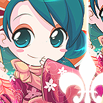
and that really KAWAII AVI in #34!JUST SO KAWAII!
I GET REALLY CRAZY WHEN I SEE KAWAII THINGS!!
Can't get ahold of myself >.<XD
Keep on the great work~!!Whee!!Wanna see more of ya' work!
Lol...I'm Back!FYI:Shana FTW!:3
^ xDD
Multiple versions of Simon Signature.
V1. Red Hue
V2. Desert
V3. Deserted Forest
(I like this one the best)
V4. Original Values
and the stock used if anyone wants it
c&c please
Over-saturating since '07
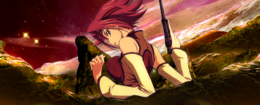
Oh God, my TTGL Fanism is starting to rise again...
No seriously, I like this version. I just think it looks better this way since most of the earth looks more like deserts anyway, so with a deserted forest feeling, looking at Simon gives a different feel rather than the desert version.
Honestly though, these are pretty damn good for the stock you chose...
But I will most definitely snag this from you. =D
All I have to say is..WOW..flawless sigs. Very well made. --Clap, clap-- Nice.
Been a while eh?
Credits to Serated for the extraction
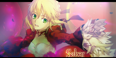
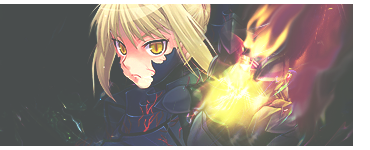
Saber, you complete and fulfill my day.
C&C please
(I think I should do more on the TTGL thing. Tomorrow.)
Over-saturating since '07
There are currently 1 users browsing this thread. (0 members and 1 guests)
 Posting Permissions


Bookmarks