


*gasps* no comments even after ONE ENTIRE DAY?? waaaaaahhh...I think I'm getting worse. So that last set is not good? *pouts*
 AnimeGalleries [dot] Net AnimeGalleries [dot] Net |  AnimeWallpapers [dot] Com AnimeWallpapers [dot] Com |  AnimePedia [dot] Com AnimePedia [dot] Com |  AnimeGlobe [dot] Com AnimeGlobe [dot] Com |
| AnimeGalleries [dot] Net | AnimeWallpapers [dot] Com | AnimePedia [dot] Com | AnimeGlobe [dot] Com |


*gasps* no comments even after ONE ENTIRE DAY?? waaaaaahhh...I think I'm getting worse. So that last set is not good? *pouts*
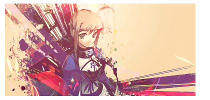
New set! Featuring saber from fate/stay night...
Newer sets! That's Sora from kingdom hearts. Inever was able to figure out whether it's a guy or a girl...wierd...


I like the sora signature! :] The colors could have been better though, and the lighting as well. I like the distorting that was done behind him,though. :]
::Latest::
Thanks marshmallow! I think I'm getting better at this distortion-background-making-thingy...
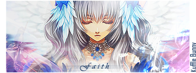
Itried the tutorial by Unli (Wonderspace collectibles) and down there is the result. Comments please?
Prepare for a massacre.
I don't think that the extract is suitable... maybe because of the building. and try an dodge up a bit more of the background :3 Text placement, you can never go wrong with a bit more positioning and font combos!
but still, its damn cute x3 and lotsa love for trying out my tutorial <3
Over-saturating since '07
among ur new sis........well i like the last one more though i agree with unli on one point , i mean the text postion but extract looks ok from my opinion.after all it realy cute ^^ and I have always loved cute SIGS..
about that sora sig...honestly i have never been a fan of sig with distorted BGs..u know i usually prefer sigs with a calm BGs that give u a convenient feelings when u look at them ....a distorted bg like this wont suite my taste though also some rough styles like abstract realy gets my atention
Last edited by salar; 04-05-2008 at 11:26 AM.
wanna see my wallpapers?? ^__^
http://salar.animewallpapers.com/
in order to use my geraphics(SIGs and GIFs) read that one rule in the first post of this topic,and dont worry its not st hard^^
also rep points are welcomed
A gift from generous KARUTO_CHAN
Salar: well...I thought that's how you make sigs coz just brushing stuff in isn't going to work. I learnt that the hard way.
Unli: IM SO SORRY!!!!!!
Holy Crap, what was that about?Originally Posted by karuto

ah, damned, this could be labeled as spam, so;
Sora Signature.
in a way, this one;
Colors kinda washed off... this could help a bit. Apply the image, and duplicate it. Set the mood around overlay and soft light, whichever suits better.
font color isn't working well >.>;; very nice background though.
Over-saturating since '07
Karo so awesome sigs.
The wonderspace sig was nice too I like the outcome of it
Nice job!
Mystcal Alchemist and Ichigo Kiss: thanks so much! glad you like them...
Unli: uh...thanks again. what color do you think would be right for the font? (you're the expert here ^_^)
Unli darling; I'm waiting...


I still cannot keep up with the skills you have :3 I hope to see more works from you and I love the Sora sig ^^
Careful, I don't take you lightly.Sig set made by Daken_________________________________________________S. O. S. Finest Swordmaster
Hmm - I thought that the last sig was very nice. It was a very interesting use of the extract. I think that the building complicated it a little - maybe try to do something with that? I love the right side of the sig though. The background and lined have a very nice look. I definitely think that this is your best set so far. The lighting is much better - the character does not look washed out or anything. Very nice job - I love the avvy. ^^
Midnight Paradise: I can't overtake everyone within a month you know! You are better than me and always will be...
Mira: If you mean the look out the window sig, it's one of the worst. My sora sig is the best one so far...
but everyone has their own tastes right?
There's the wonderspace sig re-done. Also an old set I thought I'd deleted. I used a stock photo of the Grand Prix Track behind Lelouch (is that his name?). It's also up for grabs and if anyone wants it, just tell me. I'll put your username on it.
I think the extract was done by marshmallow..the lelouch one...not sure about that though...
Last edited by Hautalken; 04-11-2008 at 03:14 AM.
The sets are lookin' good karuto! <3
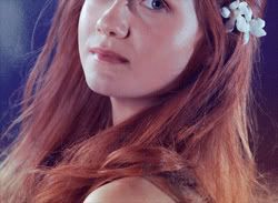
The first sig with the girl is sooo adorable.
The border is kind of faint, but that can be easily fixed.
I love the color of the word "window". It matches with the background very well, and it gives the signature a tranquil feeling. The girl is cute, and the outlines and extra elements make the sig even better.
Keep up the good work! =D
Siggeh made by me. Taking requests ATM! =3
I like that Code Geass sig karuto_chan,specially the design and effects u used but st is wrong with the extract.....Why are Lulu's so BIGGGG??its even bigger than his own face!!! XD
alos that girl sig loos much better and cuter now ^^
wanna see my wallpapers?? ^__^
http://salar.animewallpapers.com/
in order to use my geraphics(SIGs and GIFs) read that one rule in the first post of this topic,and dont worry its not st hard^^
also rep points are welcomed
A gift from generous KARUTO_CHAN
Thanks Knuffy!
and salar...
WHAT IN THE HECK IS A LULU?
Forgot to mention, the border's s'pposed to be that way...i didn't want it dark.
Last edited by FlashD; 04-13-2008 at 07:50 AM. Reason: Don't double post ... use the EDIT button instead.
lulu is the breif name main Caharcter??in the first seaon of CG he is called Lulu(comes from Lelouch)
I was saying why his hand is so freaking biggggggg??kinda funny and also cause I like Lulu alot i feel like im insulted XD
wanna see my wallpapers?? ^__^
http://salar.animewallpapers.com/
in order to use my geraphics(SIGs and GIFs) read that one rule in the first post of this topic,and dont worry its not st hard^^
also rep points are welcomed
A gift from generous KARUTO_CHAN

I like your use of coloring. It's done very nicely.
Thanks Ginny Weasly!
Salar: is his hand big? doesn't seem to bother me much. It's not like I made the Lelouch image did I? I only made a sig out of him. Maybe you can ask marshmallow...
I got the extract from him/her...whatever...
no no no...u got it wrong,im absolutely not blaming u ..just said the one who made that image should have maintain the balance between parts of his body XD,thats all
wanna see my wallpapers?? ^__^
http://salar.animewallpapers.com/
in order to use my geraphics(SIGs and GIFs) read that one rule in the first post of this topic,and dont worry its not st hard^^
also rep points are welcomed
A gift from generous KARUTO_CHAN
You're right Sal; but I took a look at some of the other extracts of Lelouch and I found that he does have large hands. I guess you never noticed when you watched the series. The same goes for Tsubasa. The limbs have wierd shapes. I mean, everyon'e TALL!! I'd feel so small in front of them T_T
Gift set for KuroTan! This is what I got after I analysed your PSD file. I think it's similar, isn't it? I learnt a lot! Basically, I learnt you don't need to keep using the 'apply image' option everytime you use a gradient mapI'm so stupid!

Last edited by FlashD; 04-15-2008 at 11:38 AM. Reason: Don't double post ... use the EDIT button instead.
XDDDD!!
And thats what New Adjustment Layers are there for :3 Though, its VERY necessary if you used GIMP. Actually, more to forced. Or maybe thats just my lacking ability to lurk around the program.
Hm, give credits to Marshmallow.
And the sig;
overall, plain background work D:
But still, you learned something new, aye? :3
Over-saturating since '07
There are currently 1 users browsing this thread. (0 members and 1 guests)
 Posting Permissions


Bookmarks