


I'll be posting my avi and sig sets here...
Feel free to comment and tell me where I can improve.
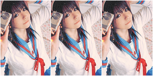
Down there is my first one featuring Kuchiki Rukia from Bleach...
how is it?
 AnimeGalleries [dot] Net AnimeGalleries [dot] Net |  AnimeWallpapers [dot] Com AnimeWallpapers [dot] Com |  AnimePedia [dot] Com AnimePedia [dot] Com |  AnimeGlobe [dot] Com AnimeGlobe [dot] Com |


") The sigs rite beside the avi. I'm surprised you didn't notice that...
The sigs rite beside the avi. I'm surprised you didn't notice that...


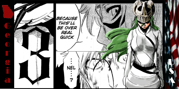


 . How is it?

Bookmarks