


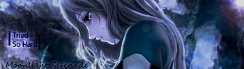
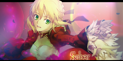
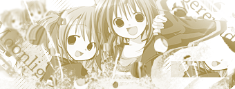
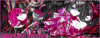
Wow. O_O
I just looked at your older works and you have improved A LOT. I really like your Moonlight Serenade banner.
BoA rocks.
 AnimeGalleries [dot] Net AnimeGalleries [dot] Net |  AnimeWallpapers [dot] Com AnimeWallpapers [dot] Com |  AnimePedia [dot] Com AnimePedia [dot] Com |  AnimeGlobe [dot] Com AnimeGlobe [dot] Com |
| AnimeGalleries [dot] Net | AnimeWallpapers [dot] Com | AnimePedia [dot] Com | AnimeGlobe [dot] Com |


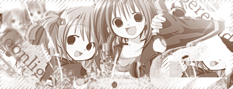
Wow. O_O
I just looked at your older works and you have improved A LOT. I really like your Moonlight Serenade banner.
BoA rocks.


@Triangler: well thanks, and yes BoA do rock, she's awesome!!
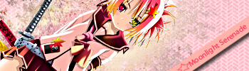
hey srry its been awhile bt i'm bak wit 2 new and simple sigs! xD stupid skewl gt me busy for a while/long time! C&C please!!


Lol @ "Fast forward to cuteness"! That's an awesomely cute sig there! ^.^
They're both really cool &cute, but try to blend in the charas a bit more.
I really like what you're doing! Especially with the colors. Your second sig has epic colors! x3
I cannot wait to see more! ♥
Ok first of all.... I GOTS PHOTOSHOP CS3 NOW!!! YAY!!!!!! lol
Ok now that I made it clear, i made a set and one sig. I spent like an hour on each because photoshopis a lil confusing bt I did something simple and I gotta say, it turned out awesome! =D C&C please, no seriously I need it this time. lol (And dang I messed up the star oh wells)
I gotta say... you're doing pretty awesomely! :3
The only thing I can see that you some improvement one is the blending.
Otherwise you're set to go, girl! Especially with that second sig! ^.^
I can't wait to see more! ~♥
WOOT! New Set! I made the set using Unleh's Simca Tutorial. So Props goes to Unleh!! It looks jacked up, bt i was fooling around. Something about the tut just didnt look right so i followed all the steps bt I twisted it by using different opacity and location. And in the end I decided to make 3 different versions. C&C Please & Jankus!!
Last edited by Moonlight_Serenade; 11-18-2008 at 05:57 PM.
Wow, that's really cute, again. xD
Very interesting text placement and effects.
The render looks a bit squished, though. How did you resize if you did at all.
Overall, I really like it.
Keep going, MS!!! <3

The first one is too bright, I think you set the contrast too high. The second one has an interesting color, how did you make that? The black and white one has to be the best the one, but too much white on bottom and the top.
Non mihi, Non tibi, Sed nobis!Not for me, Not for you, But for us!
Xbox Live Gamertag: lordrellik8Feel free to add me as a friend.
I've been look at all your post and i guess it time for me to say - you've done great, You've come along way - - many improvements, well done.Originally Posted by Moonlight_Serenade

Tip: on these, Your name is kinda out of sight, maybe trying a different contrast.
Last edited by UrusaiSevera; 11-14-2008 at 04:34 AM. Reason: Please don't quote images when you don't have to.
@Demoni: Uhm I did Resize bt if I made it smaller it looked totally wrong so i just left it at that. (Must've been a bad choice, oh well ^ ^; )
@lordrellik8: I used New Layer Adjustment>Gradient> Color to White>Ok The color part is your Foreground Color of choice. Afterwards you don't do anything leave it at so. And now that I look at it maybe you're right about the brightness on the bottom and top.
@BOOMBZA - MizaGi: hm, well I kinda agree. I tend to put my name in random places. I've been using an advice Serated told me, about the Text thing so yea. Bt I will gladly keep that in mind, I'll just have to come up with a way where the text won't be hidden yet it's not "Center of Attention", you knw what i mean.
Okie Dokie, time for a new set. I really like the outcome, bt I have to admit the I like the Av better than the sig. When I finished the sig I thought it was good bt now that I looked at it it's kinda messed up. Oh and JANKUS goes to ICHIGOKISS for the BEAM TUTORIAL!! WOOT! C&C
Your latest set is pretty cool! Especially the avatar. Lovin' it.
The sig is great... except that it is really dark. I think it should be a bit brighter, imo. But that's really all.
Keep on going! ^.^


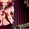
http://i78.photobucket.com/albums/j9...pink-sig-1.png
WOW XD
Lovin`that bg, and how the textwork on your nickname is.
Out of those three sig up here, I like this one the most
http://i78.photobucket.com/albums/j9..._/sis-sig2.png
Becaus it has not just one color hehe.
Your new set:
Very nice ava.
Nice effect around the figure in the sig.
Did you make it by following a tutorial?
@Demoni: Well..I like it emo! xD
@Des: Yes I did I used IchigoKiss's Beam Tutorial. And Thanks
Last edited by Moonlight_Serenade; 11-17-2008 at 07:44 PM.

@Twila☆☪~: Thanks and hmmm... really? I don't think so but thats just me. I'll try to work on the text so that everyone will be able to see it. ^ ^
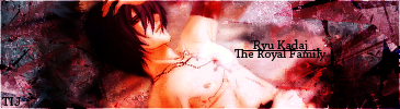
Mkays i only felt like making one random sig. This is for my TIJ Father Ryu, but I call him Daddeh Papaya x3
The sig was made using Serated's 3rd Sig Tutorial. I really liked the outcome. Anywho C&C pwease!
Yay, update! ~<3
I think this one is uber awesome. The render is a bit over-sharpened but that's all really.
Not much to say. I really like it. ^.^
@Demoni: YAY!! I don't think so but if it is, the render would be either too blurry or too sharpened. >_<;;
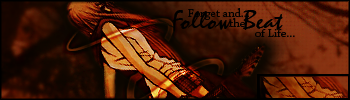
Mkays I made a banner for .Anime Beat! Lol I like it, though I am waiting for opinions for modifications! x3 Tell me what you think! btw a lil too big
http://img253.imageshack.us/my.php?i...tbannerby3.png
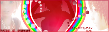
σκιє Dσκιє!! Its been ғσяєvєя since I posted here. ^ ^; Well anywho my TIJ aunteh Kai b-day was a few days ago and I decided to make a вαииєя as a gift. I used the иσσ∂ℓєs тυтσяιαℓ created by υиℓєн. Well C&C plz!
Last edited by Moonlight_Serenade; 12-02-2008 at 12:10 AM.


~*~**Moonlight_Serenade**~*~
Great job! I really like your signatures!!!!!!! ^^' Not newbie material at all! ^_______^ Keep up the good work. If this is your "newbie" work, I can only imagine what your future stuff will look like. Job well done, really. ^^'
^-^' =] =D :heart: <3
It is the mark of an educated mind to be able to entertain a thought without accepting it." ~Aristotle
@FaeryTaleAngel: Awhs thanks! I hope you will come and visit to see them!
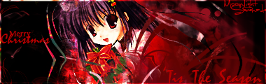
Okie dokie i was away due to exams bt i'm back with a few. the set was made for christmas, came out good i guess. The cyber-tech sig looks really messy yet so cool! x3 And the last sig was made for my TIJ account its awesome dnt cha think? The color schemes matches and it took me forever! x~x I used tuts and i used 2 extractions from Jagan and Serated..i think.... @~@ C&C
First Sig:
Oooh! We got some holiday prettiness going on up in here! x3
I really like the cloudy part behind her. What I don't like is that the rest of the bg is black... too plain for me. The border doesn't appeal to me very well. And try not to spread text around. Try to keep it all in one area. Overall, it's pretty... well... pretty! xD
Second Sig:
WOW. O__O
There is A LOT going on in this one. I love it all, but I don't think the gray mixed with the pink looks too good. Maybe keep it a bit monochrome with pink?
Third Sig:
Once again, try not to spread the text around. Move the focal more to the center of the sig, and blend her in more.
The colors in this one match very well with everything else.
-----------
Awesome siggehs! *thumbs up* :3
[Sorry I didn't reply so long : <]


Your work is beautiful.could I ask u to make me a signature.if yes I would like to be ggundam related maybe domone and it reads bursting through the darkness.I don't av a picture I could give to use but I hope u can help
@Rein*: Sure, even though that request was months ago. XD
OK well i'm back with more sigs. I lefted because as you could see I got bored. But now i'm back.
There are currently 1 users browsing this thread. (0 members and 1 guests)
 Posting Permissions


Bookmarks