


Hi guys, I need comments on these:
Thanks everyone.
 AnimeGalleries [dot] Net AnimeGalleries [dot] Net |  AnimeWallpapers [dot] Com AnimeWallpapers [dot] Com |  AnimePedia [dot] Com AnimePedia [dot] Com |  AnimeGlobe [dot] Com AnimeGlobe [dot] Com |
| AnimeGalleries [dot] Net | AnimeWallpapers [dot] Com | AnimePedia [dot] Com | AnimeGlobe [dot] Com |


Hi guys, I need comments on these:
Thanks everyone.
Thanks for the gift Unli. You're the man!

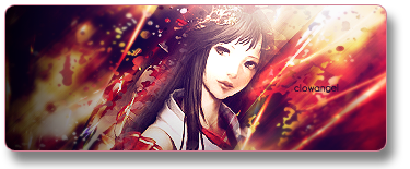
I really don't know what to say to make this constructive, but I think the signatures are really amazing. I like the colors and both have a nice flow. The only thing I dislike is the splatter-thingy on the bottom right on the second sig. I would have put it closer to the focal, but that's me.
I suppose this is what they call perfection. Keep it up! ;D
Oh, the white splatter one? I should have known that brushes too far from the focal can be inappropriate >.<
Thanks for the comment Megami.
Thanks for the gift Unli. You're the man!

I really like them. I like the colors more in the first one..since I'm not very fond of pink, but I like the overall design for the pink one.
The first one, although it's really good, I don't like how it's all black on the left side. You might've wanted to contrast against the right or something, but ..black is just a bit much.
The only thing I don't like about the second one is the duplicating of the render. I guess that's more of a personal preference more than anything though.


These are amazing. Trust me, I rarely comment around here. I haven't learned how to do such delicate effects in a sig yet, so I really admire these.
Constructive criticism. Hmm.
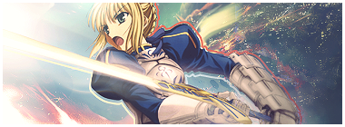
First one: The colors are great, and the brushing is beautiful. I'm not a huge fan of "lighting", so the right side is a bit much for me. I'd say either darken it there or lighten up the opposite part. It contrasts...almost too much y'know?
Second one: I honestly can't find much wrong here. Text is great, colors are superb. I agree with Megami that the spatter brush in the bottom right is a bit out of place.
Great work -claps-
--------------------------------------------
Yoo Jaesuk. Korea's loveable fool.
--------------------------------------------Awesomely in your face set by Tatty!
"All he could have; I made him just and right, sufficient to have stood, though free to fall. - John Milton
Oh, so for the first one I fail at the right side and for the second I also fail at the spatter brush misplacement. I'll try to work them out later.
Thanks clowangel and Souhi for the comments ^^
Thanks for the gift Unli. You're the man!
Wow, very nice sigs. Your style is very smooth, and I like the colors. The effects on the second and third sigs are the best, I think. The backgrounds are great, and the text is well placed and you chose good fonts. The first sig could use a little more color on the left side instead of the black
Overall great sigs! ^^
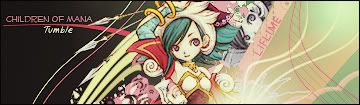
omg!! I seriously ADORE the "children of mana" siggy! I haven't played the game, unfortunately...I wish I could. *has no DS*
Anyway...I really like your siggies! They have a lot of good things going on all at once! I really like the splatter at the bottom. and I like the dots that look like they're POPPING at you. GREAT JOB!
Awesome siggy from Serated-chan! ♥Awesome siggy from Angelic-chan! ♥
ah, good -girl-! you did what i said >=DD
and since i already raped the first one, ill rape the second one here.
i like the dot effects in the left side. kinda gives it a... distant effect to it. the only thing bothering me is the lightened second duplicate (i think). i love the vector effect =D the colors love each other!
the pen tool loves you!
Last edited by Famahama; 01-29-2008 at 03:05 AM.
Over-saturating since '07
Thanks Mira, nekogirl, Aya and Unli for the comments, I'll take note of some criticism you guys said. ^^
haha, are they?Originally Posted by nekogrl

oh here's one of my old ones, about 4 months ago:
Here's recently! :
rawr my previous post got lost w/ spam :O
Thanks for the gift Unli. You're the man!

Beautiful. You know mixing and matching oh...
Sigs and Ava by me! And thank you for the Reps and Points-
~Donation needed; kindness really appreciated!~
I like the last one a lot. Overall, it's been put together very well! But... could be because of all the negative space, it feels empty. x.x;
I'm really learning from the things you guys are saying to me. Thank you guys.
Here's another old sig:
I made that after returning from my forum hiatus. XD
And my recent, yay:
Thanks for the gift Unli. You're the man!
This one is amazing. I really love the colors and just how it all flows so well. You're really awesome. I think I'm in love with your work. <33
And geez, the pen tool sure does love you. I always have trouble getting the shapes I want. D:
By the way your Fate Stay Night sig is pretty awesome as well, but I really don't like the stroke you gave her. Dunno just looks kinda out of place.
(Are you accepting requests? >_> I want a pretty sig.) Lolz. >.>
|Power of The Mask|
Thanks, and yes pen tool loves me. I'm kidding.To be great at pen tool, just always practice and play with it. If that keeps up sooner or later you can become a pen tool master.
Was the red stroke for saber too much?
I don't take request, because I don't do good when someone's expecting much from me; I feel-- overwhelmed O.o lol. I'm sorry. But I make gifts! tell me what you like and probably it can be finished early since I'm so work-free this month.
Thanks for the gift Unli. You're the man!
Oh that's cool then. Anything having to do with either T-elos or KOS-MOS from Xenosaga is instant win in my book. ;3
Oh Alucard from Hellsing is pretty much smex too. Just throwing out some ideas. But yeah just about anything from you would be pretty much awesome. <3
|Power of The Mask|
I agree. I really like the second one. I made a signature with double renders (low opacity ones behind the normal one) and clowangel said the same thing. I personally like it. I makes it pop out in 3d if its positioned right. Right now I'm trying to figure out how to make signatures with only white-black colors, that have depth. It really helps when you make colored ones. Teaches you a lot about gradients and lighting. I really like the billowing silk sheets effect.

OMG I just love the Children Of Mana siggy,I have the game and its just so freaking Kawaii^^
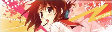
Anyway on your newly updated ones I really like the background for the 1st one.Its awsome and it blends well with the background,the render is just so cute anyway.
The 2nd one,the background is awsome and so is teh render completely but I think it could use something to make it a little less empty,maybe adding a little text to it.
Set by me.
I was Hieko.
That's amazing!! They are all very good, especially the backgrouds. They really match the anime characters.
They are so cute too!! I cant wait to see more of your siggies!


I like both your sigs, especially the backgrounds. They both match very well with the characters. Good work
Wolfie Dango ~*Red*~
Twin sister: Angella_Kagamine
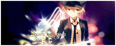
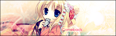
I really like the newest sigs, especially the Comeback, Lights, and Together Forever sigs. The colors are blended awesomely, and the sharpness fits well with the sigs. The affects are very nice as well, especially on the Lights sig. Great job! ^^
There are currently 1 users browsing this thread. (0 members and 1 guests)
 Posting Permissions


Bookmarks