


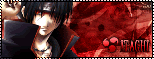
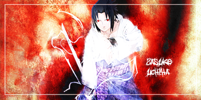
Hi all this is me, Sakura Itachi.
I'm kinda new to this siggnature making,
Which means I'm not very good.
These two are beginners so tell me whatcha think.
kk. =]
This one is bigger than the others.
1
2
3
 AnimeGalleries [dot] Net AnimeGalleries [dot] Net |  AnimeWallpapers [dot] Com AnimeWallpapers [dot] Com |  AnimePedia [dot] Com AnimePedia [dot] Com |  AnimeGlobe [dot] Com AnimeGlobe [dot] Com |


Bookmarks