


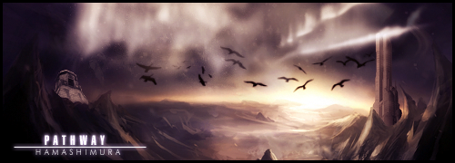
I really like your works! You use wonderful colors, beautiful fonts and amazing renders, which all gives lovely and romantic outcomes. The word to describe your sigs is definitely "beautiful".
On this page I've been through my favorites are the blue sig in post #130 [that shade of blue is a drop mouth, and that render is beautiful <3], sig in post #133 is like, WOW! and Serated's sig is pure awesomeness. Great text work, great colors and an amazing render, really.
As for your avatars, I like 'em all. ;D
Now, to make this post actually useful; *cough cough* I really like the CG sig in post #147 [Suzaku and Euphie :3], but what I'm pretty much, uhm, detesting xD are the colors. They're just too bright and too "fist-in-the-eye". The sig is great, but the colors aren't really working. It's not that easy to combine yellow and pink. So my advice... no, my request [lol] is to work on those colors a bit, cause that sig is a wonderful piece of work in my opinion. As unoriginal -when we're talking about CG- as it is, I'm seeing dark purple and green there...
*gasp* I can't believe I'm gonna post this, as I'm not as nearly as qualified to C&C gfx artists, but heck, I'm having a brave day today, lol. So yeah, I hope you won't mind anything... Keep up the great work! ^^
 AnimeGalleries [dot] Net AnimeGalleries [dot] Net |  AnimeWallpapers [dot] Com AnimeWallpapers [dot] Com |  AnimePedia [dot] Com AnimePedia [dot] Com |  AnimeGlobe [dot] Com AnimeGlobe [dot] Com |


 Very lovely sigs. Maybe sometime you can make me one.. ;D


Bookmarks