


Meg, I like your avatars, and the way you've used colours and backgrounds. Keep it up!!
 AnimeGalleries [dot] Net AnimeGalleries [dot] Net |  AnimeWallpapers [dot] Com AnimeWallpapers [dot] Com |  AnimePedia [dot] Com AnimePedia [dot] Com |  AnimeGlobe [dot] Com AnimeGlobe [dot] Com |
| AnimeGalleries [dot] Net | AnimeWallpapers [dot] Com | AnimePedia [dot] Com | AnimeGlobe [dot] Com |


Meg, I like your avatars, and the way you've used colours and backgrounds. Keep it up!!
Wolfie Dango ~*Red*~
Twin sister: Angella_Kagamine


I... I have no words to describe how much I liked this sig, just: asdfasdfasdfasdf <3Originally Posted by Megami91

I'm sorry, I need to go and mop my brain off my floor now.
The Member Formerly Known as ~*Haru*~
[♥ This is my World, and you can't Join it ♥]×Inhumane and Beautiful×
You're a 90's kid when...
You know that, before SpongeBob, the Snorkels inhabited the bottom of the Sea.
[~Set done by Megami~]
Thanks for the comments n.n
I spent 30 minutes looking for the perfect Hatsune Miku image and I finally found one I wanted to make a sig of... but the outcome I got is TERRIBLE! ;_______; I hate it I hate it I hate it! I don't really know what I wanted but it wasn't exactly this outcome...
This is how big it was supposed to be from the start:
But because the right part looked so horrible I cut it and resized it.
Image used:
-Depression-
This must be a bad sig day. 8D
Bad sig day? These are better than my "good" days!!!
Anyways, your latest sig is gorgeous [as is every single one you've ever posted].
For the original version of the sig, though it looks a little big, I like the effects on the girl better. Blends better with the bg. Your text placement is always awesome, and in the newer version of the sig, the lines to the left of the girl is a great addition. It makes the sig seem more complete.
The only problem I see with the sig is that the girl seems drowned out. And when you stick her somewhere on the top left corner, she seems unimportant and obsolete.
Overall, nice job as always =3
Siggeh made by me. Taking requests ATM! =3
Thank you <3
The girl is supposed to be on the left because in the "empty space" I was supposed to put an anime-watching-whatever-recorder-thingy. This sig of the girl was basically the "background". (See post #48 if you want to know what I mean) But yeah since I thought that it looked terrible I resized it and made it to a smaller signature instead.
Maybe a bad sig day but at least not a bad icon day 8D These cheered me up quite a bit:
What I do with the icons is: I lighten them up, sharpen, add color layers, textures, play with adjustments layers and add brushing and texting ... stuffs. x3

Gosh I don't see what your talking about.I really like it actually like it.The only thing would be you probably could have added a little something else.It looks a little empty.Other than that the blending looks okay and it seems to flow nicely.
Also all the avi images you made are really Kawaii!
Set by me.
I was Hieko.
Whoa...all sigs you dislike are turned to be great...
I love this one...
The character placement is really good,and the bg is catchy...
I love the effects,especially the changing colors...
On most sigs it would look off,but you can merge them really good...
Also,I've noticed the depth of the sig,which makes it extremely good...
Balance is perfect,and the font is really nice...
Color of the font matches with the bg,and borders are perfect...
...a gift from Balance...the legend itself...
~ click the button,I dare you ~

I think a vertical signature would have worked better in design for the Hatsune Miku one. Though i like most of it except for the fact that the render is pretty small.
I like it, really. Texts are simple, yet overly effective on the sig. The smudged effect is done well. Overall it's great, although the light blue borders are killing the light (if you'd ask me). Also, you may want to add a bit warm color into it. ^^
Thanks for the gift Unli. You're the man!

Hmmm, I actually can see what you mean. It's not bad, of course..but you've done much better. ^_^ The right side's just so empty even though it's a nice blend of colors. Meanwhile, the avatars are pretty as always. ^^
Thanks for the comments and advices everyone!
@ Serated - Really? I'm picky about vector sigs though. I think vector sigs suits better to those cute/chibi images. xD
Request from Antares:

Perhaps color and B/W doesn't go well together but it's a try, no? ^^;
Serated didn't say vector.. ^^; She said vertical.. You know, horizontal? vertical? Heh..
You're right.. ^^; Color and background doesn't go well together, but I do like the lighting. And as always, the avatar is amazing.
Megi. You should make me a siggy. :3
I like the lighting, Megi, but it does seem to be a bit empty in my opinion.
Wolfie Dango ~*Red*~
Twin sister: Angella_Kagamine
Serated is a she!? O.O And yes I misread, lawl. xD Haha I don't like vertical sigs that much... take too much of the signature space.
@ Quatre Winner - Um. Okay? *Thinks of something*
I actually don't know if Serated is a she or a he. @@; But I didn't want to say 'it'. xD Sorry, Serated if you're a guy or something. ^^;
Hehe, awesome sigs. I like the ones you dislike - the colors look great and they are well-blended. I agree about the borders though, you might want to change the color on those.
I like the new sig for Antares - the lighting and colors look good, but it seems a little large (long) for the image, which is why it may seem a bit empty. However, the background is great, and the avvy is simply awesome! ^^
So I suppose that borders should be in a pretty neutral-darkish color instead of bright, because it burns? o.o??
Remake:
I personally like this a lot better than the last one. xD
Random avatars again:


It feels like I'm spamming my own thread with avatar bombs...
[EDIT] Therefore I made another siggy xD
(followed a tutorial)
[EDIT #2] I'm bored!

I don't like the brownish color of the avatar. @.@;;
Last edited by .Lovebeat; 02-09-2008 at 02:47 PM.
Wow, I completely agree - the new sig is much better than the last one. The colors match really well, and I like the lighting and affects much better. Awesome!!!
Hehe, beware the attack of the avvies! o_O
They look great, especially the first and last ones.
I also like the last two siggies, the second one better. The lighting is nice, as are the light colors. I agree about the avvy - you might want to try something lighter and less brown-ish.
Great works! <3
Yay! Like I said, remake looks much better. And am I the only one that thinks that the back looks like a mirror? xD I'm going to feel weird if I am.
The avis are also great, especially the greish-white/blue combination in the Gackt one. And my favorite siggy is the one with Allen Walker, it's great.
The Member Formerly Known as ~*Haru*~
[♥ This is my World, and you can't Join it ♥]×Inhumane and Beautiful×
You're a 90's kid when...
You know that, before SpongeBob, the Snorkels inhabited the bottom of the Sea.
[~Set done by Megami~]
Thanks for commenting. :3
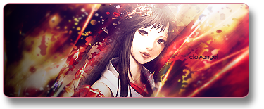
If you say that you like the next sig I'll show you, I won't believe you. I hate it:
It smells like rotten bananas and the font sucks. I want a new set for myself goddammit.


I don't. Lawl. I mean it does look rather nice but it's just not my style. Though the font looks just fine to me. I dunno. ;p
The avatars on the other hand are gorgeous. Really like them.
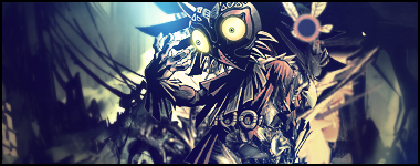
|Power of The Mask|
It feels like 'too much of the same color', but it's not ugly per se. Maybe the up-side down girl wasn't the best choice and the font... ejem, I can't see it very well.. *maybe it's because I'm not on my computer D:*
BTW, is she from Clannad? And if she is, isn't that Tomoyo?
Last edited by Antares; 02-13-2008 at 02:34 PM.
The Member Formerly Known as ~*Haru*~
[♥ This is my World, and you can't Join it ♥]×Inhumane and Beautiful×
You're a 90's kid when...
You know that, before SpongeBob, the Snorkels inhabited the bottom of the Sea.
[~Set done by Megami~]
Yurka - Yeah... the sig isn't my style either. >_>;;
Antares - Yes it's Tomoyo from Clannad. My favourite of the girls except Kyou x3
Thank you both for commenting. <3
Alrighty, new set for me ;D Maybe it's not that impressive but I like it nevertheless because the scan itself is stunning.


Tell me which avatar to use? ;_;
Song inspiration: The Perishers - Trouble Sleeping
Listen to it!
Last edited by .Lovebeat; 02-15-2008 at 06:39 AM.
Ah,waiting payed off =P
Massive comment time <3333
Let's see,from my last post there's quite much ^^
Bwahaha,let's begin XD:
~ post 61:
Hmmm...no balance,and colors arent matching the bg...
Yup,that's all,for I see much better version bellow ^^
~ post 68 (aka remake of post 61)
Now that's great...
The bg is great,so are the effects in it...
The character fits well,and it's placement creates perfect balance of sides...
Light effect is well placed,kind of gives out mystic mood or something...
Complete flow is nice,and font looks quite catchy...
Nice border coloring...
Overall great...
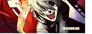
Allen Walker one is quite good,tho I immediatle noticed the borders...
I think they're somewhat too big,which gives out super big contrast,which lead to somewhat unbalanced sig...
Try looking it on white bg (I always view them in white bg,becasue then everything is well seen,even the smallest details),to realise my point...
Without borders it would look good,but the left side seems kind of empty...
Font is placed near middle,and character + effects are filling the right side + center,so that leaves left side empty...
Atleast I see it like that..
Tho I love the effect,looking simple but good...
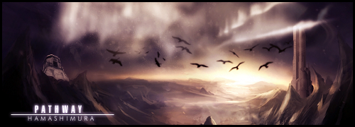
Sunset breeze on the other hand is much better...
I'm in love with those effects in bg,just brilliant...
Character completely fits into the bg...
I love the pacement of light effect,tho it might be a wee bit too strong...
But it goes well with the character,so that's not necesasrility a mistake...
Font and border coloring goes well with the whole sig,and makes it even better...
Overall great work ^^
~ post 71:
Hmmm...It is quite good,I love the bg effects,but there seem to be too much of them and they mixed up with chara and messed it up a bit...?
Balance is retty fine,and character placement is good...
Only thing I mind is that bg literally takes over the sig...
Font is good tho,I like it...
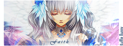
~ post 74:
Now this is great...
Mood of the sig is pretty well done,and it's completely well balanced...
Bg effect are creating beautiful image for the girl placement...
Girl fits well into the bg,and goes along with creating extremely beautiful image...
Her expression is telling so much,and the text is only adding to the mood...
Font is great,and so is the coloring of it...
Borders are well done too,goes well with complete sig..
Overall extremely good...
...a gift from Balance...the legend itself...
~ click the button,I dare you ~
There are currently 1 users browsing this thread. (0 members and 1 guests)
 Posting Permissions


Bookmarks