


Lol, what were you using before this then? I assumed you used Photoshop CS2 already xDDOriginally Posted by mikadzuki

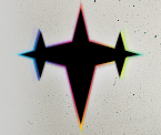
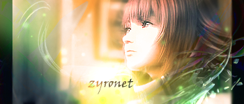
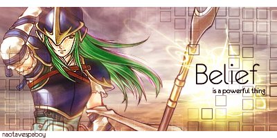
anyways, I'm not liking the blue/green colors there :/ It looks quite random. Maybe try removing them and just liquify the overall?
Btw the background is just uber sexy ;D
 AnimeGalleries [dot] Net AnimeGalleries [dot] Net |  AnimeWallpapers [dot] Com AnimeWallpapers [dot] Com |  AnimePedia [dot] Com AnimePedia [dot] Com |  AnimeGlobe [dot] Com AnimeGlobe [dot] Com |


 I thought they'd be like shattered from her ^^ Still, I'll try out your suggestion and up a version 2.0 ^^


 |
| 


Bookmarks