


This one just looks amazing beautifull great job keep on going.Originally Posted by PhoenixChan*~

 AnimeGalleries [dot] Net AnimeGalleries [dot] Net |  AnimeWallpapers [dot] Com AnimeWallpapers [dot] Com |  AnimePedia [dot] Com AnimePedia [dot] Com |  AnimeGlobe [dot] Com AnimeGlobe [dot] Com |
| AnimeGalleries [dot] Net | AnimeWallpapers [dot] Com | AnimePedia [dot] Com | AnimeGlobe [dot] Com |


This one just looks amazing beautifull great job keep on going.


Wow you are really talented, i wish i could make sigs aswell as you but i lack the right equipment, what programs do you use? pm if its is possible please.
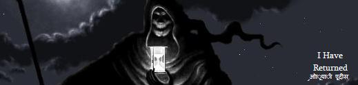
--\/-- घ फोना ईाूहील् --/\-- I Have Returned--\/--

Well I guess I've negelected this thread enough and it's about time I posted another update here since I've done a few signatures that haven't been put up in here so far but I've used them. I've been having some trouble finding inspiration for my signatures again, most at the moment have been based on my favourite music lyrics. ^^ Thanks to everyone that replied here since my last update, glad you like the sig work here.
Overall, need new inspiration and also new brushes and things I think for some new work, but a total of four new siggies to show ... one is a revised version of an older sig thanks to comments from Unli and hope it's improved. Enjoy and feel free to comment on what needs improving and which you like/dislike.
First up, the revised signature from my last update:
Onto the newest signatures:

And finally, my current set I'm using at the moment seeing as we're supposedly into Spring now (even though it snowed here the other day). Hope you lilke the newest work, I hope they aren't too big as they were before ... they look huge to me and I'm not too happy with them because of that.
Last edited by ~RiOtFoRpHoEnIx~; 04-08-2008 at 03:28 PM.
The forgotten set is Beautiful! could I please have the PSD?
Wow.
I am simply blown away by everything I have seen in this thread, from the size of your signatures to the cleanness of the borders. You're amazingly talented, way to go.
Jang Hyunseung is perfect in everyway. SO-1 FIGHTING.
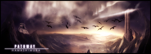
Iceflower made this dazzling signature.
Thanks for the replies Karuto and Clawdia ^_^
I'm glad you liked the latest sets and I guess it's about time for an update before this thread gets closed.
Been having a few problems coming up with ideas to base my signatures on but I've managed to come up with a few,
but any ideas always welcomed as well as the comments and critiscisms.
I loved the render I came across so I just had to use it within a set of mine, not sure whether I'm over impressed with it but I liked the overall outcome. Feel free to let me know any thoughts on it though or any improvements that could be made. Some of the signatures after that came out pretty rubbish -__- so I think I'll just show my current set at the moment, a Byakuya Kuchiki from Bleach set.
I've since made a few lighting changes to this signature and also added my username on it, I forgot to when I first made the set >.<
Hope you like them everyone and feel free to comment on things to change and improve upon or the sets you like also.
Last edited by ~RiOtFoRpHoEnIx~; 05-10-2008 at 07:14 AM.

I like this one. Nice combi of textures and renders. The violet tinge is kinda a bit too powerful though, but it still looks nice.^^
Sorreh I'm like supah late with that comment.^^'
*listens to crickets*
I see it's gone really quiet around here but I'll update anyway when I have newer signatures and avatars. Thanks Kuro for the comments, I'll try and lessen the violet tinge on that sig and re-post it up later. I'm going to go through the comments of what people have put and re-work some of my older sigs and post up the edits. In the meantime though, I have a couple of new sets that I've used and also a couple of others that are works in progress so to speak that I really need feedback on. I've signed up to a signature community site and I've been trying out new effects and styles.
Enjoy and feel free to comment away on what you think everyone.
First up is an Ergo Proxy sig that I did from scratch, brushes and C4D's, background and render, everything. I was pretty pleased how it came out but changed the colour of the lighting in V2. I was also told to work on the depth in the signature by using the dodge/burn tools available and did that too in V2. So, what do you think?
V.2.
Next up was a Saber signature yet again and from scratch with effects and brushes, render and matching the background. I'm overall not so sure on this one, to me it looks to messy maybe and also too big once again but I was trying to fit in all the C4D and render. Any comments?

Then, onto the works in progress so to speak and possibly a couple of versions on each. First up, working on a signature for Assassin's Creed and two versions.
V.2.
If the sizes are wrong and they're too big, please just ignore that fact for the meantime as I'm interested in the look of the signatures and effects, lighting, blending etc. and not whether they're way too big. Any comments greatly appreciated. And lastly, my latest signature which I'm not sure on whether it all works together or not.

Last edited by ~RiOtFoRpHoEnIx~; 07-15-2008 at 06:37 AM.
No replies?
Well that sucks a bit, but never mind I guess.
Finally, I'm working in Photoshop CS2 and I thought I'd start out by improving some of my older sigs, re-working them and posting them up. The first two shown are the outcomes from signature tutorials I came across that looked interesting, and then the others are original signatures by me and worked on in CS2.
And then onto the re-worked sigs:
Feel free to comment on what you think could be improved further and what you like/dislike. Hope you like them and look forward to reading some replies.... please reply someone?
Last edited by ~RiOtFoRpHoEnIx~; 07-21-2008 at 06:18 AM.
I like your Paine tag =D
although, she kinda looks like a puppet with that thing around her mouth >_> Nice position of lighting, but I think it could be improved, as in the strength of light. Also, I think you kinda smudged a bit too much of Paine's hair there ^_^;;
Nonetheless, nice work yo =DD
Over-saturating since '07
Ah right, thanks for pointing that out Unleh >.<
Somehow I hadn't realised that before now, hopefully this looks better around her mouth now:

Sig thread Last Updated: Not Updated|My Blog|
| Back Old Skool - Signature by myself truly. ||Still Learning Photoshop CS2||
Very nice sigs - I especially like the Paine - it looks much better with the fixed mouth. The Proxy sig rules - I think I like the lighting and colors from the first one better.
You might want to work on the text on the second sig - right now it's a bit distracting from the nice purple and effecs in the background. Maybe move it to one smaller location.
My absolute faves are the Byakuya and the Faith sigs - the coloring and lighting are both fantastic on them, and I love the text on the Faith sig. The effects are wonderful also.


I like the purple-ness of this sig, its appealing. I like the effects you used in the background to make the signature flow together so well. The text also suits the siggy well and I like how you did it, the effects are very neat. Overall, its a beautiful sig. Good job.
Thanks all of you for the replies and comments ^^
~Mira: Thanks for the comments about the 2nd sig there and the text needing some work, I'll get onto it and re-post it up when I have time to. Glad you like the Proxy sig, it took me ages to try and get it just right and the 2nd version I just did to try and improve the depth of the sig, other members on another forum suggested it to me. Thanks again...
Unleh: Thanks for pointing that out around the mouth on the Paine tag, I must have missed it because I was ditzy >.< lol. I'll try and work on the lighting too and re-post.
Jagan Eye: Thanks also, in the tutorial it showed the end result as a turquoise colour but I opted for purple instead for some reason ^^ glad you liked the choice though and glad you like the overall sig.
And also, the alternative outcome for the Paine sig tutorial (Credit to Balance here at AF) and another signature in progress, my first CS2 sig from scratch. Feel free to comment away and hope you like them.

Last edited by ~RiOtFoRpHoEnIx~; 07-30-2008 at 05:20 AM.
Ah, someone actually did my tutorial. That's good.
The first one is very interesting...
Other than that, you really have done well, and the purple outcome is much better.
Last edited by Balance; 09-10-2008 at 06:14 PM.
hey there!
They both have this sark theme!! love it! nice level of rendering...the blending needs some work but since they were earlys!! damn gd!!!
Thanks DeeviousDemon for the comments ^^ I'm still trying to get used to Photoshop, even now seeing as I left it for ages and came back to it >_<
Latest signatures that haven't been shown, my SOTW entries are in my blog though hiding away as some were pretty rubbish in my opinion >_>
Please feel free as always to comment as it helps me to know where to improve and where to go from here. Enjoy...
This was a gift that I started working on for Angelic_Assassin that I finally was happy with and I was glad she liked it too.
And this is the latest set that I did for myself only a matter of minutes ago, I'm not so impressed but I haven't messed around with Photoshop for ages so it could have been worse. Please let me know what you think everyone..

Last edited by ~RiOtFoRpHoEnIx~; 09-20-2008 at 10:44 AM.
Ah,yet another one of my favorites ^^
Have you been missing my comments dearie...?
As with everyone else,gonna start with the latest one,the follow up with the updates <3
Ah,I see it already...you've improved,ALOT!!!
But your sets remained gorgeous and lovely,as always...
The one for angelic is amazing,I really love it...
It's simple,without many effects,and that is the fact I like...
Character placement is well chosen,especially since it's on the oposite of the txt,crating a perfect balance...
Bg effecting is gorgeous,giving out beautiful mood to it...
Overall great...sorry for lame comment,tho,I don't see what else to be commented on...it's just great as it is...
The second one is amazing too...
It's gorgeous,I love the complete outcome of it...Balance of the sig is great,and character placement is good...
Character pose goes well with the complete mood of the sig,creating a perfect flow..
Effecting,again,simple yet effective,giving it ultimate beauty...
I love the look of the effect beside her hand,seems like the pale shadow of planet earth,and that alone is giving it mystical look...
Txt placement is great,and coloring of it rocks...
Overall great...keep on posting,I missed this siggy's of yours T_T
...a gift from Balance...the legend itself...
~ click the button,I dare you ~
Thanks Hama for the comments, useful as always. ^-^
Right, well seing as the last SOTW is over, here was my entry if none of you guessed it was me.
Comments welcomed as always and let's me know where to improve upon. Enjoy!
And also here was a new set I did for myself, messing around with different colours and effects,
going for a completely different feel to my usual sigs. What do you guys think?
And lastly actually, a new set I just this moment finished for myself ... going for something darker for upcoming halloween ^^
Enjoy and please please comment people *pouts*

Last edited by ~RiOtFoRpHoEnIx~; 12-12-2008 at 06:27 AM.
Now,prepare your eyes for a longie-long reply,seeing how I missed updates...Freakin' firefox,won't let me know of the updates >__<
Post 119:
~ First one:
I like it...overall coloring is great,and idea is pretty sweet...
Overall,nicely balanced,and has a good flow...
Character position is good,and background totally rocks...
Without too many effects in it,it makes one piece of a beauty...
Text is nicely placed,and coloring of text goes well with the complete siggy,and gives out sort of misterious feeling to it...
Borders might be added for more outstanding look...?
Overall,very nice,I like it <3
~ Second:
Wow...you know that I'll love this one...TEH ROOOOOSE!!!
Lol...Anyhow,overall nice...
Simplicity of it is amazing,as always...
Overall placement of the rose is good,and being emerged with bg so good is making it only more beautiful...
It has a truly beautiful feeling to it,and is nicely balanced too...
Effecting is simple,yet effective,and text placement and coloring is great,it really goes with the mood of the sig...
Awesome <3
~ Third:
Ah,the darker colors ^^
Pretty nicely pulled out,character is good,and sig is well focused...
Bg is good,goes along with the mood of the character,creating a perfect feeling to it...
Overall nicely balanced...it is very misterious,and those letters in the bg only makes that feeling even higher...
Overall bg effecting is great,it gives the feeling of some misterious air,and I really like how it looks like...
Doubled text is nice idea,especially the fade away effect on it,and I am definitely satisfied with it...
Complete sig is beautiful and great in every possible way...
Simply,magnificent >__<
...a gift from Balance...the legend itself...
~ click the button,I dare you ~
Phoenix! It's been a while since I've seen an update from you. Glad to see you're up and about again. ^_^
I'm loving your newest set. Specially the text work. Ohoho, that's some smexy text work. *0* lol, I'm not making sense. You've got some nice smudging going on with the char, but it sorta ends abruptly. Maybe drag it out a bit more so it kinda blends with the bg more?
Thanks for the comments both Hama and Kuro ^_^
Quick edited version with more smudging work around the character as Kuro suggested.
Any better Kuro-Chan?

Last edited by ~RiOtFoRpHoEnIx~; 10-20-2008 at 10:51 AM.
Sig thread Last Updated: Not Updated|My Blog|
| Back Old Skool - Signature by myself truly. ||Still Learning Photoshop CS2||
Oho. Helped quite a lot from the looks of it. Very well done. =D
Thanks and I'm glad you like the set ^_^
Thought it about time for an update anywho.
Edit: Well, time to add some of the newest sig work and sets.
Included is a set for Halloween, Autumn Theme SOTW and also a new set I did for myself for after Halloween.
Comments are always appreciated, both good and bad and also in depth too. xD
Hope you like them, enjoy.
Autumn Theme SOTW:
Halloween Set:
Latest Set for myself:
Last edited by ~RiOtFoRpHoEnIx~; 11-08-2008 at 10:47 AM.
0___o No replies for my other update? That makes me sad ...
Latest set I did for myself, maybe going to start working on some gifts soon also for some other users here at AF, maybe some christmas ones.
Comments, constructive/harsh or whatever always welcomed...
Enjoy...
Comments pwease?
Sig thread Last Updated: Not Updated|My Blog|
| Back Old Skool - Signature by myself truly. ||Still Learning Photoshop CS2||
There are currently 1 users browsing this thread. (0 members and 1 guests)
 Posting Permissions


Bookmarks