


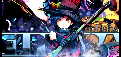
what do you guys think? any improvements i could make? dont be too cruel... thx
 AnimeGalleries [dot] Net AnimeGalleries [dot] Net |  AnimeWallpapers [dot] Com AnimeWallpapers [dot] Com |  AnimePedia [dot] Com AnimePedia [dot] Com |  AnimeGlobe [dot] Com AnimeGlobe [dot] Com |
| AnimeGalleries [dot] Net | AnimeWallpapers [dot] Com | AnimePedia [dot] Com | AnimeGlobe [dot] Com |


what do you guys think? any improvements i could make? dont be too cruel... thx
Last edited by Yippy123; 07-18-2007 at 10:39 PM.
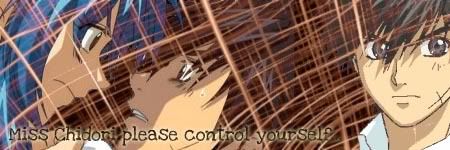
Full Metal Panic!


The blending is actually really good. Don't really know about improvements..I'll think about it. Good job though.
Thank you Azel! ^^ *glomps* but i was hoping for some negative lol
Full Metal Panic!

It's hawt but u could do with less of the brush


Nice~ The lines look 3D ^^I like it <33

concrete jungles where dreams
are made of,
there's nothing you can do~
I ♥ NY

Its really good <33 improvements? hmm...giving it a border would make it better. and this is something i though: the quote. i dont know if its the color or where its being placed but it doesnt blend as good. everything else i love^^
Hmm interesting... less of the brush? :/ you really think so?
Thank you sasuke-clan!
Ok i'll give it a border and then play around with the text.
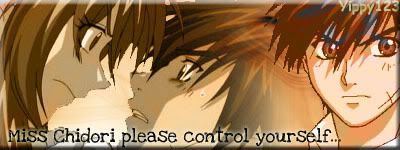
Full Metal Panic!


I did not see this thread. Ok. Heres what I think.
You do need a border and like I said, add your name. One thing is that I don't get it. But maybe thats because I've never read Full Metal Panic. Maybe you should bring one of the layers above the brush. Like the guy on the right or the two people on the left. You could use some different brush effects to make it cooler. But I do like it. ♥ Good job ♥
Oh thx for the comment Jagan! *writes down advice* well i recommend you watching the anime xD Sousuke is cool (the guy on the right) yea im not too good with brush effects :/
Ok here it is lol not much diference but oh well...
Oh and i tried something different what do you guys think of this one? argh i dont know which one to use *confused*
Last edited by Yippy123; 07-19-2007 at 10:37 AM. Reason: To include siggys ^^
Full Metal Panic!
The newer one is sooooo much hotter!!!! The text is clearer. Good job with it. And it looks better with the guy on the right all above the people on the left. Nice.


I like it!!! It uses really good colors(I like those colors).
I'm Back~!
Sorry I was gone so long! I had so much to do!
Oh thank you Jagan! im really pleased you think my second one is hotter ^^ hehe *dances*
Thx Hitsugaya xD
Full Metal Panic!
Less brush, I like that fade one better, but still a border would probably improve it as long as you didn't make the color to strong, probably something more dark.

You did very good on it I would say no changes

i like it and the lines do look 3-D keep it up.
[set by blueangel06661]♥
Hey guys what do you think of this one?

Full Metal Panic!
I dont like buttonizing of sigs. They dont look good. just add a plain simple border is all you need. Not sure if the colors are working for it. Text doesnt work well either. More effects could be used in the background. Little more blending of the extract would be good. Looking foward to seeing more.
Waaa...everything you said was negative! *goes off and cries in the corner*
Full Metal Panic!
Ok. Ok. I think the text looks good, but it shouldn't overlap Renji. I also don't think there should be any brush on top on Renji. Nope. And Mr. Renji looks sorta flat. Your namefull in the corner doesn't look too good. Try to keep your name and Renji's name the same color. You need some more to the bg. Just plain brush not so fun. Do something else with the border. Yep yep. Its a cute picture tho. ♥ Keep trying.
aww im sorry i didnt mean to sound bad. i was just trying to give ya some advice on how to improve. Im sorry lol if it sounded bad.Originally Posted by Yippy123

Oh no problem Mystic ^^ i was sorta shocked at first but i got over it haha... thx for the advice anyway.
Full Metal Panic!
There are currently 1 users browsing this thread. (0 members and 1 guests)
 Posting Permissions


Bookmarks