


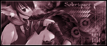
I'm finally getting back into making sigs again, but I still need some advice, especially on this first sig. I like the image and background for the most part, but the color balance seems a bit off. Any suggestions?

 AnimeGalleries [dot] Net AnimeGalleries [dot] Net |  AnimeWallpapers [dot] Com AnimeWallpapers [dot] Com |  AnimePedia [dot] Com AnimePedia [dot] Com |  AnimeGlobe [dot] Com AnimeGlobe [dot] Com |
")


 |
| 


Bookmarks