


Back
With
A
Vengeance
Uh oh, I'm back. O: Trust me, I'll try my best not to be ignorant for your sake and my sigs (hopefully) won't give you heartburn anymore. >_>;;;
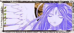
Jeanne set.
 AnimeGalleries [dot] Net AnimeGalleries [dot] Net |  AnimeWallpapers [dot] Com AnimeWallpapers [dot] Com |  AnimePedia [dot] Com AnimePedia [dot] Com |  AnimeGlobe [dot] Com AnimeGlobe [dot] Com |


Bookmarks