


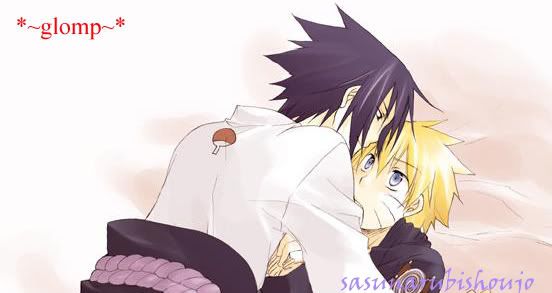
Herers one i did today.
and heres some other from a week ago or so
----
----
----
----
this was my first try at making a tht wierd sword lol
----
i dont really like this one but ill post it anyways.
----
----
Comments and Critisizm welcome")
 AnimeGalleries [dot] Net AnimeGalleries [dot] Net |  AnimeWallpapers [dot] Com AnimeWallpapers [dot] Com |  AnimePedia [dot] Com AnimePedia [dot] Com |  AnimeGlobe [dot] Com AnimeGlobe [dot] Com |


 ---a sig I made ealier not my best


 I have some problems with a few of the sigs though. For example, in the first Naruto one, the render seems deformed, as with the Fullmetal Alchemist one. Also, the 'White Knight' one is a bit too dark and there's alot of empty space in it, same thing with the second Naruto one. I really like the DBZ one though, and I LOVE the background for the Fullmetal Alchemist one.


Bookmarks