


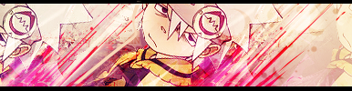
Here's what i have to show lol =P
More to come ^^
 AnimeGalleries [dot] Net AnimeGalleries [dot] Net |  AnimeWallpapers [dot] Com AnimeWallpapers [dot] Com |  AnimePedia [dot] Com AnimePedia [dot] Com |  AnimeGlobe [dot] Com AnimeGlobe [dot] Com |
| AnimeGalleries [dot] Net | AnimeWallpapers [dot] Com | AnimePedia [dot] Com | AnimeGlobe [dot] Com |


Here's what i have to show lol =P
More to come ^^
Wow! ^_^
These are beautiful! I have no criticizen. They are perfect.
Can't wait to see more!
.candy coated disposable teen.

You must really like making these . Cause it looks great
Over-saturating since '07
Enjoy ^^
Last edited by Xerotwo; 07-07-2007 at 01:36 AM.
Sorry for the double posting, but here's my new sig based on the Lucky Star one lol


You have some nice stuff here really. o_0
You should try matching the text a bit more tho (like you did in the LS and iroha ones) , I'm not one to speak, my text placement sucks. ^^;;;;; But I think i'd like the 'celebration' and 'haruhi' ones with no or simpler font/text.
That's just me chattering,-runs off-
>>>>>|| BELOW SIGNITURE BY ME ||<<<<<
Let's do this in a cool way


I love them!
They're all nice and pretty. Not to mention, ATTRACTIVE!!!
I especially like the simple and smooth background in the sig below the two haruhi ones. (But, I guess I just love simple things!) Even though, I still love the other BGs in the other sigs.
I LOVE THEM ALL!!!!!
Hope to see more. Keep makin' them!
Set made by GoodyLucky. Fans are in my Journal. Thank you so much!

Cool. Nice effects in everything and.. its just awesome.

I really like how you match the colors... it looks absolutely fabulous ^^
The last one you posted is like "wow o.O" it looks grand and the effects are truly stunning!
Keep up the grand work and keep on posting !!
~Urusai


You make awsome siggy's. they are so creative. my favorite...is this one....

"Gone - flitted away,
Taken the stars from the night and the sun
From the day!
Gone, and a cloud in my heart."
Signature credited to Serated. ^-^

Your sigs have good colours and they're very bright. These ones though... it can look too faded :/ but overall they are great! xDOriginally Posted by Xerotwo

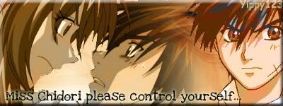
Full Metal Panic!
Here's my latest, but more's coming!!!


ooh...very very nice.^^ i like how most of them turn up so brightly.haha.im a fan of those kinds of sigs.^^
ok crticism time.only one.the sig with tenma (tenma rite?its been so long since i watched school rumble.^^') she looks kinda out of place in the sig.a little blending wuld fix that.i think...
anyway,nice works,keep it up!XD
Since my first topic got closed, I have decided to make a new topic with my current works and here they are:

You're so good! O_O I love how you mix reality with anime in the first two. Brilliant!
My favorite one has got to be the "promise" one. It's so pretty, the blending is perfect, and the render is nice. I LOVE the brushes used.
You're amazing, keep up the good work! =3
Siggeh made by me. Taking requests ATM! =3
Wow, you have a very interesting style - I don't think I've seen one like it. It is very nice - I like how you combine images from the real world with anime images and effects. The outcome is very nice. I really like the Firefox, Promise, Rukia and Valkyrie sigs. The colors and effects are great - keep posting your awesome works! ^^
Lol, thanks for ur comments, more would be appreciated x3
I'll be sure to update later!
Wow! Beautiful. Can you make one for me? Hihihi...
Sigs and Ava by me! And thank you for the Reps and Points-
~Donation needed; kindness really appreciated!~
Sure, if u got a render x3 lol
and how it should almost look, then i'll do my best lol
Well then, any anime will do. I like the style to be almost like your siggy right now (With some lines). Make a red bloody color. Is it okay?
Sigs and Ava by me! And thank you for the Reps and Points-
~Donation needed; kindness really appreciated!~
lol i'll see what i can do x3
Thanks. I'll give you reps and points in return!
Sigs and Ava by me! And thank you for the Reps and Points-
~Donation needed; kindness really appreciated!~
whoa~! Those are really nice sigs! I like the curious mix of reality and anime in the first three sigs--nice touch! ^^ of the 3, my fave is the one with Chii in it... I like the contrast of her flowing form against the angular form of the building behind her...^^ But the other two are also great... there's a crispness on the 'reality' parts that sort of make them go well with the extracts... I just love them! =D
Your other sigs calls to mind the words: fresh, simple and clean... generally, your choices of extracts/characters are really nice... ^^ My favorite of the last 6 sigs is the "Promise". I like the brushes you've used and how you've used them... minor erhm critique though ^^; the "P" is a little far from the "romise" and I think the "romise" itself is too near the margin... how about moving it a little farther from the margin? or maybe using a different font for the "P" per se? Something cursive for the "P" perhaps... just a suggestion though...^^
But in the end, you really did a great job! nice going! XD
Sorry for the wait but here's the sig:
Enjoy! x3
There are currently 1 users browsing this thread. (0 members and 1 guests)
 Posting Permissions


 |
| 


Bookmarks