


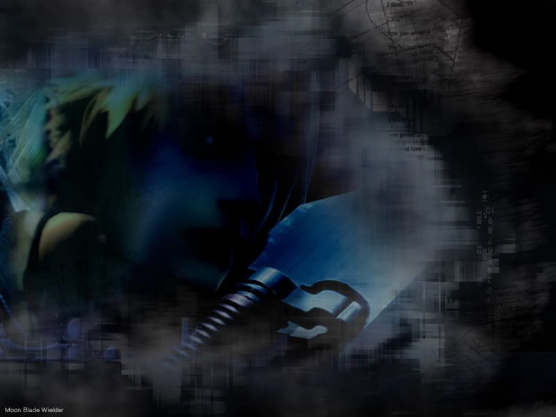
I flexed my photoshopping muscles this time.. This was done with a few highly advanced techniques.
Surely someone wants to comment........
 AnimeGalleries [dot] Net AnimeGalleries [dot] Net |  AnimeWallpapers [dot] Com AnimeWallpapers [dot] Com |  AnimePedia [dot] Com AnimePedia [dot] Com |  AnimeGlobe [dot] Com AnimeGlobe [dot] Com |
| AnimeGalleries [dot] Net | AnimeWallpapers [dot] Com | AnimePedia [dot] Com | AnimeGlobe [dot] Com |


I flexed my photoshopping muscles this time.. This was done with a few highly advanced techniques.
Surely someone wants to comment........
Last edited by Takashi MoonBlade Wielder; 12-08-2006 at 09:50 PM.


Do you still run a 800x600 screen resolution? Well, I guess some people do. >_> Just wanted to leave a comment on your wallpaper.
What I do like about your wallpaper is it looks like this dude is walking in front of a building, it's dark and spooky and scary, and suddenly this hole is ripped from the inside! and AAHHHAH! PWNed. o_o No, just kidding, but that's what it looks like.
The thing I don't like is the text. The overlay gradient you have on it, if that is a gradient overlay, really doesn't compliment the wallpaper, and it messes up with the consistency. I actually would of left the text off all together and just added your name in the corner in a san-serif font and about 10 pts.Um, you should make it bigger too. I wouldn't make any wallpapers lower than 1024 x 768 because that's the normal resolution for most screens.
So hopefully that helps.
Ill switch it out with the 1024px when im not too lazy to do so.Originally Posted by Thornwillow

Thank you for the comment. I am going to take your advice and do that.
However its supposed to look dark and scary, sorta like the evil version of cloud.
I merged 2 pictures to look like one and left his shoulder so you would notice.
Edit:
Yes thats a gradient overlay.
I <3 the gradient tool.
Edit#2:
Edited according to your wishes
It won't let me post the bigger version and im too lazy to add it as an attachment so sorry.
Last edited by Takashi MoonBlade Wielder; 12-08-2006 at 10:13 PM.


I don't feel like it has a purpose. It looks like you just piled on a bunch of layer masks on top of one another and did an invert on the main picture.
What is your main focus of the wall? To improve I'd say extract cloud totally, leave him as is, and add layers if you want him darkened. It just feels cluttered to me.
A simple kiss can warm an entire body
Excuse me? Don't assume you know what I did. I did not invert anything. I colored his face with pure skill. I don't need any filters to do things like that. Second of all there is an extremely easy way to darken someones face with a single layer. If you had any photoshop knowledge at all you would know that that was the linear burn/brush tool.
The main focus is "dark cloud" or "evil cloud"
In other words I was attempting to make cloud look evil.
How dare you assume you know what I did and it makes me angry because you're actually WAY OFFFFFF...
Uhhh ooohhh... here comes deadpool to bad mouth me
Last edited by Takashi MoonBlade Wielder; 12-08-2006 at 10:27 PM.
LOL, you're right I have no photoshop knowledge at all.
When I say "focus" I mean what part of that square do you want people to focus on, to see, right now I see the sword, thats it. Cloud is lost in a sea of layers that have no cohesion to them.
Thanks for the good laugh about my photoshop knowledge tho ^^
Can't wait til my slaves see this!
A simple kiss can warm an entire body
Well you did call my brushwork an invert.
That alone proves that you pretend to see what people do.
But then again with the two images merged it kinda looks like an invert.
Furthermore: I have seen you comment people with very little experience and not diss their work.
Go find the original picture on google and you will see how much I changed it -.-
Last edited by Takashi MoonBlade Wielder; 12-08-2006 at 10:36 PM.
only because I've used photoshop since 1998, and am no novice when it comes to the program. Maybe you should research some of the work I've done before accusing me of not knowing anything.
All you have around cloud are several layers with layer masks. Its distracting, it has no main focus of the wall. When people look at it, they will focus probably around clouds mouth to sword, which isn't really where you want them to look.
You have an idea, but I think its more like this A FANTASTIC Ergo Proxy wall done by LavaBug. But you'll see that the main focus is right ON the character instead of lost in the middle. And each part has a purpose rather than just piled ontop of one another.
A simple kiss can warm an entire body
Thats a good wallpaper. I never said mine was the best.
PS: I did not use a single "layer mask"
It would seem the more you try to predict me the less I am impressed.
Infact 99 percent of it is brushes.
When I said Advanced Wallpaper I was talking about how I used the brushes.
All you people do is get into arguements with me.......................................
I know you're still here planning your next assault on me -.-
Last edited by Takashi MoonBlade Wielder; 12-08-2006 at 10:46 PM.
My goal is not to "impress" you its an attempt to improve your wallpaper. But if you won't listen to me fine. You're pressing against me because I said something negative. I'll let MuZ0NaZ, LavaBug, or The Wizzard come in and tell you exactly what I did.
your focus is off, its not where it should be. I'm telling you that hiding Cloud under all that isn't doing you any favors. You need to put him on top like the Ergo Proxy one. When you look at that the first thing you see is the characters eyes, then the rest, the gun and THEN the background. Yours is the background first, then the mouth/sword then you attempt to figure out the rest.
Great wallpapers grab your attention at the character first, then you take in the background. Stop hiding "cloud" and let him out to play.
A simple kiss can warm an entire body
You say great wallpapers like theres standards for a great wallpaper.
"great" wallpaper is an opinion.
Its all in the eyes of the beholder im afraid.
alright, be my guest
www.animepaper.net
go there, sign up an account and submit your wallpaper. Thats where its at hon. See if they accept your wallpaper into the gallery. They'll let you know whats good or not. Go right ahead and see if you've got what it takes.
A simple kiss can warm an entire body


Actually, I was looking at the topic and was simply observing, I just wondered off to do something else. But since you put out the bait, I might as well bite.Uhhh ooohhh... here comes deadpool to bad mouth me
Before I saw the filename, I couldn't even tell what the hell I was looking at. You didn't make cloud look evil in any way, you simply made him un-noticable. All you see is half his hair, his shoulder, and part of his sword. It what way does he look evil? When you actually have to sit down and explain the emotion or feel being portrayed, you've failed.
Thats because the less experienced people tend to be less arrogant about the quality of their work. Most inexperienced users tend to simply ask how they may improve, or what aspects of a peice to keep. You however, seem to think very highly of yourself and your abilities with the program. So if YOU think so highly of your work, why shouldn't we?Furthermore: I have seen you comment people with very little experience and not diss their work.
That is because all you do is complain and insult people. You also have a very self-absorbed, rude and arrogant attitude. Look at the post your desktop topic. You made a comment about everyone elses wallpapers not being as "Elite" as yours, a wallpaper you yourself made. Arrogant.All you people do is get into arguements with me.......................................
Or the picture threads, where all you do is insult members...Remember this comment directed at Myyra's photo?
Rude.NOOOOOOOOOOOOOOOOOOOOOOOOOOO
Pay to post forum?
"Do you hate retards? I know I do"
Flat out immature.
dude.. don't ever post in my threads again. Especially since you hate me
Maybe your graphics card sucks.. but on my computer his face is the first thing I notice...
I don't see Cloud...I like the thing you did with the background, but it ended up looking like a foreground instead >.< Also... I don't see Cloud, wouldn't have know twas Cloud if you didn't say it was.
(PM option is off. I refuse to hear people whine.)


I barely recognized him because of his hair. You are really stupid TMW. It DOES just look like a mess of black and grunge. I don't know why you think it's elite.
And as for the stupid people thread in P2P....look in a mirror.
Back, by popular demand! Now with new avy.
ok fine w/e I don't care.
Capernicus if you don't like me then don't comment........
Obviously you do care because you're still posting. >.>
Back, by popular demand! Now with new avy.
Why tell someone that? So what if she doesn't like you? What do you want, all praises? Then put your work somewhere else, then just put a link on your siggy that says "All who like me, comment on my work."Capernicus if you don't like me then don't comment........
Still, I don't see Cloud. Maybe you can do something about the lighting?
(PM option is off. I refuse to hear people whine.)


Accepting criticism is a virtue, rejecting it and being self centered is idiocy
Anyway, this thread made my day ...
This thread makes me sick, Wizzy. Takashi What's-Your-Face, you are the POSTERCHILD for DeviantArt.
I'm SURE you'll fit in there. Lots of suck-ups and spineless jellyfish to crawl around and idolize you.

Some day, you'll dine on a solid snake.


to be honest, i did not even realise there´s a guy in this wallpaper until people started talking about him and even then i needed some third and fourth looks...oO
his face really does not stick out, and i dont even know the character thus having even more problems identifying him
maybe brightening the face a little will help with this...
since i´m hungry, here´s the following analogy:
making a wallpaper is kinda like cooking...having/using "good" brushes or elements of any kind is not everything...
you can have the best ingredients, but if you just pour them all into a big bowl and mix em with ketchup it´ll taste like ketchup...
it´s all about the right mixture/arrangement of elements...you still have to get a feeling for that imho...
Last edited by LavaBug; 12-09-2006 at 04:30 AM.
___________________________________________
Spammers busted: 正
This is why I don't have a DeviantArt account. You can't improve on something if people constantly suck up to you.I'm SURE you'll fit in there. Lots of suck-ups and spineless jellyfish to crawl around and idolize you.
Good analogy ^^ I've just started learning Photoshop and I'll agree with that.making a wallpaper is kinda like cooking...
@Takashi
Also, unless you're going to use the wallpaper/artwork for yourself only, it's better to accept criticisms from the possible users. And even then, constructive criticisms still will help you out because some people can see things (and in the case of the Cloud wp, not see things) that you don't.
And if you don't care about other people's comments, why make a thread about it at all? Just submit it and watch it get rejected/accepted then.
(PM option is off. I refuse to hear people whine.)
post.
And I don't hate you, I simply find you very annoying and immature. Hating you would require energy I don't feel like wasting on you.
Maybe your graphics card sucks.. but on my computer his face is the first thing I notice...[/QUOTE]
Nvidia GeForce 7800. Not the best out on the market, but very far from the worst.Or maybe your brightness is just unreasonably high, since no one else can see his face but you.
It's a problem when you have to tilt your monitor in many different directions to see any definition.
All The Ways You Wish Could Be? That's me
There are currently 1 users browsing this thread. (0 members and 1 guests)
 Posting Permissions


Bookmarks