


here a wallpaper i made.i did all the background by hand.i hope you like it ^_^.
 AnimeGalleries [dot] Net AnimeGalleries [dot] Net |  AnimeWallpapers [dot] Com AnimeWallpapers [dot] Com |  AnimePedia [dot] Com AnimePedia [dot] Com |  AnimeGlobe [dot] Com AnimeGlobe [dot] Com |
| AnimeGalleries [dot] Net | AnimeWallpapers [dot] Com | AnimePedia [dot] Com | AnimeGlobe [dot] Com |


here a wallpaper i made.i did all the background by hand.i hope you like it ^_^.
set by me

I guess they look good. But I know you can do alot better than that. ^-^


The background looks a little flat. It also looks like a kid drew it with crayons. I'd suggest taking a look at walls and see how they are made up; where the shadows and highlights are, how the blocks look, etc. I think there are also tutorials on making good walls (check the stickies!!). In all, I think you have good perspective (which is REALLY hard for most people to do well) but it just needs to be cleaned up.
Pink is the new Pooky
Party it up in Wallpapers | join the AF Gaia guild!
"Spilt coffee has a sad remembrance of old"- from a plastic bag seen on the train
musing of a mod : Illuminated Spirits : Theme: uber_pink
thanks pooky.^_^ well here a another one
set by me

Wow, that pic is awsome. I'm really liking it, it's creative.


KawaII!!!
I love them!!
There Awesome!!
Keep up the good work!!!
=~.^=
Some Sweet awesome walls. Keep up the good artwork ^_^
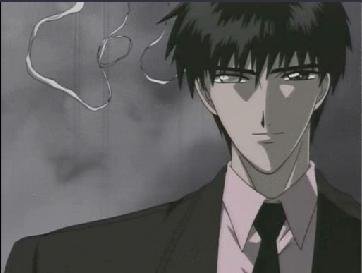
I like the one with the two guys, nice job on the bg. Must of took awhile.


Your first wallpaper will need to be rendered. Most anime wallpapers look better when rendered.
Your second wallpaper looks nice the way it is.

The background on the 'two guys' wallpaper is all that's wrong with it. It's too shiny, as if they're sitting against a pile of platinum bars in a bank. There's not nearly enough definition to it.
The 'dreaming' wallpaper is beautiful. The colors are especially great.
here is another wallpaper i hope you like it ^_^
set by me
heres another one of my wallpapers.i love fate stay night so i wanted to make wallpaper of one.enjoy
set by me


All 4 WPs are really good. I like them all! I think I'll use them.
Comment on the 3rd one: If you could put the girl's pic higher, I think it'll be better.
Great job! ^^
In the 3rd wallpaper..there's something odd about it but I can't tell what it is. I do know there is a typo.. "It" if you read the sentence again.
The 4th one the character doesn't fit in with the bg imo.
Other than that I really like the 2nd wallpaper. The first one needs work with the shadow as mentioned by Pooky.

Actually, the perspective in the first wall is horribly off, I suggest you read about 1&2-point perspective. Also, 3rd&4th walls could use more scan/background blending.
In need of a dose of ARIA.
In need of a ticket to Neo-Venezia.
Ivanova is god.
I like the "warriors path" wallpaper, except for the text, which is atrocious.
"warriors" -> "warrior's"
"it just" -> "it is just"
"begining" -> "beginning"
And the grey circle symbols on each end of the text appear to be a bit too high; they should be centered on the midline of the text.
Make "Wallpaper by dawnrune" a little more subtle (darker shading); it steals attention from the other text.
The source character art is great, the grey coloration is a terrific idea against that background, and the wisps and the seagulls are a really nice touch.
There's something that doesn't seem right with the "Holy Grail" wallpaper. One problem is that the "The fight ... begin" text is a different shade of white than the "Fate stay night" text, and this seems wrong when they're so close together. It also seems to me that the stardust behind the character is exceptionally thick, and detracts from her somewhat.
here is my new wallpaper for the new year.
set by me


I love seeing extractions that I make being ultilized! XD I love this wallpaper little bro and I think it looks good. You did some nifty effects with the stock and the fireworks aren't that bad at all.
I gave you my opinions IRL, so I don't think I need to share them here, other than I love how you used the stock. xD

i luv ur wallpappers dawnrune!!! hope u make more and keep up the awesome work!!!!
thax for the sigs and advatars -Ookami- and kiss
of death!!!!!!!!!!!!!
There are currently 1 users browsing this thread. (0 members and 1 guests)
 Posting Permissions


 -A Fan
Bookmarks