


Feels like its missing something? If not, comments? As I stated in another wall post I have a widescreen laptop.
 AnimeGalleries [dot] Net AnimeGalleries [dot] Net |  AnimeWallpapers [dot] Com AnimeWallpapers [dot] Com |  AnimePedia [dot] Com AnimePedia [dot] Com |  AnimeGlobe [dot] Com AnimeGlobe [dot] Com |
| AnimeGalleries [dot] Net | AnimeWallpapers [dot] Com | AnimePedia [dot] Com | AnimeGlobe [dot] Com |


Feels like its missing something? If not, comments? As I stated in another wall post I have a widescreen laptop.
Last edited by ecchi_maker; 07-14-2006 at 08:43 PM. Reason: Title Warning
I wanna fly high so I can reach the highest of all the heavens
Somebody will be waiting for me, so I have gotta fly higher


Missing anything? I dunno, maybe some DECENCY?!
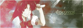
But from an ARTISTIC point of view, the background is very plain, and the right bar with the whatever her name is just really butts in and kills the theme. Like, smooth rolling hills and then suddenly a big mountain shoots up out of nowhere.


Oh, stop the party pooping. =\ I think it's cute.


stop being DICK!! It's great!!!Originally Posted by Ch33zyph33r

Thanks BD15...you rule!!!
To help those in need and to be a true friend! That is my nindo, my ninja way!
10% luck
20% skill
15% concetrated power of will
5% pleasure
50% pain
100% to remember MY name.


mhm, Anemone is out of place (the pink girl) ... go without her. Maybe you should move the text insted of her ... or get the Eureka Seven logo ...
Another patern layer in the bg would also be good. Try different combination, variations ... as it is now, it's rather plain.


The dots are bothersome, rather. And I hate the thick black outline. Kind of looks like you took a scan and slapped it on, cut the edges and put on an outline. o_O;
Other than that, it's an ok wallpaper.
| Someone painted the sky || Forever in my heart |
Game Developer/3D Character AnimatoreSports Commentator & Senior Server Administrator for LionsEK
I agree with Baka Fish, Anemone is very out of place. The dots make my eyes hurt.......


I think the dots are lovely, but maybe make them a bit lighter. also, lose the character on the right as she doesn't fit in at all. By doing that, you also have some empty space on the right for icons and such.
Oh, and don't complain about the images. A warning was given so you knew what to expect.
Pink is the new Pooky
Party it up in Wallpapers | join the AF Gaia guild!
"Spilt coffee has a sad remembrance of old"- from a plastic bag seen on the train
musing of a mod : Illuminated Spirits : Theme: uber_pink

All i know is that eureka seven is a great anime... no doubt about it!
no offense but it is rather plain. It just looks like you put in the dots to take up the white space. The stock image itself seems less artistic and more towards the pornish side. I have no problem with panty shots but that what it looks like to me.
Last edited by jigglyness; 07-25-2006 at 10:43 PM.
There are currently 1 users browsing this thread. (0 members and 1 guests)
 Posting Permissions


Bookmarks