


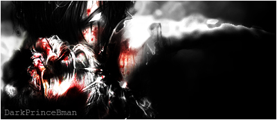
Well here is one of few wallpapers that I actually upload...I would love to hear some feed back from many of our wonderful Graphics designers.
 AnimeGalleries [dot] Net AnimeGalleries [dot] Net |  AnimeWallpapers [dot] Com AnimeWallpapers [dot] Com |  AnimePedia [dot] Com AnimePedia [dot] Com |  AnimeGlobe [dot] Com AnimeGlobe [dot] Com |
| AnimeGalleries [dot] Net | AnimeWallpapers [dot] Com | AnimePedia [dot] Com | AnimeGlobe [dot] Com |


Well here is one of few wallpapers that I actually upload...I would love to hear some feed back from many of our wonderful Graphics designers.
[ True*Poet ]


Looks like my style!! I love it! I would change the bars a bit, though. Make them a little shorter and more transparent. I would also use a fuzzy brush so that the edges are less crisp.
Pink is the new Pooky
Party it up in Wallpapers | join the AF Gaia guild!
"Spilt coffee has a sad remembrance of old"- from a plastic bag seen on the train
musing of a mod : Illuminated Spirits : Theme: uber_pink


Wow, I like the bars. Keeps away that boring empty space. The guy looks great too, love that cropping job you did. Upload more, I could use some new wallpapers for my computer!
Back, by popular demand! Now with new avy.
Looks awesome. I really like the brushings you used for the background of the guy. The lines give a really nice effect on the wallpaper. The bars are okay, but the gradient effect on the bars would looks better if they were sort of shortened bit by bit, going down the bars.
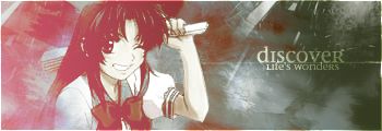
Awesome sig+avy set made by [kaisen] <3
hm..the guy is cute. The background though is a little irky [couldn't think of a better word]. I think instead of only having the brushing part stop halfway you should have had it more to the right so it doesn't seem so empty on the right. and then later blend the lines on the right gradually into the background. It takes the attention away from the main stock.
I really like it; I dig the crisp look it has to it. I like the bars, but perhaps if they were a bit more transparent, it'd be better.
Very good work though.
Thanks alot people your all too kind ^_^
I designed it so that when all your short cuts are placed onto it there is no attension taken away from them...though the character is still the focus also the bars thing i see people have been making alot of critiques about it...but i dont really understand what you guys are trying to say....do you want them to be alittle less visible or just shorter....well which it may be its going to be difficult cause i already deleted the PSD format of the wallpaper...but ill take in consideration all your advices the next one im working on right now
WOW thanks alot you guys have really gotten much better in critiqueing work
[ True*Poet ]
Yes, I like it. It has a lovely character on it,and nice background.Green defently goes with this man's style...WOO!If I was to rate such a wallpaper from 1 to 10...it would be a 8.5...which would be a nine!AHA!Because everyone loves rounding decimals!
GOOOD WALLPAPER!GETS GOOD REPPS!
meow.

Try increasing the sharpness of the character slightly - right now he's softer than the fine lines in the background, which makes it look like the focus is on the background.
The background behind the character is visually interesting, and it's good that it matches the color of the stripes to the right of it.
The character on the whole is too dark - detail is being lost on his gloves and belt, and his uniform looks like a featureless sea of black. I see what you're trying to accomplish, but I think it would help to raise the brightness of the source image so he's not *quite* so dark.
I don't think he's that cute....
Uh.. nevermind I said that.
But I think those bars could be a bit brighter.... just my opinion.


those are totaly awsome. super cool
Thankz so much Sailor Lunar Eclipse. I love it!
There are currently 1 users browsing this thread. (0 members and 1 guests)
 Posting Permissions


Bookmarks