


I really love the fourth one..
 AnimeGalleries [dot] Net AnimeGalleries [dot] Net |  AnimeWallpapers [dot] Com AnimeWallpapers [dot] Com |  AnimePedia [dot] Com AnimePedia [dot] Com |  AnimeGlobe [dot] Com AnimeGlobe [dot] Com |
| AnimeGalleries [dot] Net | AnimeWallpapers [dot] Com | AnimePedia [dot] Com | AnimeGlobe [dot] Com |


Blank


I really love the fourth one..
Forever angel floating on a cloud

mm out of those only nr 3 and 5 gives of the good vibes
the rest are ok.
1,2 and 8 are not really my cake.
Last edited by Sumomo1; 08-25-2005 at 04:45 AM.


Doesnt it let you vote?? Well, if i read the rules right, it said that you can only vote in one of the 3 polls. They couldnt fit over 10 options in one thread so they had to make 3.


Hm ... didn't expect so many sigs ... xD I kinda wanted to comment all of them, tho, don't have that much time ... so, I'll be commenting only the "top of the cream" sigs xD
1st: it looks interesting ^^ quite nifty ... and creepy xD tho ... I'd go with a different text where the link ag.net is ... and put that link somwhere on the bottom of the sig
2nd: Yup ... looks like a flash work ... and Tsukihime sig ... *looks around*, I know you xD ... anyway ... personally, I'm kinda anti Flash ... tho, the animation isn't so bad. ... too bad, I can't read the text on it ;_;
3rd: Simple, small, nice effects used ^^ ... also, nice quote xD ... I simply like it ^_^ ... personally, I'd use it ^^
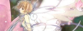
4th: .. "Kami no Hime" aka Princess of Gods ... Overall ... one of the best sigs in this contest ... like the composition, effects and text used on it ^^ ... I'm usually picky, when the chars do look out of the sig (not at the center of it) tho, must say ... the char really fits with this one. And to add ... it's small xD
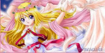
5th: ... love the animation ... tho, as already mentioned ... the text ... is kinda jagged ... maybe a small one would be better. ... and the writings ... "Maou no Hime" ... the right opposit of the 4th sig's writing.
6th: Nice, clean, good extractions, nice effects ... maybe, overall, a bit too big sig ... you know, I really hate too big sigs xD xD
7th: looks nice ... tho, the char is rather too bright respect the bg ... that's kinda bothering me, tho, must say, I like the bg ^_^
8th: looks good ... tho ... I dislike the red lines >_> ... sorry, it's just me.
9th: yup yup ... so ... Sailor moonish xD I like it ... tho, not sure about the double border lines at the top and botom ... I also see a white dot ... probably that escaped from the artists look while making the sig ... nothing serious tho xD
Last edited by wizz-o-matic; 08-25-2005 at 10:09 AM.
Aifa - lol it was my faultI had not logged in in those other two polls...yeah..I'm not QUITE awake yet
Ah ok, that explains it
I think number 5 in here is getting a lot of the votes. 0.0 ....
Im glad im not the only one that noticed the jaggyness and size! ^^;Originally Posted by Wizzard
i like the one with the words " princess of the gods"... its very nice...
^I'm a cold vanilla milkshake with poison in it.^
^Please take a sip.^

i like the colours on number 5 there just really nice and calming, and the pic just suits them really well
The 8th one got my vote. ^^
What do you think happens when you join JAVA + UDP Sockets + my girlfriend?
My girlfriend making fun of my lousy code. =/


I can't decide between the 4th and 5th one! *goes for the 5th one .... likes the animation*
Signature and avatar made by Trinity Muse!


The red lines in #8 are great! Good splash of color.
I was wondering thought... What does the PLX in #6 mean? (the artist can PM me; I already voted)
Pink is the new Pooky
Party it up in Wallpapers | join the AF Gaia guild!
"Spilt coffee has a sad remembrance of old"- from a plastic bag seen on the train
musing of a mod : Illuminated Spirits : Theme: uber_pink
Looks to me that the 3 first winner sigs are set. Nr 4,5 and 8.
The fourth one is currently a tie between 3 other sigs in the other threads.
I think the desgin on the 1st one is very clever, speshly the way they got www.animegalleries.net and nice colour scheme too.. the second one has awesome animation.. its really clever.. I could go and comment on all of them but these are all really good, I still don't know who to vote for.. but Number 3 and Number 7 and 8 are also very immpressive.. I actually like everyone on this page.. !!.. ><!!
So when the birds fly South, I'll Reach up and hold their Tails
Pull up and out of hereAnd bridle the autumn gales
Bwahaha! I've voted ^^ It took ages because while I kept going back to this particular one, I was biased against it for other reasons. Once I realized this and dropped those reasons, I could see it for the excellent piece of work it is.
i like the 8th one.
Made by: Vagary. Meh baka buddy <3
how long does the voting last until?
Pink is the new Pooky
Party it up in Wallpapers | join the AF Gaia guild!
"Spilt coffee has a sad remembrance of old"- from a plastic bag seen on the train
musing of a mod : Illuminated Spirits : Theme: uber_pink
Oh, finally voted ^_^ ... must say, was indecieded between the 3rd, 4th, 5th and the last one ....
and ... the last one got my vote ^_^ ... for some reason ... I <3 it xD ... kinda like the style ^_^ ... I'm more into simple sigs today ^^
Saturday, then everyone who didn't have the chance in the week, can before it ends ^_^
'I wish she'd guri-guri me like that'
'Yes! Guri-guri-ing all over the place. I'm jealous!'
I hope I somehow make it to the finals!! >_>
I like the 4th one!! ^_^ She is so pretty!


GAHHH! (( >< )) it was so hard to choose!
damn doi and his talent....<3 on to part two!
.-.
(o.o)
|=|
__|__
//.=|=.\\
// .=|=. \\
\\ .=|=. //
\\(_=_)//
(:| |: )
|| ||
() ()
|| ||
|| ||
==' '==
Huh? O_o
'I wish she'd guri-guri me like that'
'Yes! Guri-guri-ing all over the place. I'm jealous!'
Doi, seems a lot of people are voting in this section, I'm just wondering, does everybody actually KNOW that there are 2 more threads?
If they read the first post before voting, like they are suposed to, they do...
'I wish she'd guri-guri me like that'
'Yes! Guri-guri-ing all over the place. I'm jealous!'
Notice that there -are- a large number of blanks on the other 2 pages. If people were like me, then they put blank in the other threads after voting for one sig to make sure they only voted for one.
There are currently 1 users browsing this thread. (0 members and 1 guests)
 Posting Permissions


Bookmarks