
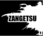


Your avi has an instant impact and slickness that I really like, and I really like how the directional lines in the background reflect the general direction of the character's fingers and hair. I get a clear sense of use of layers too, with the character being clearly distinguished from the background without looking too clashy. But... and although this is a minor, possibly-picky observation--the text... It's great that it's present and all, but imo it's also the most obscure element in the theme since it's the only thing that's aligned upright; and while it's nice to have readable text, I think on this occasion it would have looked more integrated had it been rotated anticlockwise to reflect the angle of those background stripes--and I think it'd still be readable while looking like it's part of the overall theme and less awkward, as it looks somewhat cramped the way it is. But apart from that I really, truly love your avi! ^ ^
9/10
 AnimeGalleries [dot] Net AnimeGalleries [dot] Net |  AnimeWallpapers [dot] Com AnimeWallpapers [dot] Com |  AnimePedia [dot] Com AnimePedia [dot] Com |  AnimeGlobe [dot] Com AnimeGlobe [dot] Com |


Bookmarks