


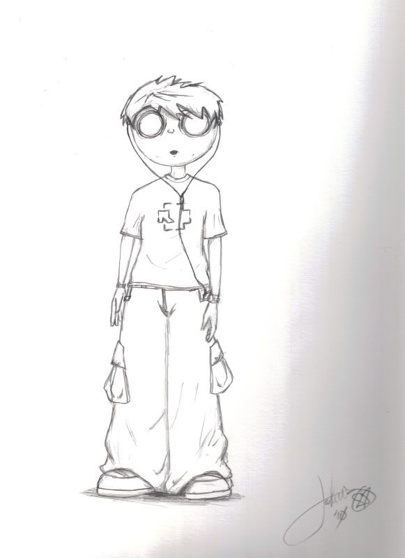
and a scanned hand drawing for good measure
 AnimeGalleries [dot] Net AnimeGalleries [dot] Net |  AnimeWallpapers [dot] Com AnimeWallpapers [dot] Com |  AnimePedia [dot] Com AnimePedia [dot] Com |  AnimeGlobe [dot] Com AnimeGlobe [dot] Com |
| AnimeGalleries [dot] Net | AnimeWallpapers [dot] Com | AnimePedia [dot] Com | AnimeGlobe [dot] Com |


and a scanned hand drawing for good measure


I like your style, and it looks like you're well on your way to becoming pro
If you don't mind, from one designer to another, there's only a few things to point out:
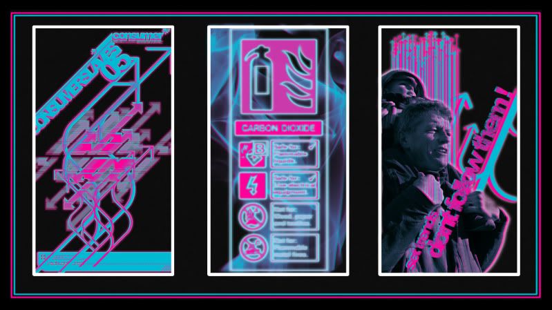
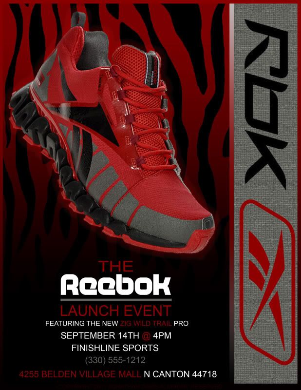
1. Typography (text). A friendly rule to never ever use Papyrus, comic sans, chiller, Hobo, and a few others. On some of them your fonts work, like the Reebok and monster gym ones. On others, it doesn't look like it fits at all. Also, try playing around with placement a little. I like to use text as a weapon; it's the attention grabber. If you can make it stand out just enough to get some attention, they'll stay to look, then stay to buy (or whatever you're doing).
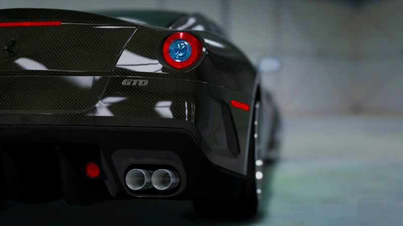
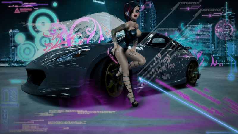
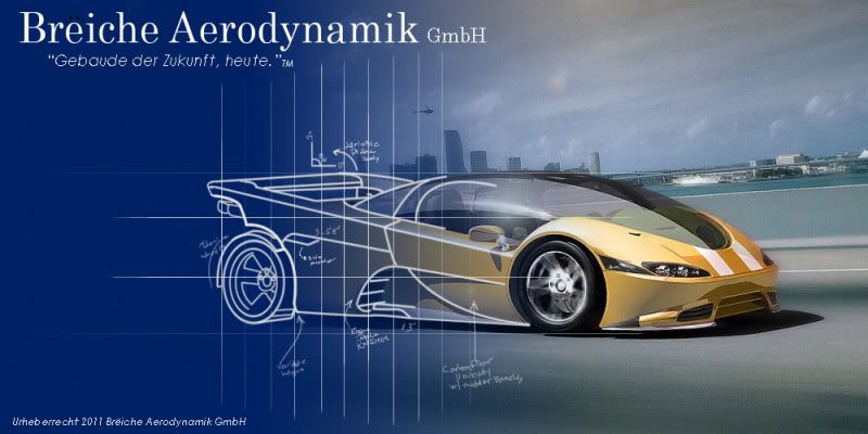
2. Just a few things look "off". On the one with the girl+car, some of your brushes just stop in midair. Try and hide them behind stuff where they stop. The quality on some of them look kinda pixely/grainy. And the depth of field on the car could use less blur, and more sharpen in some parts.
I can't wait to see more of your stuff, post often!

@Operator863 : This is very satisfactory. The graphics are time well spent and I like the overall feel/mood of each picture. If you went to a school for fashion, design and/or technology I wouldn't be surprised. You're unquestionably talented in this area and I would also not be shocked if you had a successful career in graphic designs. Smooth and svelte job done.
Have a great week, mortals.
Your Wi-Fi, it's blown out...
My Wi-Fi, it's gone out . . .

Yes very nice work! I especially like the car ones.
I see some of your work was for Canton area things, I have some family up there by Canton actually.
Last edited by T-Stew; 02-12-2012 at 12:06 PM.
~ Tristan
There are currently 1 users browsing this thread. (0 members and 1 guests)
 Posting Permissions


 Reply With Quote

Bookmarks