
Originally Posted by
under the rain

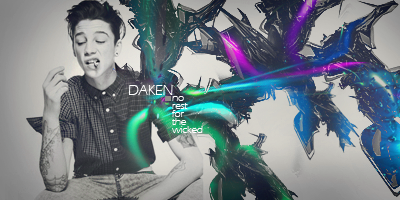
First one: One of your weaker ones. I'm not a big fan of your color composition, it seems kind of monotone which makes it boring to look at. The lack of depth is unfortunate, but I suppose not all tags need great depth. I think the weakest part is a lack of a foreground. It's all background, and your background is just a gradient with brush-spam. You could have really spiced it up with some nice effects in the foreground. I think the weakest aspect of the tag, though, is the typography. It's too far from the focal and especially with the stroke you have there, it takes attention away from the focal. Unless your tag is really text-based, this is no what you want. (Plus I'm not a big fan of overdoing the effects on text.) Still, it's more creative than a lot of tags I see these days. I'll give it a 4/10.
Second one: You're improving here. The tag is prettier to look at, largely due to your color composition. Your depth and typography have also improved a great bit here, though I think your typography still needs to be a little closer to your tag... My main issue here is still the lack of a foreground. This is a tag that really needed one, it being composed the way it was. Another thing that bothers me is the lack of flow, which I think a gone foreground could have facilitated. Without flow, the whole tag simply seems too busy. I'll give this one a 5/10.
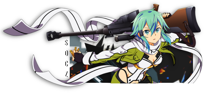
Third one: This one is your best. Interesting color composition, decent depth, not too busy like your last two, and it has a decent foreground. While I feel your execution was a little off, it's a solid tag. 7/10
Fourth one: Your typography is the best on this one because it adds to the flow of the tag. Your color composition is nice, and in this sort of tag you don't really need a foreground. Still, it does feel a bit too busy. For that, you get a 6/10.
Fourth one: Better than your first, but worse than all of your others. I think in this case it's your composition. It's simply so dull, there's no foreground, your color composition has returned to a monotone, you lack a foreground, and the misuse of your gradient kinda ruins it for me. Still, your typography is better than most people's and most of my praises of your first tag also apply. I'll give it a 5/10.
Fifth one: (Disgaea) You've reverted to brush spam and that annoying transparency that seems to be so popular. Your typography has gotten worse and you still lack a solid foreground. I'm not a fan of your color composition here, either. The flow is way off, and the focal is confused and busy. 2/10


 AnimeGalleries [dot] Net
 AnimeWallpapers [dot] Com
 AnimePedia [dot] Com
 AnimeGlobe [dot] Com


 Reply With Quote


Bookmarks