


Well, I will post some of my old and good and sucky siggies and avatars....>.<
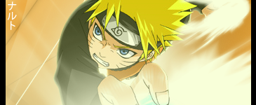
Naruto GFX Style siggy (sucks I know):
My Animated Ichigo Siggy:
My Lelouch Avatar(70x70):
Kiba (Different Colors):

 AnimeGalleries [dot] Net AnimeGalleries [dot] Net |  AnimeWallpapers [dot] Com AnimeWallpapers [dot] Com |  AnimePedia [dot] Com AnimePedia [dot] Com |  AnimeGlobe [dot] Com AnimeGlobe [dot] Com |


 Reply With Quote


Bookmarks