


Because both of our judges used a different style of judging, I'll just post what the judges told me instead of summarizing:
Edit: Sorry about this, but I have the judgings from judge 3 (will be listed as judge 4 in Maru's and Seung's battle).
Ultear vs. Avi-chan:
Judge 1:
Ultear: When I looked at this particular entry it didn't really spark as "patriotic" in my mind. But the entire composition of the signature [lightening, text, stock placement, background blending] Is all very well done.
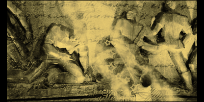
Avi-Chan: First thing, I can barely read the text, secondly I can't really tell what is going on. I see stars, writing, and I think men in stone? A baby? And some bright yellow line down the center of the signature. It "seems" patriotic but it has no focal and I really can't see what I'm exactly looking at.
Ultear GMV.
Judge 2:
Tough match-up; both of these confused me quite a bit. However, with hesitation, I say Ultear wins this match-up. It looks pretty good, and I suppose at the most vague interpretations, a soldier SORT OF inherently represents patriotism. The reason I hesitate is because Avi-chan's entry was...hmm, well admittedly it was different. I honestly tried to see how the entry related to patriotism but only felt dumb because I didn't immediately draw the connection. Is it the declaration of Independence? A copy of some country's constitution? What in heavens name is going on in the background? Are the stars supposed to mean something? I can only conclude that I'm not cultured enough, so the message completely escapes me.
Since both really didn't quite get the idea of patriotism right, going by looks alone: Ultear's was more aesthetically interesting.
Theme: Ultear (2/5) Avi-chan (1?/5)
Execution: Ultear (3/5) Avi-chan (2/5)
Judge 3:
Ultear: This is a lovely piece. Great colors, mood, and lighting. The text is kind of horrible, but an effort was put forth to mix font faces and sizes. It's not anything different from her usual c4d spam, but in this case she actually blended the render well, and the sig has that science-fiction feel that c4ds are good for. I'm very impressed.
Avi: This is a very unique piece and a great interpretation of the theme. However, it's a mess. The text is illegible, the figures aren't distinct enough, everything kind of morphs into everything else, and all in all its lacking in coherence. This is a perfect example of a great idea that lacked execution.
Ultear GMV.
illu vs. King Tatty
Judge 1:
illu: Cool signature but I do not think Halo is really patriotic. Love the use of C4D's and the blurred background and all the colors but it's just not right for this theme on any grounds.
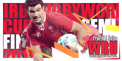
KingTatty: The text could use a bit more work. "Pride of a nation" is hard to read as the tracking is too close and the letters are too narrow. I'm not sure who or what country you're submitting your patriotism too but it has a better feel than halo and nice over-all composition of the piece besides some issues with text.
KingTatty GMV.
Judge 2:
Ehh, I guess Halo counts as patriotism, so no problems with the theme here. Very different executions here though; In illu's the ruined city accentuates the whole Halo theme, and it's got pretty standard type, with a standard c4d, and standard blending. On the other hand Tatty's easily had a lot of patriotism packed in, referencing the Welsh Rugby Union, the Wales flag inside a circle there, the Welsh dragon in the corner, talking about the world cup and something about semi-finalists. While I recognize that the symbolism is certainly there, it really feels like they were forced to be there. It wasn't subtle by any means, and several things feel out of place. The flag circle ultimately doesn't blend in very well and the vectored triangles in particular ultimately feel intrusive to the overall image.
So, while illu played it very safe with a traditional approach, Tatty really wins this match-up by making it very clear how much thought he put into the theme (despite a few minor elements not perfectly segueing into the overall composition).
Theme: illu (3/5) King Tatty (5/5)
Execution: illu (4/5) King Tatty (3.5/5)
Judge 3:
Illu: The problem with this piece is that it's uniform in every way. You used the typical stock background of a generic urban area. You used the typical smattering of c4ds. You used blue and orange, which are the colors used in advertisements for action movies and video games 50% of the time. You had mixed fonts and gradient map-text placed behind him along with a smattering of bubble c4ds. I have seen this exact sig probably a thousand times. Is it bad? No, on the contrary, it's perfectly executed. Does it bring anything new to the table? Absolutely not. This tells me nothing about you as an artist or your personal taste.
Tatty: This has the same but opposite problem as the above sig. It's not a typical sig, but it's typical for him. He's made this exact sig a thousand times. I like the big text in the background, but whatever that blur thing around the soccer player is had got to go. Without the big text, this sig is completely boring, and the font he chose for animegalleries.net is just strange. How is it illegible at that size? Bad choices all around, and the colors are very dull. I'm used to tatty using a lot of white-with-neon, and in this case, sticking to his strengths would have been way more helpful.
I pick illu. I don't want to, but considering he didn't do anything but be generic while Tatty's sig had glaring flaws speaks for itself.
Seung-li vs. Marudashi
Judge 1:
Seung-li: The font choice is grainy and doesn't compliment, The clipping into the font also doesn't compliment. The text takes up too much space and looks slapped on with no planning. The number one rule is don't put text on the face.
Marudashi: Chose to reposent war? Scary but it is a huge part of America's past [and present] it seems that it is all this country knows. The mushroom cloud in the background along with the american flag blended in work really well. The text is very nice and draws me in to read it.
Marudashi GMV
Judge 2:
Seung-li v. Marudashi
Was this a coincidence? Two entries with typography as the focus right next to each other. Certainly Seung-li's has the USA's flag as the background, with a classic pin-up girl and the dictionary definition of patriotism covering the majority of the banner; which is pretty damn sufficient for a patriotic theme. Marudashi's on the other hand is a giant mushroom cloud with a smattering of words like 'war', 'world', 'theories', 'youth', 'bulge', 'political', 'nations', 'history', 'states', and so on. Read these words all together to the next person you see and ask if they build or share a common theme. My brother had NO IDEA that it was patriotism. My sample size is a bit small but I think only a few would be able to draw that connection. Oh nevermind, I see a flag now.
However, as different as their approaches to the theme is, so too is there execution. Seung-li's tag is very low-contrast across the middle, while the edges have those flaky white textures just kind of there. Also, with the type taking up nearly all of the space and being the first thing to look at it's incredibly hard to read and doesn't blend in smoothly with the rest of the tag. Inversely, Maru's tag feels like she really paid attention to the word placement, and the colors don't clash. The textures aren't too obvious, and their placement is strategic.
This one is especially tough. What's more important for these challenges, the adherence to the theme or to focus on aesthetic pleasure? We've got opposite sides of the coin here, so it's time to split some hairs. I look at Seung-li's and I see an image that says "patriotism"...literally, while not really pleasing my aesthetic tastes at all. Maru's on the other hand is the polar opposite. I look at it and it's pretty nice; but when I look at it I see an image that says "the United States is a nation with a history of war" (and theories I suppose). Patriotism is not really the first thing that comes to mind. Ehh, let's leave it to the point cards for this one.
Theme: Seung-li (5/5) Marudashi (1/5)
Execution: Seung-li (2/5) Marudashi (4/5)
Seung-li escapes unscathed with 7-5.
Judge 3:
(Because this was a tie, I got a third judge to help with this one.)
This one was quite a tough one for me to choose. I feel that Seung's better represents the theme, but that Maru's is better done overall. Although I do feel that Maru's is better done, I don't feel like it's a better portrayal of the theme. A lot of time people do associate patriotism with the army, but not necessarily warfare, which is the focus of this sig. Seung's feels like not much was done with it, and almost feels beginner. Although it has that feel, I think it portrays the theme really well.
For better portrayal of theme, Seung-li gets my vote.
Judge 4:
Seung-li: This is a cute idea and an overall nice design. There's no focal, though. Your eyes jumps from the giant text to the girl in the background to the messy stuff in the corner and doesn't know where to stop. I think she could have done soooooooo much better than this.
Maru: This looks baller, plain and simple. Great idea, great execution, a sleek, modern design, and it's not too busy. I love everything about it.
Maru GMV.
Daken vs. Garzhvog
Judge 1:
Daken: Touching images used. True patritism! though this signature is really bright and simplistic I personally think it best represents the them out of all the contestants.
Serif: Amazing signature and skill was used. It's sad it got paired against Dakens. While patriotic in it's own merits I think it lost to Dakens use of an actual member of the Marines.
Daken GMV
Judge 2:
Hey, these look great, AND they pretty much meet the theme expectations. Clearly two soldiers saluting flags show duty, service, and dedication to one's country--sounds like patriotism to me, and Captain America is pretty much the iconic patriot. All things considered though, I feel like the theme is more strongly represented by soldiers saluting a flag, while Captain America just makes think of comic books. They both look good, between Daken's flag on top of dudes saluting more flags, and Serif's traditional styling and blending.
I say Daken's pulls ahead for theme.
Theme: Daken (5/5) Serif (4/5)
Execution: Daken (4/5) Serif (4/5)
Judge 3:
Daken: I thought to myself when I first started judging this that I was absolutely going to vote for this piece. I mean, look at it, such gorgeous colors! Then I realized the colors were just about the only thing I liked about it. There is no set, good focal, and while overlay is nice, it doesn't work very well here. It looks like two stock images were slapped together and then a flag was placed over them. I don't get the design. Like I said, though, stunning colors.
Serif: This one's just fun. I don't know how only one person thought to do Captain America, but kudos to you! The sig isn't spectacular, but it's not bad either. Decent effects, choice of stock, placement, and for once an actual focal!
Serif GMV.
Here's a list of the people who will be moving on:
Participant list: (4/16)
@Ultear
@King Tatty
@Seung-li
@Daken
 AnimeGalleries [dot] Net AnimeGalleries [dot] Net |  AnimeWallpapers [dot] Com AnimeWallpapers [dot] Com |  AnimePedia [dot] Com AnimePedia [dot] Com |  AnimeGlobe [dot] Com AnimeGlobe [dot] Com |


 Reply With Quote


Bookmarks