


Requests are:
Closed
[Empty Space; Will fill later once requests are open]
 AnimeGalleries [dot] Net AnimeGalleries [dot] Net |  AnimeWallpapers [dot] Com AnimeWallpapers [dot] Com |  AnimePedia [dot] Com AnimePedia [dot] Com |  AnimeGlobe [dot] Com AnimeGlobe [dot] Com |
| AnimeGalleries [dot] Net | AnimeWallpapers [dot] Com | AnimePedia [dot] Com | AnimeGlobe [dot] Com |


Requests are:
Closed
[Empty Space; Will fill later once requests are open]
Last edited by Bubblegum Pop; 10-26-2012 at 10:01 PM.
Made by me!
"See? We met again, like we promised."
I miss you guys. <3


Borders, eh? I personally don't recommend them but it's completely up to you...(Not that I'm a good sig maker myself).
1st: Character's a little to dark. Maybe you can lighten her up?
2nd: Love this one. No need to change it...
3rd: Maybe some text would be good, and your sig won't be stolen.
Good works you've done. With some improvements, you can become the sig you were once before.
WARNING: This user is wanted for unauthorized access into Ultratech archives. If you see this user in person, please contact Ultratech immediately.
@Light BusterThose were VERY helpful comments! And yeah for the last sig I'm gonna use it as a set soon, But I really couldn't think of any text xD
@RyuTama I made a present for my wifey <3 Lol I hope you like it.
Okay now before I get obsessed with PS I think im going to go to bed... almost 3am. <3
Made by me!
"See? We met again, like we promised."
I miss you guys. <3


This signature is too dark. I really like the border around this one though. This bold border looks great. I like the dark ground, but your character just blends it, though this is great most of the time, you don't want to over look the character either. Also the character looks a bit too blurred around the shoulders.Originally Posted by MikuChuu

Not too bad. I like the space background, but next maybe add a few C4D's and you should play around with Filters and Gradient Maps too. Look up a few tutorials. (That's how I learned most of my stuff) I don't really like the bold border around this signature though. Tone it down a bit. Borders are always great to have. It makes sure the signature doesn't look like it's going to spill out everywhere.
I like this one, the only problem I have with it, is it is too light. Take a black and white gradient map and apply it over the entire image then fiddle around with the opacity and put the layer to overlay or screen or whatever looks best to you.
Like this (Hope you don't mind that I edited your signature to show what I mean) :
All I did was take a black and white gradient and place it over the signature with the black over the face of the render. The I went down the list and I like the color burn one. I change the opacity to 50%. Now the render doesn't look so washed out.
This looks a little washed out again, but that's okay, you're still new at this. Like I did with the other signature, you could do that to this one. It just adds more depth to it over all. I really like the heart over in the corner. And the border is great.
Again this is washed out. There is a lot of negative (blank) space on the right side, you could use a C4D for that side if you're like or use the pen tool. The font is a little over the top. The color of the font matches well though. What I've learned is that fancy fonts (like you used) rarely ever work. You just have to test different fonts to see what works. I'm still struggling with fonts myself.
Over all I think this is really good for a new/old beginner like you lol. Keep up the good work.
Last edited by FlashD; 11-13-2011 at 12:22 PM. Reason: Don't quote images
Thank you so much @Yukari
I was messing around with C4D's before bed but I couldn't get the hang of using them. I'll keep working on it. Again thank you so much! <3
Made by me!
"See? We met again, like we promised."
I miss you guys. <3
The thing about C4D's is that you need to find one that fits the signature. And there are 3 types or C4D's.
Effect C4D's: Ones that typical take up space
Lighting C4D's: They typical add lighting and other things. They are usually put on effect layers such a color burn or whatever you want.
WireFrame C4D's: With these to work, you need to put it on Multiply to get right of the white, but the wire frame will still be there.
You'll just have to play around with a BUNCH of C4D's to "get the hang of it"
So been playing around with c4d's all day... Finally came up with this.
I'm actually going to use it as a set. Unfortunately I don't have time to make more so I'll have to wait until after work. I need to work on text a little more o.o
Comments please
Made by me!
"See? We met again, like we promised."
I miss you guys. <3

I am not a big fan of this "luminosity" layer that sorta makes the signature itself a bit more white, because it distorts the signature's true colors. Because of that, I can't really see the C4Ds that well. C4Ds should not only help with the flow but blending as well, try approaching it that way when you're applying them and see what happens.
Last edited by FlashD; 11-14-2011 at 05:59 PM. Reason: Don't quote images
Woo. Alright I second what illu said. Again this looks washed out and the signature is over all kind of bland (I think that is because it is washed out)
The font (as you said) needs work. The font itself looks fine, the color needs work though. Sometimes I use a color wheel to see what complementary colors go well together or whatever.
Another thing, Maybe use a phrase or something in the negative space up in the top right. It's a little too blank over there.
Last edited by FlashD; 11-14-2011 at 05:59 PM. Reason: Don't quote images
Okay! So I used a new style since i'm not that great with C4D's.
Tutorial used: http://www.animerender.com/index.php...-vectorsigtut/
Tried my best not to make the render looked washed out. I'll try this style again with a better render, this was just for practice.
Comments please
Made by me!
"See? We met again, like we promised."
I miss you guys. <3
I like it!! Such improvement! Again I love the border. It's great. I love what you did with the text. and I love how you copied the character and filled her in and placed her in the background around the signature. You're flow could use a bit of work. maybe look up some flow tutorials. It helped me a lot when I did so.
Last edited by FlashD; 11-15-2011 at 04:05 AM. Reason: What did I say about quoting images??
That's an improvement ^^. Colors much more vibrant and appealing. Like Yukari said, your flow needs to improve. When you put brushes/C4Ds, they should somehow attract the eye towards the focal. Keep up with the good work.
Last edited by FlashD; 11-15-2011 at 04:06 AM. Reason: What did I say about quoting images??
Thanks guys
---------- Post added at 11:26 PM ---------- Previous post was at 09:54 PM ----------
Double post graaa o_o
So I finished my set. I don't really like the stars but... eh I still love the outcome

Made by me!
"See? We met again, like we promised."
I miss you guys. <3
You still need a little help with the flow of the signature. Although you have gotten better and I love this style too
Here I have shown the flow of the signature:

Last edited by Yukari; 11-14-2011 at 11:44 PM.
Ohhh I get it. I think XD I should really look at that flow tutorial I found.. o_o *laziness*
Made by me!
"See? We met again, like we promised."
I miss you guys. <3
There is a good one here on AF...lemme see if I can find it.
---------- Post added at 12:52 AM ---------- Previous post was at 12:47 AM ----------
http://www.animeforum.com/showthread...ip-of-the-Week
That is the thread Tip of the Week.
It talks about a lot of the aspects of signature making.
Very helpful tutorial :o Thanks so much Yukari! <3
Trying my hand at C4D's again. I think I did...decent o.o
Darker version:
I still can't get the text right. C4D's are still kinda tricky. Comment please. :3
Last edited by FlashD; 11-16-2011 at 04:39 AM. Reason: Don't double post, use the EDIT button or respect the two days delay.
Made by me!
"See? We met again, like we promised."
I miss you guys. <3
Here's one tutorial for using C4Ds that I made, it's very old but still fairly basic on how to use them.
http://www.deviantart.com/download/1...y_Arkjoint.png
I have another one that I'll post here later for you.
Edit:
here it is:
http://www.deviantart.com/download/1...y_Arkjoint.png
These won't make your signatures amazing overnight, but it's somewhere to start.
Having fun with C4D's. This one wasn't practice...I just got bored. I really do like it though o.o
Comments?
Made by me!
"See? We met again, like we promised."
I miss you guys. <3
A bit better. The depth is ok, but the C4Ds are a bit unusual. It may look better if it looked as if it wrapped around the render to give more depth. Also, becareful of the blurring since they're both to seem way overblurred. It has to be methodical and a smoother transition.
This actually has a lot of potential. Mind if you send me the PSD? I want to give it some tweaks.
Last edited by FlashD; 11-17-2011 at 12:47 PM. Reason: It's the 3rd time ... do not quote the images ...
Yeah, I'll send it after work. I'm not feeling good right now so I'm trying to rest up before work. And yeah, I get what you're saying. I'll take that into consideration onto my next sig. Thanks <3 :3
Made by me!
"See? We met again, like we promised."
I miss you guys. <3
So I decided to play with smudging, and coloring. This is the outcome:
I couldn't find the right font for the text...so I just left it like this x.x
Made by me!
"See? We met again, like we promised."
I miss you guys. <3
You're going back to that "whiteish" layer that sorta washes out the colors. As for color, see what happens when you add a vibrance layer and play around with the settings. As for a text, in my opinion I would go for a more script type of font.
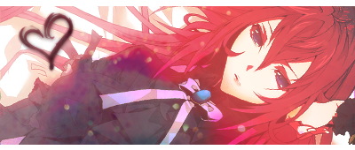
Just finished my set lol. I like this style...Just need to find a way to make it look..not as simple. :o
Edit: I just noticed I forgot to darken the render... >.> Eh ill do it tomorrow. I like it how it is though.
Last edited by Bubblegum Pop; 11-22-2011 at 10:58 PM.
Made by me!
"See? We met again, like we promised."
I miss you guys. <3


Not that I disapprove by any means, but the only part of her that's visible is some of her face and her massive cleavage. Did you blend it this way on purpose or...? lol
Also, for really soft signatures like these, having a slew of vibrant colors isn't really the target. The appeal of these pastel tags are how 'soft' they look, which you generally get by having high brightness, and really faint touches of color with low contrast between elements. If you want to really bring out colors in anything though, you'll have to keep the overall brightness down by purposefully avoiding whites and neutral colors. The best tip I can give is to start with a really colorful stock, and decide on 3 to 4 primary colors that you want to theme the tag or whatever you're working on around, then start adding in those colors with really high saturation. It'll come out fairly bold this way, but I find it steers me away from a uniformly colored image. You can always adjust the hues and saturation after you get the big picture is finished anyways.
Last edited by Cantelope; 11-22-2011 at 11:17 PM.
There are currently 1 users browsing this thread. (0 members and 1 guests)
 Posting Permissions


 Reply With Quote


Bookmarks