
Originally Posted by
Seung-li

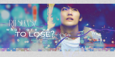
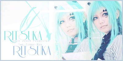
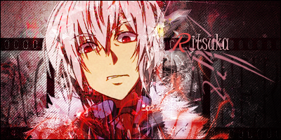
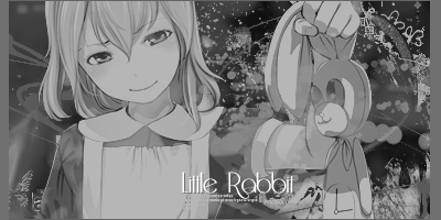
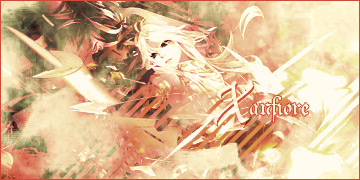
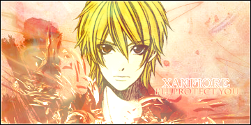
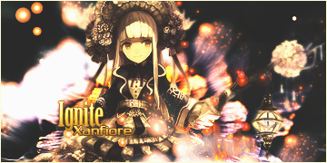
I forgot to give you my feedbacks on your two signatures that are above me. First of all, I'm curious on the render you're using. The huge factor is that you are good when your render is good to begin with, unless you have an idea on how to fix it up. So, let's say the render is good, however you can fix up the setting on it such as putting it on Multiply, Screen, Soft Light, etc. I'm saying that because it can make a huge difference with your signature with that alone. How I evaluate your signature the contrast is too high and it's very bright. Sometimes people can do their work in high contrast BUT for some reason it ends up working (and varies on people's taste) and I suggest toning down the brightness because the contrast is real high in both of them. I have no problem with the colours, I think they're stunning. Typography I think it's alright. At least it fills up the emptiness of your signatures for those two. My main concern is more of the brightness and the contrast issue that can be adjusted but I think those two are quite nice. <3


 AnimeGalleries [dot] Net
 AnimeWallpapers [dot] Com
 AnimePedia [dot] Com
 AnimeGlobe [dot] Com

 //
// 


 //
// 


 Reply With Quote


Bookmarks