


Thank you so much to our wonderful judges~ Also, instead of combining the judging into one paragraph, I'll be showing the opinions of both judges. This will be interesting, considering one is more supportive and one is more...harsh. There was a third judge in case of ties.
Battle 1: Daken vs. Aiacos
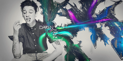
Daken:1). In this entry we see both a clever interpretation of the theme and a refreshing minimalist style. He kept up with his interpretation by choosing the obviously "gangster" stock that not only fits well but is a breath of fresh air in comparison to the usual choices. Overall, the greyscale color makes the theme colors in question pop more. The sig is generally lacking in flow and depth, and is kinda plain and has some odd parts, however, but is otherwise well designed.
2). This entry seems very bland, seeing your old RGB and CMYK entries you don't seem to have done anything different really and haven't taken the theme into account for all it's possibilities. The background and image aren't blended much if at all, the spatter brush behind your focal is completely out of place and the text seems randomly slapped on. The soft red, green and blue brushes are extremely out of place such as the outline of the focal coloured in the same colours.
Aiacos:
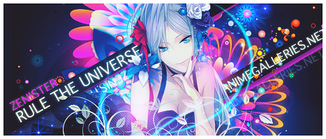
1).This is a good sig by conventional means. It presents both depth through use of c4ds and a sense of chaos from the sporadic placement that aids the action presented with the stock used. The colors are more subdued but still present red, green, and blue. The starry texture laid overhead almost obliterates the depth, however, gives everything the same fuzzy feel, and adds nothing to the flow of the piece. The text is a simple serif font that is added by placement and various sizes but otherwise adds nothing to the piece.
2). Now this tag fits the theme extremely loosely which is a bit cheap. This tag is again very bland, looks like very simple technically too, Stock Image > C4D > Focal > C4D > Random White Light> Text > Star map, nothing really imitative about this piece visually or technically. The text is very badly placed and the font used for the AG.net text just isn't right at all. The blending is weak, as the background or C4D(s) don't suit this focal at all.
This was a tough one. One judge voted for Daken, and another Aiacos. The overall victory goes to Aiacos, for good use for C4Ds and better typography.
Battle 2: Loki vs. Blueangel
Loki:
1). This sig is the only one to literally and metaphorically think out of the box. The use of an "old school" anime is both evocative and endearing, plus the ability to show good composition within a smaller canvas space while still using that small space to the fullest advantage is impressive to say the least. The piece is lacking in lighting and depth, and is simple but the use of brushes and motion is not lost. Again, this is doubly impressive because the creator had so much less room to work with. All in all, I think it's ingenious and perfectly fits the theme.
2). This has to be the most imaginative piece entered in this contest without a doubt, that being said the execution could have been a lot better. To that point the way the images re placed in their respective letters and blending is very basic whats looks like smudging. However the placement of the AG.Net is again very creative and the text is indeed very well placed. Overall there's not much else too it so not much to be said.
Blueangel:
1). The presence of three separate characters, all in the theme colors, is absolutely brilliant. That is, however, one of the only remarkable things about the sig. A simple dot background is just that: simple. It appears to have very little workmanship behind it. The only show of depth in the sig is in the text, which stands out thanks to simple drop shadows. The use of clipping masks in the text is, however, a very nice touch, especially considering the corresponding colors.
2). Lets start with the huge glaring mistake you get hit with straight away, top left corner the boarder has not been aligned properly and you should have checked for silly little mistakes like that straight away. Your focal(s) seem to be washed out when drenched in their respective colors and the way you have blended the 3 colors together is not very appealing. Now for the text, the RGB text with the clipping mask's seems very creative and well placed together, but it doesn't really fit in with the tag and the AG.Net text is lazily slapped in a corner.
This was a tough one for both judges. They both felt that both pieces had creativity, although the win goes to Loki for better use of theme and creativity.
Battle 3: Ellipsis vs. Seung-li
Ellipsis:
1). This is the only sig in the entire competition that has a strong and realistic light source. Although this is a relatively simple sig (just a gradient background, some brushes, and some pentooling) the devil is in the details. Larger, fainter brushes mixed in with smaller, more solid ones trick the eye into seeing depth that otherwise wouldn't be there. My biggest complaint is that thanks to the stroke over the stock's breast, the sig looks like it says "RGD" instead of "B". That, and when it comes down to it, it's really a very simple sig.
2). This tag seems very well put together, however there are some apparent flaw's such as the secondary RGB text that's slanted south east, it doesn't fit in at all, You could have had the main RGB Text placed in front of your focal and kept the AG.net text as is, this would have fixed the problem of having had the secondary text and given that tag some more depth that it seems to be lacking. It could have been a good idea to have had an outer glow on each of throwing knifes in red , green and blue. Now like most other piece this fits the theme very very loosely.
Seung-li:
1). It's just plain messy. The background is random splotches. The foreground is random vector brushes and a skyline that doesn't make sense. The girl and the lighting bolt throw off the flow entirely by having their own flow that is completely separate from the rest. The black vector circles are stark and contrasting compared to the pastel shades and grayscale of everything else. The text is fine, though, the boxes are cool. Had she kept the geometric theme throughout, it would have been much better.
2). yest again another tag that has the problem of fitting the theme so very loosely, that being said, the blending in this tag seems to be top notch apart from the "skyscraper/building" brush on the right side which seems to stick out like a sore thumb, as for the background it is very pretty and fits in with the urban feel of this tag. The lightning bolts on either side of the focal are well placed and add depth to the tag. The text is well [placed in regards to that brushwork, however the outer glow(s) seem very out of place for this kind of tag.
Another tie. One judge felt that Ellipsis' sig could've done better with the text, and another felt that Seung's sig was just too messy. The third judge felt that Seung had better use with the brushes, though, and thus this round goes to Seung-li.
Battle 4: Avi-Chan vs. King Tatty
Avi-chan:
1). The border on this is completely ridiculous. I know she was going for creativity, but it's a hot mess. the rest of the sig, however, is exquisite. She chose the absolute most fitting stock out of every sig in this whole thing, and she paired it with brushes that both fit and had a sense of cohesion and whimsy at the same time. Somehow, those violent colors work together. It even has a kind of glossy feel to it that just makes it look splendid. The text is fine except for the pixely stroke around the letters.
2). There's very little blending on this one. The blue parts just seemed to be put in there for the fact that you needed something blue and it doesnt really help the quality of the sig as a whole. What are the hearts for? The lighting source seems to be in an odd spot, and the upper right and left background seem bare. But with all that said, this sig caught my attention. The border's creative, and it actually screams out RGB to me. The cartoonish font goes well with the feel of the sig, although it could've been blended a bit better. The dots behind the girl also add a cool effect.
Tatty:
1). Original, clever, and none of the other ones look anything like it. A problem with it is it's just really plain. I can break it down into three pieces: splatter outlines, pen tool, computer. Nothing else. It doesn't leave a lasting impression, though the text fits the theme just fine.
2). It's definitely...original. Why the lines? They don't seem to help much. Background is way too bare. The computer seems to just be randomly put in there. The dots above the computer just seem to be there to add more red, green, and blue. AG.net is barely legible, and the only reason I can read it is because I know what it's supposed to be. The only thing that works for me in this sig is the text "RGB."
This one goes to Avi-chan. The judges felt that although tatty's was original and made good use of the theme, it was just too simple and just didn't stand out.
Odd one out due to only having 9 entries: Aleyna
Below is a list of those going on to the next round :3
Participant list: (5/16)
@Aiacos
@Loki
@Seung-li
@Avi-chan
@Aleyna
 AnimeGalleries [dot] Net AnimeGalleries [dot] Net |  AnimeWallpapers [dot] Com AnimeWallpapers [dot] Com |  AnimePedia [dot] Com AnimePedia [dot] Com |  AnimeGlobe [dot] Com AnimeGlobe [dot] Com |


 Reply With Quote


 Yea, the font just doesn't work. Funny, after I made that signature, I downloaded a bunch fonts, because I didn't have that many to use. Yea the words should be together and right by the main focal point, cause there should only be one focal point. Thanks for the criticism.


Bookmarks