AnimeGalleries [dot] NetAnimeWallpapers [dot] ComAnimeLyrics [dot] ComAnimePedia [dot] ComAnimeGlobe [dot] Com


User Tag List

View Poll Results: Which Entry?

Voters
12. You may not vote on this poll
    The results in this poll are hidden.
  • Entry A

    The results are hidden 0%
  • Entry B

    The results are hidden 0%
  • Entry C

    The results are hidden 0%
  • Entry D

    The results are hidden 0%
  • Entry E

    The results are hidden 0%
+ Reply to Thread
Results 1 to 10 of 10

Thread: Beginner Signature of the Week #1 Voting

  1. #1
    Saved Archaic Devices has a reputation beyond repute Archaic Devices has a reputation beyond repute Archaic Devices has a reputation beyond repute Archaic Devices has a reputation beyond repute Archaic Devices has a reputation beyond repute Archaic Devices has a reputation beyond repute Archaic Devices has a reputation beyond repute Archaic Devices has a reputation beyond repute Archaic Devices has a reputation beyond repute Archaic Devices has a reputation beyond repute Archaic Devices has a reputation beyond repute Archaic Devices's Avatar
    Gil
    5,597,404.45
    Gender
    My Mood
    Bashful
    Gifts Telescope Baka Be Mine
    Mentioned
    298 Post(s)
    Tagged
    0 Thread(s)
    Latest Post
    07-21-2014 10:13 PM
    User Info Thanks / Tagging Info Gifts / Achievements / Awards vBActivity Stats
    Join Date
    Mar 2008
    Threads
    258
    Posts
    2,226
    Blog Entries
    22
    AW Wallpapers
    1
    Rep Power
    2465

    Default Beginner Signature of the Week #1 Voting

    Signature of the Week #1 Voting

    Theme: Freestyle


    Ok guys, this is how it's gonna work. I know that if I make you guys state your reasons for voting, I'll be lucky to get 3 votes. What I'll do is I'll ask some Illuminated Spirits members if they could post some positive CnC here, so that way the beginners will have an idea on what they need to improve on, what they're doing well, etc. Even if you're not an IS member, please feel free to post some CnC on the entries as well!


    Rules and Guidelines for Voting:


    1) It's strongly recommended that you post positive feedback along with your poll choice.

    2) You are NOT allowed to campaign for any specific entry, nor should you post negative comments on any other entry that you are not voting for. You should vote based upon solely what YOU like, NOT what other people are voting for.

    3) NOT FOLLOWING RULE 2 WILL RESULT IN YOUR VOTE BEING DELETED.

    4) This contest is designed so entries are to remain anonymous. Any reference to missing deadlines, who entered or did not enter will result in your entry being disqualified, and your post removed. You also risk being removed from further competitions of this nature.


    Voting Ends Sunday, September 11th, 2011.
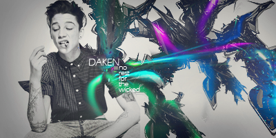
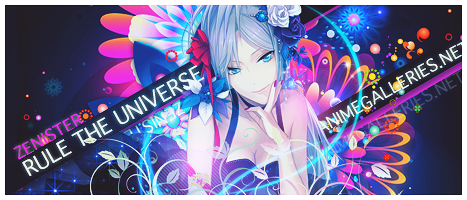
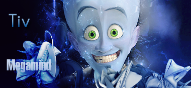


    Entry A:


    Entry B:


    Entry C:


    Entry D:


    Entry E:

    Last edited by Archaic Devices; 09-04-2011 at 07:15 PM.

    Sig by Feferi <3


    "Don't go around saying the world owes you a living. The world owes you nothing. It was here first."
    -Mark Twain

  2. #2
    Hanamaru Kunikida has a reputation beyond repute Hanamaru Kunikida has a reputation beyond repute Hanamaru Kunikida has a reputation beyond repute Hanamaru Kunikida has a reputation beyond repute Hanamaru Kunikida has a reputation beyond repute Hanamaru Kunikida has a reputation beyond repute Hanamaru Kunikida has a reputation beyond repute Hanamaru Kunikida has a reputation beyond repute Hanamaru Kunikida has a reputation beyond repute Hanamaru Kunikida has a reputation beyond repute Hanamaru Kunikida has a reputation beyond repute Hanamaru Kunikida's Avatar
    Gil
    50,461,728,855.57
    Gender
    My Mood
    Amazed
    Gifts Penguin Movie Ticket Gabumon
    Mentioned
    595 Post(s)
    Tagged
    0 Thread(s)
    Latest Post
    02-13-2024 02:28 PM
    User Info Thanks / Tagging Info Gifts / Achievements / Awards vBActivity Stats
    Join Date
    May 2008
    Location
    Kira Estate
    Threads
    737
    Posts
    11,209
    Blog Entries
    86
    Rep Power
    6393

    Default Re: Beginner Signature of the Week #1 Voting

    Entry A gets my vote because to me, it's seems like it actually a sig has efforts put into it, unlike the others that seem more like a stock pasted in a background plus a few effects.
    Well Entry E as well but Entry A is more colorful and attracts more.

  3. Likes Archaic Devices liked this post
  4. #3
    Is back!!! Yukari has a reputation beyond repute Yukari has a reputation beyond repute Yukari has a reputation beyond repute Yukari has a reputation beyond repute Yukari has a reputation beyond repute Yukari has a reputation beyond repute Yukari has a reputation beyond repute Yukari has a reputation beyond repute Yukari has a reputation beyond repute Yukari has a reputation beyond repute Yukari has a reputation beyond repute Yukari's Avatar
    Gil
    10,302.03
    Gender
    My Mood
    In Love
    Gifts Kawaii Ice Cream Cone Bento Photoshop
    Mentioned
    87 Post(s)
    Tagged
    1 Thread(s)
    Latest Post
    06-04-2013 09:53 PM
    User Info Thanks / Tagging Info Gifts / Achievements / Awards vBActivity Stats
    Join Date
    Feb 2006
    Threads
    65
    Posts
    1,606
    Rep Power
    344

    Default Re: Beginner Signature of the Week #1 Voting

    Entry A: I love the colors here. They remind me of the fall season. The only problem I might have is that there seems to be a bright spot right above the right shoulder. Maybe if you lowered the opacity, it wouldn't look so out of place.

    Entry B: It looks squished and cluttered. The text isn't in a good place either. Look at some of @Serated 's TOTW. When i was starting out they helped me a lot.

    Entry C: There is no blending what so ever. It seems like you just pasted a background then the stock. Car's, for me at least, are not that good as stock. You should try a tut that goes along with your stock to maybe add some blending to your new signatures you plan on making.

    Entry D: I don't really understand this one. It seems like you might have tried some blending here. And that green boomerang looking thing should go. No offense. Or maybe find a better place to put it. And the stock blends in way too much with the signature you have to search to find it. I also see no flow within the signature. Look over a few tut's on flow and blending! they help a lot.

    Entry E: It was a hard choice between this one and Entry A, but Entry A got my vote because of the colors, though nothing is wrong with your colors besides them being maybe a bit too bright. You blended pretty well for a beginner and it seemed like you put some effort into your signature. Maybe next time, take a black brush and brush over some areas you think might be too bright and fiddle with the opacity.

  5. Likes Archaic Devices liked this post
  6. #4
    Senior Member Daken. has a reputation beyond repute Daken. has a reputation beyond repute Daken. has a reputation beyond repute Daken. has a reputation beyond repute Daken. has a reputation beyond repute Daken. has a reputation beyond repute Daken. has a reputation beyond repute Daken. has a reputation beyond repute Daken. has a reputation beyond repute Daken. has a reputation beyond repute Daken. has a reputation beyond repute Daken.'s Avatar
    Gil
    307.38
    Gender
    My Mood
    Lurking
    Gifts 311 - Plusle 133 - Eevee Spinning Beach Ball Doom
    Mentioned
    315 Post(s)
    Tagged
    0 Thread(s)
    Latest Post
    08-31-2014 03:25 AM
    User Info Thanks / Tagging Info Gifts / Achievements / Awards vBActivity Stats
    Join Date
    Dec 2008
    Location
    Planet X.
    Threads
    18
    Posts
    2,840
    Rep Power
    3672

    Default Re: Beginner Signature of the Week #1 Voting

    Entry A - This is a nice entry, it has a nice style going on for it, but to me the left side is too empty and I think the font would of looked better without that orange stroke. But overall its a good job, espically seeing how the render is a scan.

    Entry B - Kind of too small for my taste. Espically since the render takes over most of the picture, and it's hard to pick out what all they did in the signature.

    Entry C - It would of been nicer if they had blended the car, it just sticks out because to me it's like they just slapped it on a C4D background. And the text is spread out which it really shouldn't be, and the green outerglow of the text kind of kills it.

    Entry D - Nice, but the background seems a little TOO dark in my opinon. And the colors don't really match.

    Entry E - I like they went with the vert signature, and I love how the colors match the render. I think it would of looked better without that thing infront of her chest.

    For that, I will place my vote for Entry A.

  7. Likes Archaic Devices liked this post
  8. #5
    Senior Member Xeyuzio has a reputation beyond repute Xeyuzio has a reputation beyond repute Xeyuzio has a reputation beyond repute Xeyuzio has a reputation beyond repute Xeyuzio has a reputation beyond repute Xeyuzio has a reputation beyond repute Xeyuzio has a reputation beyond repute Xeyuzio has a reputation beyond repute Xeyuzio has a reputation beyond repute Xeyuzio has a reputation beyond repute Xeyuzio has a reputation beyond repute Xeyuzio's Avatar
    Gil
    798,866,447,204,601.50
    Gender
    Gifts Cake Kawaiislice Cake
    Mentioned
    469 Post(s)
    Tagged
    4 Thread(s)
    Latest Post
    08-12-2014 08:06 PM
    User Info Thanks / Tagging Info Gifts / Achievements / Awards vBActivity Stats
    Join Date
    Oct 2010
    Location
    Illinois
    Threads
    185
    Posts
    3,999
    Blog Entries
    444
    AW Wallpapers
    1
    Rep Power
    2280

    Default Re: Beginner Signature of the Week #1 Voting

    E is just amazing, it gets my vote:
    人類は調和したのか?
    VY2V3 = Me | Kagamine Len Act 1 = You

  9. #6
    s.c.i.n.t.i.l.l.a.t.e Zenister has a reputation beyond repute Zenister has a reputation beyond repute Zenister has a reputation beyond repute Zenister has a reputation beyond repute Zenister has a reputation beyond repute Zenister has a reputation beyond repute Zenister has a reputation beyond repute Zenister has a reputation beyond repute Zenister has a reputation beyond repute Zenister has a reputation beyond repute Zenister has a reputation beyond repute Zenister's Avatar
    Gil
    988,983,976.57
    Gender
    My Mood
    Drunk
    Gifts EVE Pokedex Rainbow Ribbon
    Mentioned
    67 Post(s)
    Tagged
    0 Thread(s)
    Latest Post
    08-01-2013 12:31 PM
    User Info Thanks / Tagging Info Gifts / Achievements / Awards vBActivity Stats
    Join Date
    Sep 2010
    Location
    Kyrgyzstan
    Threads
    5
    Posts
    347
    AW Wallpapers
    7
    Rep Power
    481

    Default Re: Beginner Signature of the Week #1 Voting

    Wow, a lot of these don't look very beginner. Nice work, guys!

    I voted for E for its superior colors and unique composition.
    love is a matter of chemistry, but sex is a matter of physics


  10. #7
    The Palmtop Tiger blueangel06661 has a reputation beyond repute blueangel06661 has a reputation beyond repute blueangel06661 has a reputation beyond repute blueangel06661 has a reputation beyond repute blueangel06661 has a reputation beyond repute blueangel06661 has a reputation beyond repute blueangel06661 has a reputation beyond repute blueangel06661 has a reputation beyond repute blueangel06661 has a reputation beyond repute blueangel06661 has a reputation beyond repute blueangel06661 has a reputation beyond repute blueangel06661's Avatar
    Gil
    13,001.71
    Gender
    My Mood
    Angelic
    Gifts Hedgehog PPG Bubbles Alice
    Mentioned
    437 Post(s)
    Tagged
    0 Thread(s)
    Latest Post
    09-13-2018 07:05 PM
    User Info Thanks / Tagging Info Gifts / Achievements / Awards vBActivity Stats
    Join Date
    Aug 2007
    Location
    Florida
    Age
    32
    Threads
    368
    Posts
    7,756
    Blog Entries
    2
    AW Wallpapers
    33
    Rep Power
    12353
    Gamer IDs

    PSN ID: blueangel06661 Steam ID: blueangel06661

    Default Re: Beginner Signature of the Week #1 Voting

    I placed my vote for A

    A: The text placement is nice as well as the color of the text and the stroke all sit nicely in the signature. The over all color scheme was nice and consistant and flowed really well. I personally loved this piece and it was put together nicely. A considerable tip: a black border would look nice.

    B: This one is cluttered and small for the look it's trying to achieve. I'm not sure how you saved it but it appears to have lost some quality along the way. A word of advice. Don't ever place text where it was placed in this sig and try to never use that font again. I don't think I've ever seen it successfully compliment any signature. There are just some fonts that work and some that don't. The one used is one of them that does not. Also widen your signature a bit more. But as a personal rule I'll say one nice thing. How you have the lines going over a part of the render and under another is pretty nice. :]

    C: Yikes green outerglows! Rarely is there a time where outerglows work. I just avoid them all together unless you "reaaallllllly" understand what you're doing. There is nothing in the foreground to help blend in the car. To acheive better blending try to aim for a background. Middle ground [where the stock is] and a foreground to help blend in the stock AND create some depth depending. The rayburst does no favor either. And for the one nice thing rule. If worked on your font choice was actually pretty nice if the text was places in a more central location :]

    D: This entry is nice and it earns third place in my list. However with that said it's over sharpened. It's sharpened to the point that some of the green looks like the dead pixels on my laptop. I'm not a fan of the red text in the top right either. There's only a few fonts/sizes that work as corner text placements and they are typically small and pretty straight and are black or white. Even though I said it was too sharpened I do like the sharpness of the main render. But everything else is a bit too much. :3

    E: This entry is number 2 of the list of likes. But it's flow just wasn't there for me. It was really bright and I don't know if I like the green tree bark looking things at the top. Also have of her hair is normal [light pink] and the other half looks burned. That doesn't blend in well with the rest of the lightness of the signature. I do like the concept and it seems like she's just blooming out of nowhere :]

    今日...明日...永遠に...
    Interested in Pop-Up Cafes in Japan? Dango News is the place for you.
    Dango News
    | Twitter | Facebook | Instagram


  11. Likes Archaic Devices liked this post
  12. #8
    Like a boss! tiv has a reputation beyond repute tiv has a reputation beyond repute tiv has a reputation beyond repute tiv has a reputation beyond repute tiv has a reputation beyond repute tiv has a reputation beyond repute tiv has a reputation beyond repute tiv has a reputation beyond repute tiv has a reputation beyond repute tiv has a reputation beyond repute tiv has a reputation beyond repute tiv's Avatar
    Gil
    806,045.98
    Gender
    Gifts Be Mine Volvo Eye
    Mentioned
    14 Post(s)
    Tagged
    0 Thread(s)
    Latest Post
    07-13-2012 08:12 PM
    User Info Thanks / Tagging Info Gifts / Achievements / Awards vBActivity Stats
    Join Date
    Mar 2004
    Location
    usually..upon my rump O_o;
    Age
    41
    Threads
    86
    Posts
    667
    Rep Power
    133

    Default Re: Beginner Signature of the Week #1 Voting

    A: I really enjoy the colors and the composition with this one. The woman stands out really well, however, she doesn't seem to match the background. Also, the font could do to be a little bit larger so it's a bit more legible and readable. I love the splashes of green in this one, it adds to the image a lot.

    B: I really like the pinks that are in this sig. I think that the main image, Miku, vanishes a bit in the background however. It would be nice if she was more saturated or the background was faded out more so that she would pop out better. Also, the text doesn't stand out too well and the font looks a little 'clumsy'. I think perhaps a san serif font, like Helvetica or Verdana, may work better. The color of it should be reconsidered as well so it pops out better.

    C: This one may need to be sized down a little. To me this is a bit too large for a signature. Green and black do go well together, but I think that perhaps the text should have been green and glows shouldn't have been added. Shadowing under the car may help to bring it out better instead of it looking like it's sort of pasted on and the large spot of white that's on the right is a little distracting; maybe toning it down would help.

    D: I like the image used, however maybe placing it more to the right or the left would make it stand out better. When the image is placed right in the middle, it tends to mess with the viewer. Also, the background looks overly saturated. Perhaps toning it down would be a good idea, this would help the main image pop out more. Maybe another color should be considered for the font in this one as well. I think that perhaps a lighter color, maybe the pinkish tone of the character's hair, would help it stand out more.

    E: Though vertical fonts aren't for me, I do enjoy the color scheme of this one. However, it feels a little cluttered to me. It's got a lot going on around the image especially under her, to the left of her and to the upper right. Perhaps removing one of these portions would help. The text near the character's head may have stood out better if it was the same color as the red of the character's hair, or a different color. The two pinks match very closely and the background one seems to swallow the text color. The text along the bottom looks nice and is easily readable.

    Hopefully these critiques help. Good luck everyone.^_^
    Just a couple quotes here that amuse me:

    'Have you seen my feet, my investigatin' feet?!'
    --The Cat ~Red Dwarf~

    'I'm the world's happiest tool.'
    --Reese ~Malcom in the Middle


    'And remember: Tuesday is Soylent Green day.'
    --Soylent Green


    'The bread is delicious.'
    --Medal of Honor


    ~~Tivian Talous~~


  13. #9
    Senior Member Ezza Obsuna has a reputation beyond repute Ezza Obsuna has a reputation beyond repute Ezza Obsuna has a reputation beyond repute Ezza Obsuna has a reputation beyond repute Ezza Obsuna has a reputation beyond repute Ezza Obsuna has a reputation beyond repute Ezza Obsuna has a reputation beyond repute Ezza Obsuna has a reputation beyond repute Ezza Obsuna has a reputation beyond repute Ezza Obsuna has a reputation beyond repute Ezza Obsuna has a reputation beyond repute Ezza Obsuna's Avatar
    Gil
    976.64
    Gender
    My Mood
    Woot
    Gifts K-on Pick Black Cat Manekineko
    Mentioned
    15 Post(s)
    Tagged
    0 Thread(s)
    Latest Post
    11-13-2011 11:47 PM
    User Info Thanks / Tagging Info Gifts / Achievements / Awards vBActivity Stats
    Join Date
    Jun 2011
    Location
    Locked Up In A Booby Hatch
    Age
    34
    Threads
    10
    Posts
    574
    Blog Entries
    4
    Rep Power
    164

    Default Re: Beginner Signature of the Week #1 Voting

    Entry A: This is second for me. It's nice but It's a little bit too orangey for my taste. But then, that's the theme. I just don't like orange. But I love that is has some space at the left side so that it doesn't look ckuttered.
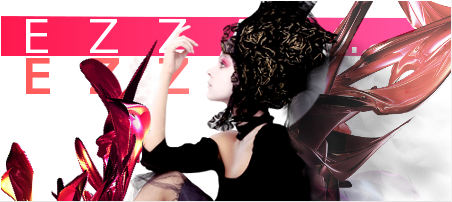
    Entry B: This one look a little blurry. It's a little too small for me. The height is actually just fine. It's the width that gets to me. I think it's too small for what you are trying to convey. Anyway, just size problems and something with the text and it'll look OK. This is my second choice because I like the render you used.

    Entry C: It looks like you just pasted you're render on a C4D. No blending of any sort. Also i don't like the 'alieny' font outerglow. Another thing, there's some sort of light under the car. It would have looked better if it wasn't there.

    Entry D: It's too dark and there's no flow. There's also that triangle thingy on the left side. The render would have been better in a cowboy theme, with sandy texture and etc.

    Entry E: It is a little too bright. I love the pink, white, violet color combination. It would have been better without the C4D at topmost part. This gets my vote.

    :SET BY ME:
    Requests are OPENMy Works Illuminated Spirits
    November Update for my Ebook Collection!
    Don't take life too seriously. You'll never get out alive. -Bugs Bunny

  14. #10
    Senior Member Acnologia has a reputation beyond repute Acnologia has a reputation beyond repute Acnologia has a reputation beyond repute Acnologia has a reputation beyond repute Acnologia has a reputation beyond repute Acnologia has a reputation beyond repute Acnologia has a reputation beyond repute Acnologia has a reputation beyond repute Acnologia has a reputation beyond repute Acnologia has a reputation beyond repute Acnologia has a reputation beyond repute Acnologia's Avatar
    Gil
    66,321.49
    Gender
    My Mood
    Tired
    Gifts Present Bomb Aquarius
    Mentioned
    55 Post(s)
    Tagged
    0 Thread(s)
    Latest Post
    02-17-2014 05:45 PM
    User Info Thanks / Tagging Info Gifts / Achievements / Awards vBActivity Stats
    Join Date
    Sep 2006
    Location
    Babylon
    Age
    34
    Threads
    103
    Posts
    5,216
    Blog Entries
    7
    AW Wallpapers
    1
    Rep Power
    7073

    Default Re: Beginner Signature of the Week #1 Voting

    I vote for D

    ITS CROSS OMG
    I like how they didn't seem to use downloadable resources but just used the stock itself, my complain is just that it's a bit sharp

    ein, zwei, drei, vier bin endlich weg von Dir
    fünf, sechs, sieben, acht Du hast jetzt keine Macht


+ Reply to Thread

Thread Information

Users Browsing this Thread

There are currently 1 users browsing this thread. (0 members and 1 guests)


Similar Threads

  1. Beginner Signature of the Week #1 Theme
    By Archaic Devices in forum Art Forum
    Replies: 1
    Last Post: 05-09-2012, 03:23 AM
  2. Signature of the Week #13 Voting
    By Vintniv in forum Art Forum
    Replies: 8
    Last Post: 10-08-2010, 12:08 PM
  3. Signature of the Week #7 Voting
    By Vintniv in forum Art Forum
    Replies: 10
    Last Post: 08-27-2010, 01:15 AM
  4. Signature of the Week 57 VOTING
    By Ωmega in forum Art Forum
    Replies: 21
    Last Post: 07-05-2009, 12:18 AM
  5. Signature of the Week #11 Voting
    By Vintniv in forum Art Forum
    Replies: 24
    Last Post: 07-21-2008, 06:54 PM

Bookmarks

Posting Permissions

  • You may not post new threads
  • You may not post replies
  • You may not post attachments
  • You may not edit your posts