


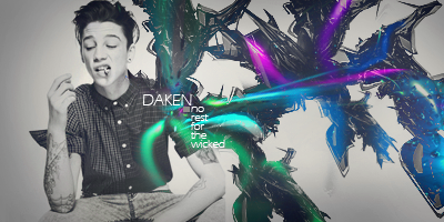
Redid my BOTM entry. I like this one MUCH more. I'll eventually get around to my own signature

 AnimeGalleries [dot] Net AnimeGalleries [dot] Net |  AnimeWallpapers [dot] Com AnimeWallpapers [dot] Com |  AnimePedia [dot] Com AnimePedia [dot] Com |  AnimeGlobe [dot] Com AnimeGlobe [dot] Com |
| AnimeGalleries [dot] Net | AnimeWallpapers [dot] Com | AnimePedia [dot] Com | AnimeGlobe [dot] Com |


Redid my BOTM entry. I like this one MUCH more. I'll eventually get around to my own signature
.-.
(o.o)
|=|
__|__
//.=|=.\\
// .=|=. \\
\\ .=|=. //
\\(_=_)//
(:| |: )
|| ||
() ()
|| ||
|| ||
==' '==


Maru, that signature is a much better adaptation to your previous versions. The designs and texture are excellent, which make the overall signature ten times as great.
Ty =3
Edited the sig for myself

.-.
(o.o)
|=|
__|__
//.=|=.\\
// .=|=. \\
\\ .=|=. //
\\(_=_)//
(:| |: )
|| ||
() ()
|| ||
|| ||
==' '==
 Elphaba liked this post
MUCH BETTER!!! You're really good at working with all that wide space, you seem to make no space wasted, great job on your signatures, I can't really recommend anything to fix but I would love to see you try out some taller signatures. =P
人類は調和したのか?VY2V3 = Me | Kagamine Len Act 1 = You

Much better, but I think that without text it would be better as it's pretty busy as it is.
ein, zwei, drei, vier bin endlich weg von Dir
fünf, sechs, sieben, acht Du hast jetzt keine Macht
♥
Thanks =3
Sig request for Kaitou+
\
I also have a request from Elphaba coming up soon, plus my entry for BOTM =3
---------- Post added at 11:02 PM ---------- Previous post was at 08:32 PM ----------
Signature request for @Elphaba [I hope Im doing this tag thing right...]
I'll be more than happy to make any changes requested =3

.-.
(o.o)
|=|
__|__
//.=|=.\\
// .=|=. \\
\\ .=|=. //
\\(_=_)//
(:| |: )
|| ||
() ()
|| ||
|| ||
==' '==


I like your styles very much, I think you're creative with everything that you do. Is there anything that inspires you to make your signatures like that, or do you just go with the flow?
I usually just mess around until I get something I like. Theres been times I work on something and end up starting all over because I dont like the end product [case and point, my final entry for the May BOTM]
Speaking of battle of the month, my entry
Not sure if Im thrilled with it though @__@
.-.
(o.o)
|=|
__|__
//.=|=.\\
// .=|=. \\
\\ .=|=. //
\\(_=_)//
(:| |: )
|| ||
() ()
|| ||
|| ||
==' '==
Perhaps you should texture and darken the layer behind the render in the above? That could work out if you do it right. Otherwise, the signature looks decent Maru.
My poor signature thread, how Ive neglected thee
My current BOTM entry. Not sure if Im 100% happy with it
Previous BOTM entry. Theme was peace, love and happiness
Previous SOTW entry. Theme was photoshop defaults, won this one
And a challenge by Serated. I had to use the extraction given and use nothing but c4ds

.-.
(o.o)
|=|
__|__
//.=|=.\\
// .=|=. \\
\\ .=|=. //
\\(_=_)//
(:| |: )
|| ||
() ()
|| ||
|| ||
==' '==
New entry for BOTM. Apparently its "boring" and "uncreative"
Feedback?

.-.
(o.o)
|=|
__|__
//.=|=.\\
// .=|=. \\
\\ .=|=. //
\\(_=_)//
(:| |: )
|| ||
() ()
|| ||
|| ||
==' '==

Pft. Quit it, it's amazing and I love the clean and simplicity of it. ;_; In fact its really my favourite one there.Originally Posted by MaruDashi

 Ωmega thanked for this post
Ty <3
Im quite proud of it too, I usually dont do too many typography pieces, but I was super happy with the end result here. I saw some of the previous entries and thought they were really cluttered, so I wanted something simple but got the point across, I thought I did....according to a specific person, I didnt. Thats why I thought Id go ahead and ask for criticism.
.-.
(o.o)
|=|
__|__
//.=|=.\\
// .=|=. \\
\\ .=|=. //
\\(_=_)//
(:| |: )
|| ||
() ()
|| ||
|| ||
==' '==


Actually when I was linked to the BoTM thread, I believe I picked yours and another as the best of the bunch.
I think the creativeness in this piece is its simplicity, its a typography piece with the 4 colours you need. It does what it says on the tin, and I applaud that.
There's too many people (im one of the worst of these offenders) making over complicated headaches when it comes to tags.
Anywho for what it is, I liked it.
Lex Luger R.I.P
¦ Sexy Logo By Me ¦ R A R E R E N D E R ¦ Tutorial requests and PSD Requests open ¦ Tag Thread

Requests~
Elphaba
Tatty

.-.
(o.o)
|=|
__|__
//.=|=.\\
// .=|=. \\
\\ .=|=. //
\\(_=_)//
(:| |: )
|| ||
() ()
|| ||
|| ||
==' '==
http://img688.imageshack.us/img688/6...phaba2copy.png
The main thing I notice about this sig is the flowers. They seem a bit too over sharp and over contrasted at the edges, I'd recommend watching the contrast as you make the sig :3 Also the lighting seems to be coming down from top right to bottom left, yet you have it on the other side of her.
ein, zwei, drei, vier bin endlich weg von Dir
fünf, sechs, sieben, acht Du hast jetzt keine Macht
♥
Ah, I see what you mean. I'll keep that in mind in the future
New request. I was so determined to use this stock, not sure I did as well as I could have...
Hmm, looking at them together, the sig is much lighter than the avi. I'll get around to fixing it
.-.
(o.o)
|=|
__|__
//.=|=.\\
// .=|=. \\
\\ .=|=. //
\\(_=_)//
(:| |: )
|| ||
() ()
|| ||
|| ||
==' '==
Elphaba liked this post

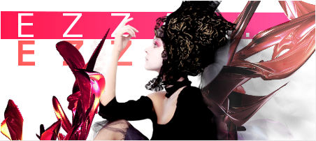
I soo love this one. Good choice for the green/pink combo and I like the font styles that you used. Good job!
:SET BY ME:
│ Requests are OPEN │ My Works │ Illuminated Spirits │
November Update for my Ebook Collection!
Don't take life too seriously. You'll never get out alive. -Bugs Bunny
@MaruDashi <33Thank you lodzzz and I love it!
Last edited by Vaishu; 11-02-2013 at 05:44 AM.
Awesome signature made by Ωmega:3
~Pizza is bae~
[kicks thread]
I got bored
Older sigs

.-.
(o.o)
|=|
__|__
//.=|=.\\
// .=|=. \\
\\ .=|=. //
\\(_=_)//
(:| |: )
|| ||
() ()
|| ||
|| ||
==' '==
....not like anyones gonna comment or critique. Why am I still updating this?

.-.
(o.o)
|=|
__|__
//.=|=.\\
// .=|=. \\
\\ .=|=. //
\\(_=_)//
(:| |: )
|| ||
() ()
|| ||
|| ||
==' '==


Because people only care about themselves and winning competitions (that we don't have atm)
Anyways a stunning piece of work. It actually looks like watercolor and the colors and contrast are all well done. I love the blues and reds in the signature and the typography for "watercolor" is very nice and suits extremely well. However I think your name stand out like a sore thumb. Moving watercolor to the area your name is in would've made the piece very solid.
Once again nice work on the contrast between the face and the actual painting around her.
今日...明日...永遠に...
Interested in Pop-Up Cafes in Japan? Dango News is the place for you.
Dango News | Twitter | Facebook | Instagram
Yeah, the text was a little off putting for me too, but I was just too lazy to fix it [lol]
Aaaaaaand a new sig too. Im obsessed with watercolor right now @_@
I dont know what else to do with this one. It just doesnt feel finished

Last edited by FlashD; 05-04-2012 at 11:32 AM. Reason: >_>;;
.-.
(o.o)
|=|
__|__
//.=|=.\\
// .=|=. \\
\\ .=|=. //
\\(_=_)//
(:| |: )
|| ||
() ()
|| ||
|| ||
==' '==
Maybe use some white brushes that are like swirly or have flower buds or something hand have it attach around "spring" by erasing what doesn't fit so it looks like it's blooming off the word?
今日...明日...永遠に...
Interested in Pop-Up Cafes in Japan? Dango News is the place for you.
Dango News | Twitter | Facebook | Instagram
Ωmega thanked for this post
Im still looking for a floral patter I like for the text. I might just end up vectoring something from scratch.
And meeeeeeeeeeeeeeeeeeeh

.-.
(o.o)
|=|
__|__
//.=|=.\\
// .=|=. \\
\\ .=|=. //
\\(_=_)//
(:| |: )
|| ||
() ()
|| ||
|| ||
==' '==
There are currently 1 users browsing this thread. (0 members and 1 guests)
 Posting Permissions
 Reply With Quote


Bookmarks