


Under our Zero tolerance policy, I am not giving an extra day to those people who didnt send me an entry. AND BOY DID THEY NOT SEND ENTRIES. Of the 12 people who signed up, 4 didnt enter. So an entire 3rd of our participants should probably keep sticky notes handy so they can remember the things they sign up for!
Remember, you are 3 times as likely to remember something if you write it down!
Kay, that all aside, here's how this one will go; skip one. So that means Entry 1 vs Entry 3, Entry 2 vs Entry 4, etc.
Round 1: Zenister vs Ardelia
Zenister's approach is very straight forward, C4ds, lots of strong color, and some good flow and blending. But how par for the course is this? The text looks like its just been slapped in there; and given that this is a TEXT PRESET theme, the text should be very important and handled with care.
Ardelia tries something new, using C4Ds and a sense of lighting. The text is small, and a little out of the way, and overall the tag is slightly over sharpened.
But, one must win, and we are going with Ardelia. The tag has just an overall stronger sense of display to it. Areas and certain elements have been considered; such as leaving an area perfectly set for the text to go, with areas to handle the placement of the flow.
Round 2: Daken vs Hyphen
Daken opens strong. The color here is great, strong reds, purples and white which compliments most everything in the tag, including the text and its choice colors. However, it could have been handled better. There's very little flow, and the fact that a drop shadow was used on the text usually indicates that the maker couldnt get it to fit anywhere but needs it to show up anyway.
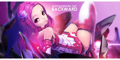
Hyphen has a lot going for him. Very good lighting, and very strange stock choice given what is usually submitted in these contests. But tag is very sloppily done. The stock is overblended, and is very busy, with effect like the arrows just spattered about all over the place with no sense of direction. So why use them? I also cant even read the 'Backward' text or the AG.net text.
Chalk one up for Daken. Given that these contests are all presets, things need to be considered. So, because this is a text preset, you should first lay down the text, and then build around it. Although Daken didnt necessarily do this; everything in the entry feels like it belongs there.
Round 3: MaruDashi vs Kaitou
An Alice in Wonderland tag, what's already nice about this particular entry is that even though this is a preset, the fact that I said you couldnt do certain things, Maru ran with and made this one a little more personal. The colors are nice, the stock choice is unique. But the composition is just a shotgun blast of masks and textures with no sense of organization to a particular focus. Also, the word was BACKWARD, not 'Backwards.' AND YES, I AM CALLING YOU OUT ON THAT. It was the only thing you had to do, and you messed it up! GAWD.
Ahemm... Kaitou's entry is strong in its color sense choice. Very vibrant oranges and reds. Also, the word is correct... But the tag is just... empty. There's not much in here to remark on. Very little flow, and not a lot of blending, the entire thing is just a white mass that happens to have color in it.
Overall, we are giving this one to Maru. Although the text is wrong, the design work is there. The thoughts of how things the maker wanted are here.
Final Round: BlueAngel vs Arrancar Grimmjow
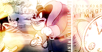
Disney! Very strange stock choice on Blue's part... Um... there's a lot going on here. Why that stock? The word 'backward' is impossible to read; not only backward, but the majority of the text. A serious lack of hierarchy not just in the text, but in the overall tag truly cripples this one. Where do I look first? What does the text say? The tag is a far cry from all those ugly C4Ds and Photoshop brushes, but this one just doesnt work.
Grimmjow's is more par for the course on the other hand. Using external images to try and compliment the stock choice. Again, the text here is difficult to read, but composition-wise is a bit thought out. We can see the lighting coming from the right, we can see that the text is kept kind of close together (most of it anyway). While not the greatest tag in the world, its shows more thought.
In the end, we hand this one to Arrancar Grimmjow. Its not a great tag, it has its flaws, but its composition says a lot about it.
AND THAT'S IT! Congratulations to all winners! Members continuing on to the next round are listed below:
Ardelia
Daken
MaruDashi
Arrancar Grimmjow
Thanks to all those that participated!
 AnimeGalleries [dot] Net AnimeGalleries [dot] Net |  AnimeWallpapers [dot] Com AnimeWallpapers [dot] Com |  AnimePedia [dot] Com AnimePedia [dot] Com |  AnimeGlobe [dot] Com AnimeGlobe [dot] Com |


 Reply With Quote
Bookmarks