


Text was bad D:
 AnimeGalleries [dot] Net AnimeGalleries [dot] Net |  AnimeWallpapers [dot] Com AnimeWallpapers [dot] Com |  AnimePedia [dot] Com AnimePedia [dot] Com |  AnimeGlobe [dot] Com AnimeGlobe [dot] Com |
| AnimeGalleries [dot] Net | AnimeWallpapers [dot] Com | AnimePedia [dot] Com | AnimeGlobe [dot] Com |


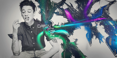
Text was bad D:


Read some tuts, really has nothing going except for flow, which is not that good :E


I think your signature has to much red going for it, you should use more than one color, and your render looks a bit stretched. I think if you focus on those things and add more depth into your signature I think the next one will be twice as good.


There are currently 1 users browsing this thread. (0 members and 1 guests)
 Posting Permissions

 Reply With Quote
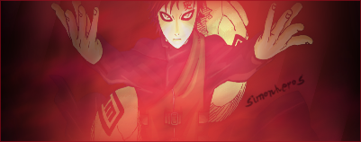

Bookmarks