


Beginning projects.
Tell me what ya think. >)
Uh...yeah?
 AnimeGalleries [dot] Net AnimeGalleries [dot] Net |  AnimeWallpapers [dot] Com AnimeWallpapers [dot] Com |  AnimePedia [dot] Com AnimePedia [dot] Com |  AnimeGlobe [dot] Com AnimeGlobe [dot] Com |
| AnimeGalleries [dot] Net | AnimeWallpapers [dot] Com | AnimePedia [dot] Com | AnimeGlobe [dot] Com |


Beginning projects.
Tell me what ya think. >)
Uh...yeah?
Last edited by pickles; 02-04-2011 at 06:32 PM.
Overusage of C4D's and lack of flow for the most part. It's good you've centered the focus in the center, but other than that it all feels too chaotic and grungy.
|Power of The Mask|


On the ipods I don't like how the right effect over them is so large. The red one would look nice if the right side was a bit smaller or the bottom part was taken off and then the top moved upwards.
Thanks you both. I'll try to understand what you meant and change some things around. And learn more on this "flow" you speak of.


I think they are pretty good, for the first two, I just dislike how much the effects are overlapping the main object so much, and for the first one, the effects don't make sense imo. I think you should use more "calm" effects, and maybe some more objects to make it less boring.
The third one looks pretty cool but it feels like something's missing, maybe some text or another object.
Overall, these things looks really good! I hope to see more of your work soon.


The first two aren't bad at all, but they're both a bit oversharpened. The colors are a tad monotone too, so try experimenting with some gradient maps. The second one is still my favorite of the bunch though.
There are currently 1 users browsing this thread. (0 members and 1 guests)
 Posting Permissions


 Reply With Quote
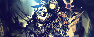


Bookmarks