


The latest comment I make on this page will act as my latest update.
Dec. 30, 2010:
December 31, 2010:
January 1, 2010:
 AnimeGalleries [dot] Net AnimeGalleries [dot] Net |  AnimeWallpapers [dot] Com AnimeWallpapers [dot] Com |  AnimePedia [dot] Com AnimePedia [dot] Com |  AnimeGlobe [dot] Com AnimeGlobe [dot] Com |
| AnimeGalleries [dot] Net | AnimeWallpapers [dot] Com | AnimePedia [dot] Com | AnimeGlobe [dot] Com |


The latest comment I make on this page will act as my latest update.
Dec. 30, 2010:
December 31, 2010:
January 1, 2010:
Last edited by Skilero; 03-24-2011 at 09:34 PM.


They seem pretty empty to me, maybe you should add more to them, not saying you have to, since some signatures are fine plain. But I'd like to see that. On your second signature, I don't really like that pink line around her, it would look better without it in my opinion. Maybe look at some tuts? If you do, I can see great improvement from you in the future. Keep posting. (:
The second one would've worked if I could've added Konata. Sigma didn't want Konata in the signature though! I'll see if I can find any tutorials.
---------- Post added at 05:45 PM ---------- Previous post was at 12:21 PM ----------
UPDATE!
Miku Hatsune Signature #2 posted
Nice new signature, I think the size is perfect for it. I see it has a little more going for it, that is a improvement. The only thing im iffy about is that it basically only has one color sheme, maybe add some more colors to your next signature? I'd love to see that. Nice job.
Updates made! Comments?


In my personal opinion as stated they look plain as previously stated. However in your attempt to make more going on you seemed to have gone over board with a smoke brush set EX: spiderman sig. You might need to expand out of the smoke brushes and try newer things also your borders are not that great either. EX: Thor and guyver. Each side isn't consistent
今日...明日...永遠に...
Interested in Pop-Up Cafes in Japan? Dango News is the place for you.
Dango News | Twitter | Facebook | Instagram
I love the sigs SasoriKiller ^_^ My Guyver request came out awesome!
Check out all of my new January 1 and past sigs!
Trying a new style using screens, blends, and overlays.
I'm progressing.
Which is your favorite?
Last edited by Skilero; 01-01-2011 at 10:50 PM.

This newest one is the best, simply because it actually has a background, and it seems to work well enough. However, the blending needs work, and the text is just awful. The text in the top left is unreadable because of the color and the light and the text shouldn't be on opposite corners of the signature. Not fond of the font either.
You're certainly progressing though
It is pretty hard to make a text that literally blends in, :P. I tried to make it like a watermark that still made the image look nice. Well, the English language isn't very pretty so I had to comprimise! I also thought that if they were on opposite corners, it could be almost like a reflection across the render (sasuke), if that makes any bit of sense.Originally Posted by Annie Hall

I'm surprised you like the Sasuke one, as I would like to think something like the Hawk in the original post would be better. I guess the black background is really something the majority of people will agree with. I'll download some fonts, I guess ^^. I've been skimpy with spending any of my computer's memory since it is new, but it has to be done to make any decent signatures.
Thanks for the constructive feedback! I've also gotten some help through private messages too.
~SK
Anything else on the other sigs anyone?
P.S. Jan. 1st's Haruhi Signature perhaps? 8D
Last edited by Skilero; 01-02-2011 at 10:02 AM.
The best way to apply your mark to a sig is to use a small box/squared/compact like font in your bottom right or left corner depending on the sig layout. Make reference to the wallpapers at animewallpapers.com for the type of font I'm talking about. Simple and small is best for your SN so it doesn't compete with the other text in the signature which should be larger and more elaborate fonts.
今日...明日...永遠に...
Interested in Pop-Up Cafes in Japan? Dango News is the place for you.
Dango News | Twitter | Facebook | Instagram


You know, it's easier to just post your most recent sig(s) in the new post. I think there's an image limit on the forums too. As far as your latest ones go though, you seem to be good on colors. In most of them you kept a color palette which is good, but you place your text too far from your characters. Also try centering your characters a little more. Don't be afraid to experiment either; you can't break Gimp :P.
I tried hard on this one. I love Rosario Vampire, so I had to make a Moka signature!
Please Comment on this and the others.
Multi-Sig updates will come soon.
EDIT:
Moka sig w/border:

Last edited by Skilero; 01-08-2011 at 08:26 AM.

They could use alot more in the backgrounds I would have to agree. They are a good start just maybe a bit more. Don't be afraid to add more to them.

I like your bird set, but the border looks a little messed up on the bottom. Keep posting though, you seem to be getting better.
This is a Mario-themed signature I made after reviewing tutorials and going over the basics:
And an Ulquiorra-themed signature using the same techniques:
SIGMA new Kagame signature!
With avatar:
Please Comment!
Here's some others you might've missed as well:
Last edited by Skilero; 01-13-2011 at 01:11 AM.
This is madness!
(Understand the second was just messing around)
Kagami and Konata. My first vector attempt.
Killzone 3 Signature. Looks alright.
Botched Shana Signature.
Hakurei Reimu Signature.
Magus Tale Sig I made this just thinking the render was cool. I still don't really know what Magus Tale is, but I think I have an egg on my face with this signature... /facepalm
Last edited by Skilero; 01-15-2011 at 07:53 PM.
I like the effect between K&K, but the problem is, your characters are so far apart that it actually wants to makes me focus on the middle of the signature more with trying to figure out what the text says without focusing on the characters in the signature.

-points at Magus Tale-
i think i've seen that kind of style before ~///~
Rawr. I messaged them about it and I haven't heard anything back yet >.<.
I said to Therolyte through PM I'll pull it out if they don't like the signature.
Last edited by Skilero; 01-15-2011 at 08:25 PM.
Your newest batch seems decent if not a little boring, imo. Doesn't seem like you spent too much time in any of them except for maybe the Magnus one which is the one I like the most.
As for your worst I believe it's your Killzone one. I don't know what you were trying to achieve with it but overall it's way too dark. There's way too much black all around him with the little hint of color near the character. Incorporating lightning into your sigs would be nice as well.
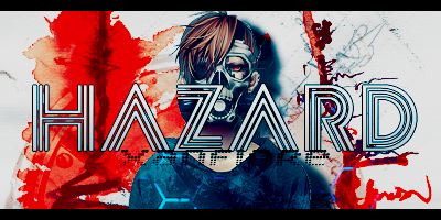
|Power of The Mask|


Ahaha I think it's fine. The thing is it seems blurry and rough around the edges.
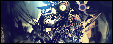
The terror! -still in construction!-
ah..I see.. ^^;
There are currently 1 users browsing this thread. (0 members and 1 guests)
 Posting Permissions


 [/CENTER]


 Reply With Quote


Bookmarks